Biography
Hey! I'm Richard - a multi-disciplinary Graphic Designer and Visual Artist with a creative flair for the bold, eccentric and unusual. I love introducing characteristics and methods of an era's design into projects and utilise a multitude of digital, practical, and hand-done techniques into my work. I've developed extensive skills in branding and identity, print and editorial design, advertising, and typography, I'm incredibly passionate in furthering them and continuing to add new skills to my arsenal.
Contact
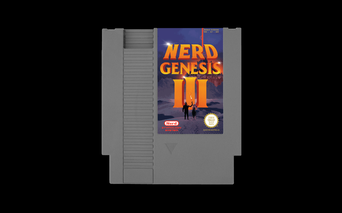
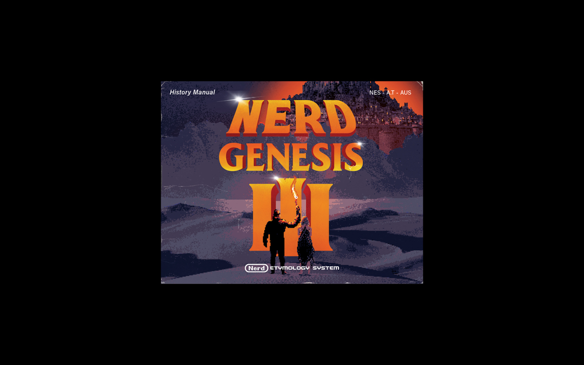
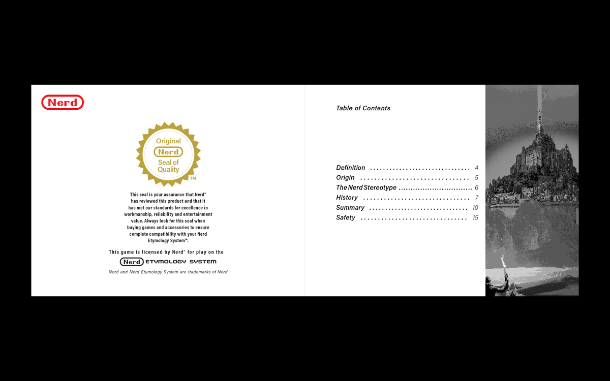
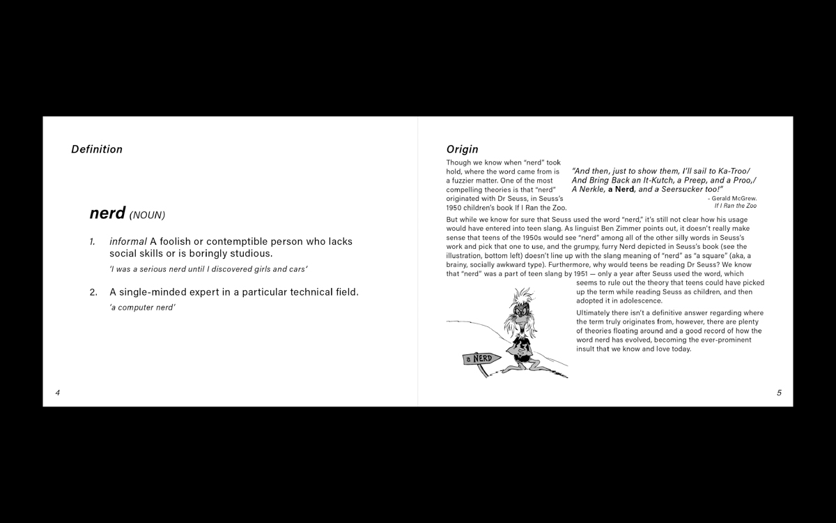
Nerd Genesis III - Type Etymology Exploration
Typography | Print Design | Digital Art
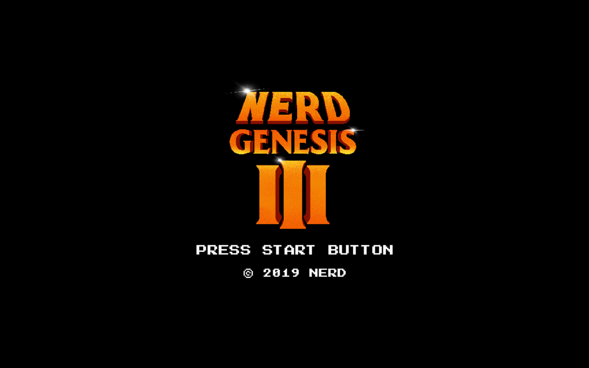
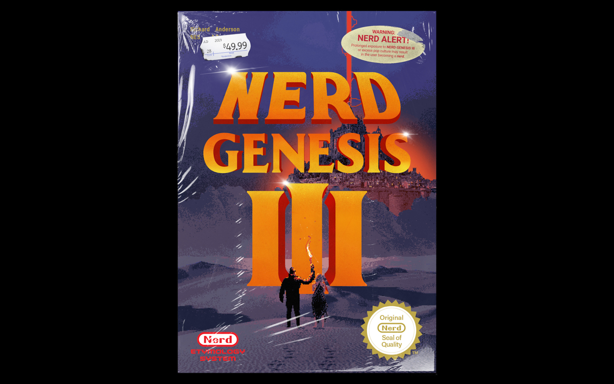
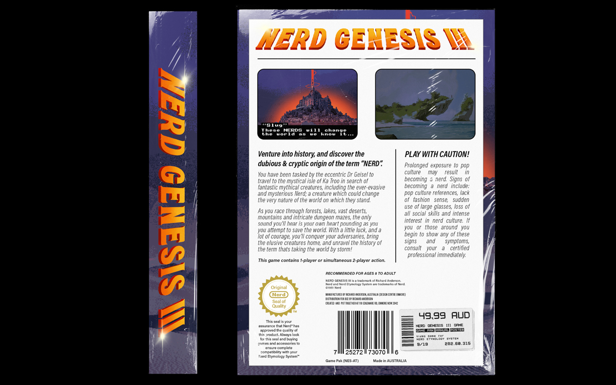
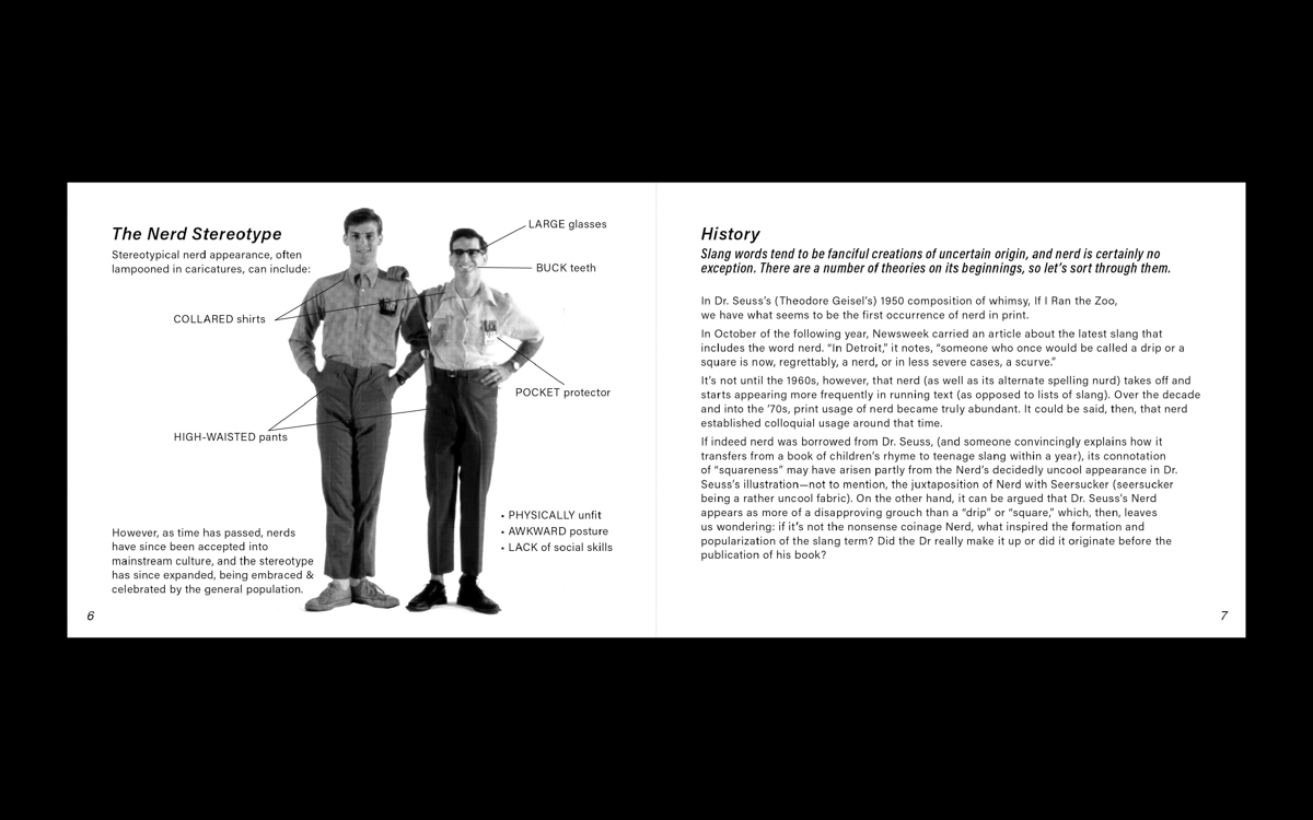
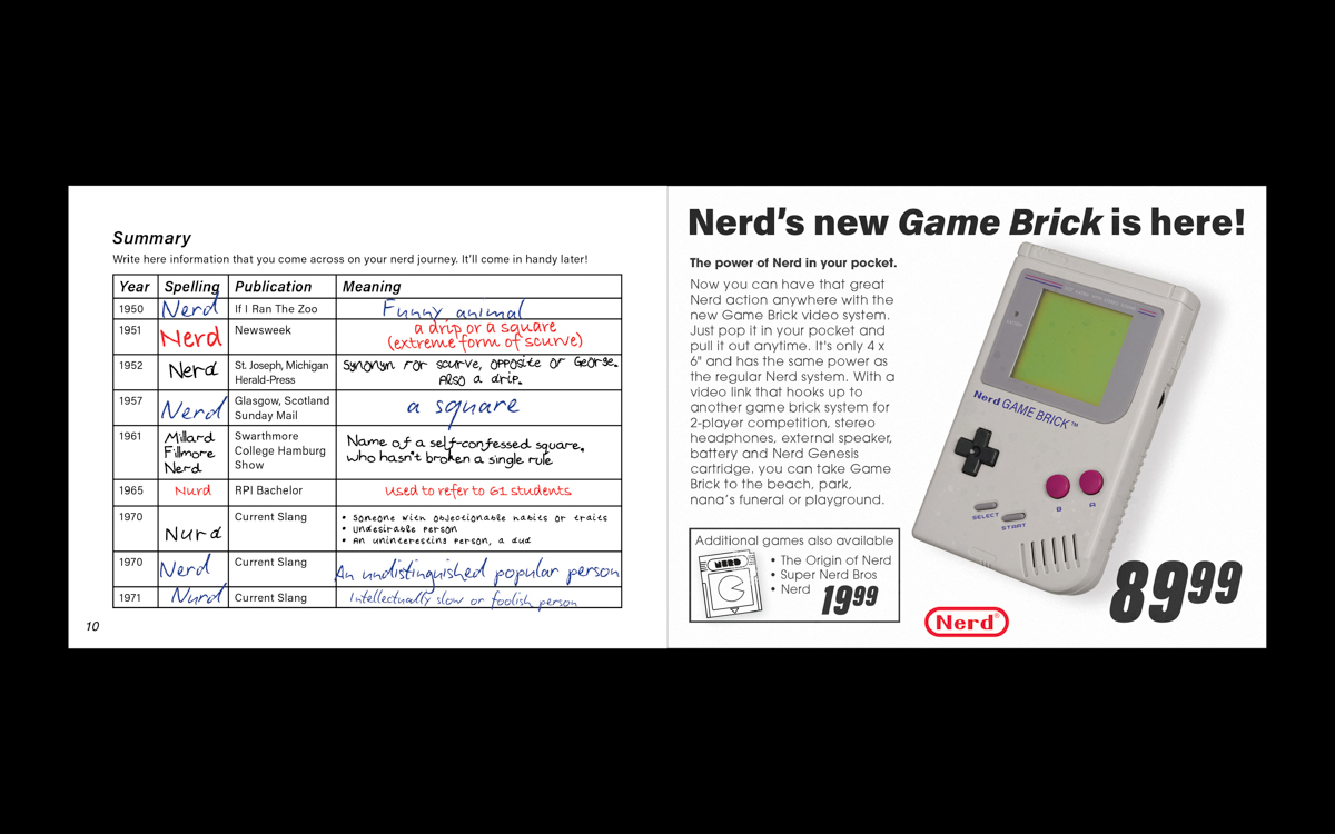
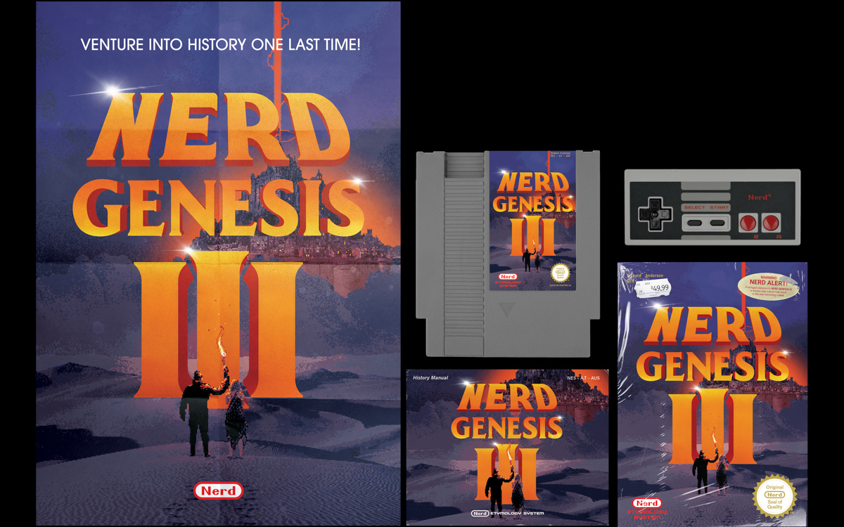
The objective
To explore the mysterious etymology behind the word NERD in a creative manner.
The solution
Originally an insult stemming from mysterious origins, the word NERD was popularised in the '80s. How else better to explore the word's etymology than by expressing it through a medium that would later reveal itself as one of the biggest cultural influences of its time. Nintendo's NES was iconic, and its video games allowed for nerds all over the world to come forth, and make their mark on the world so creating a satirical NES proved to be a unique method of exploring the words ever-evolving history.
Wes Wilson Exhibition Poster Series
Poster Design
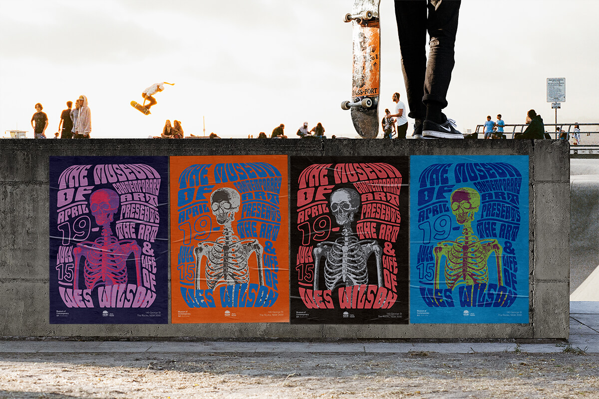
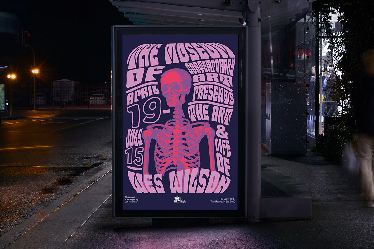
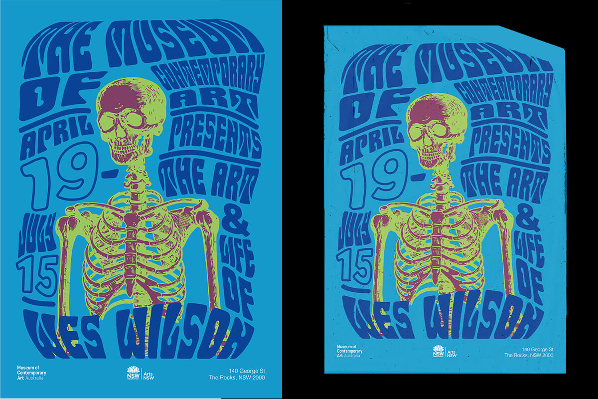
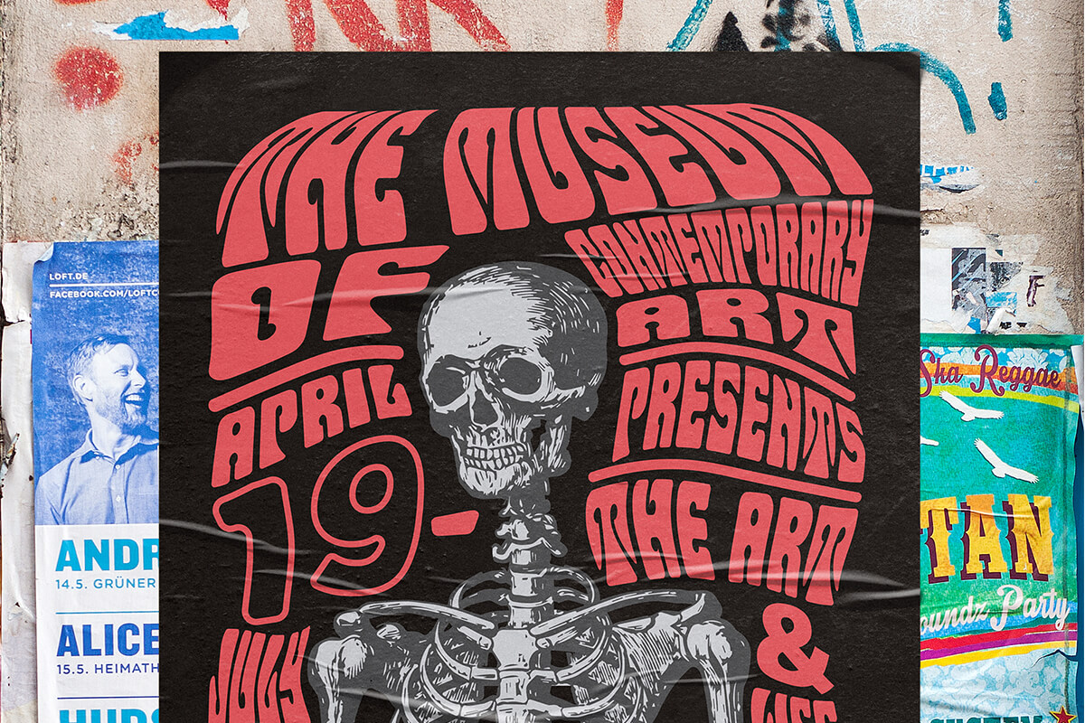
The objective
Create a poster series reflective of American artist Wes Wilsons' world-renowned psychedelic poster work for hypothetical exhibition to be held at the Museum of Contemporary Art.
The solution
Encapsulate the aesthetic created by Wilson that is now synonymous with the peace movement, the psychedelic era and the 1960s. Embrace the richly saturated colours, glaring contrast, strongly symmetrical composition, rubber-like distortions, and bizarre iconography that are all hallmarks of the San Francisco psychedelic poster art style.
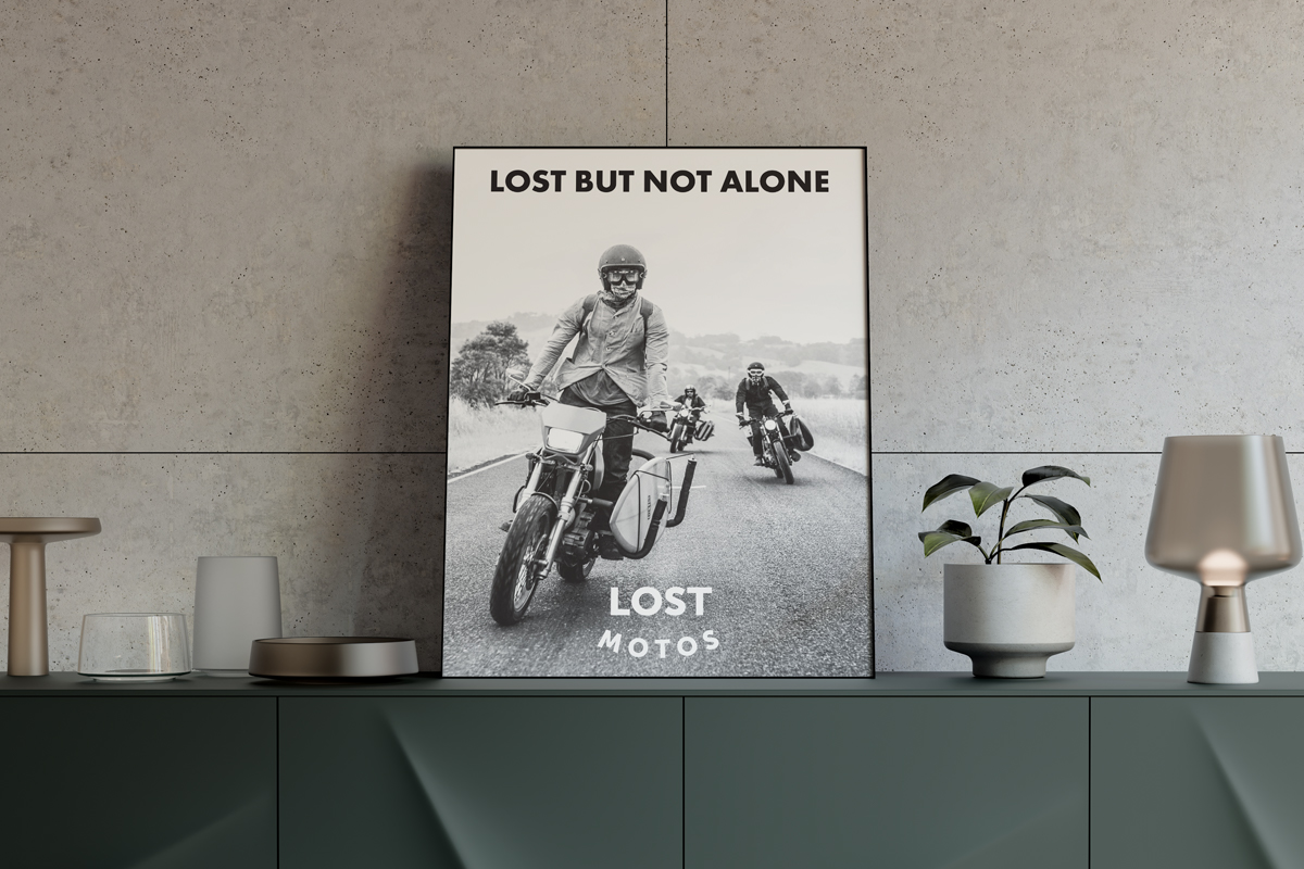
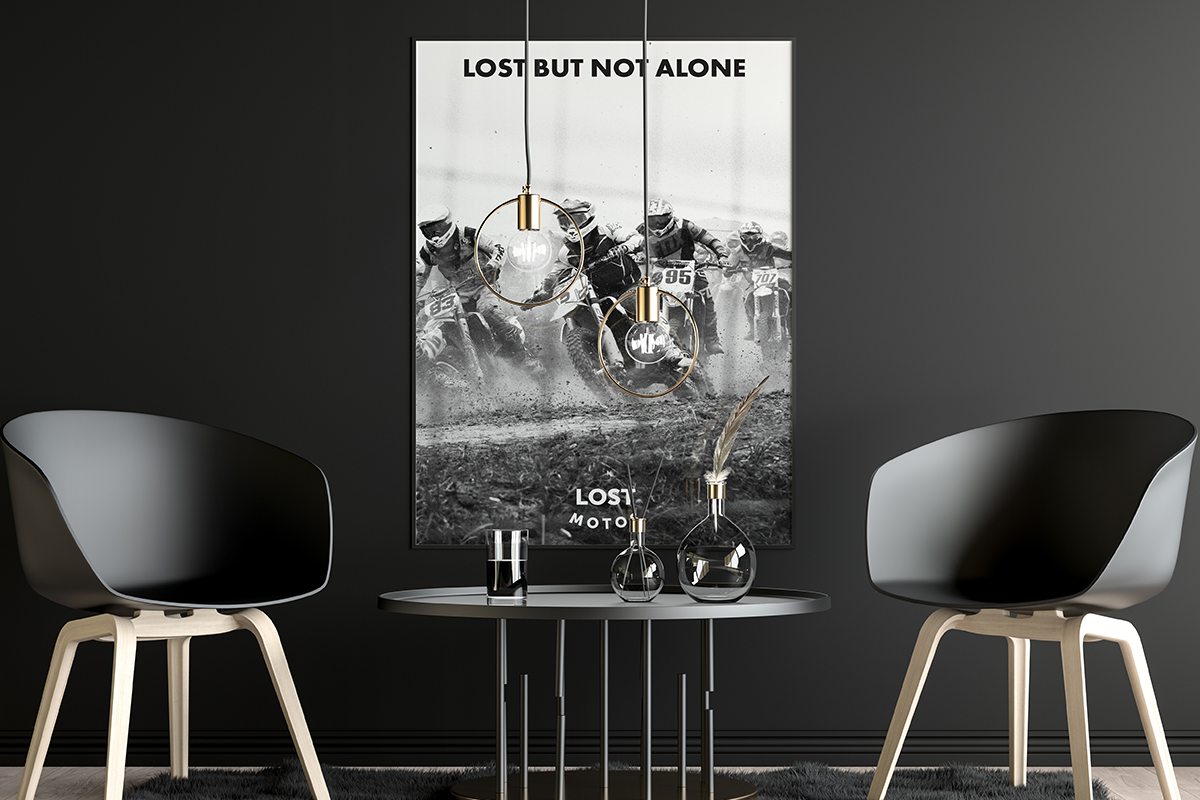
LOST BUT NOT ALONE - Lost Motos Mental Health Campaign
Video Editing | Print Design
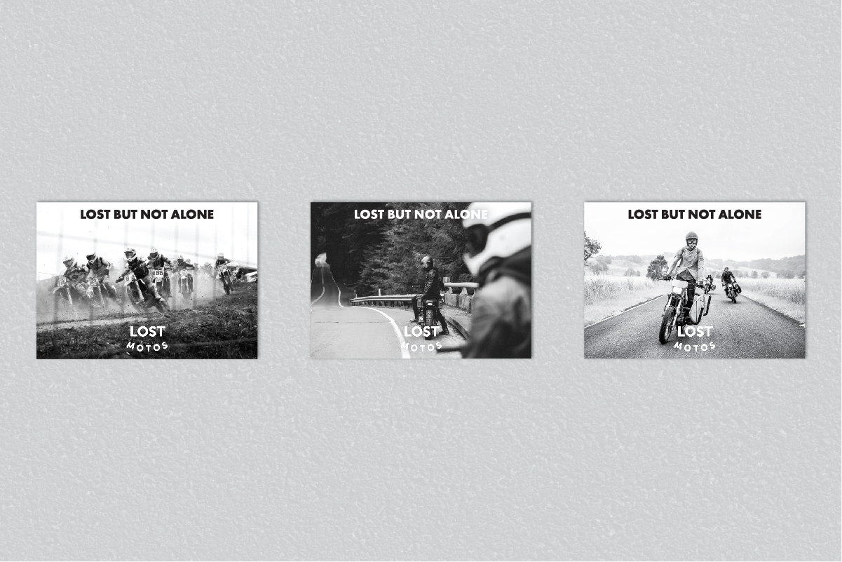
The objective
Throughout history, most men haven't spoken about or acknowledged their mental health. Let's help blokes on bikes know it's okay to open up.
The solution
Lost Motos is a group of guys who are there to support each other through hard times and break down the stigma surrounding men's mental health. The campaign was kept minimalistic and inclusive, allowing for individuals to fill in the gaps themselves - after all, no one's mental health is the same. Utilising real-world footage and photography throughout the entire campaign serves as a reminder that even if you feel lost - there's a whole community behind you for support, and that you're never alone.
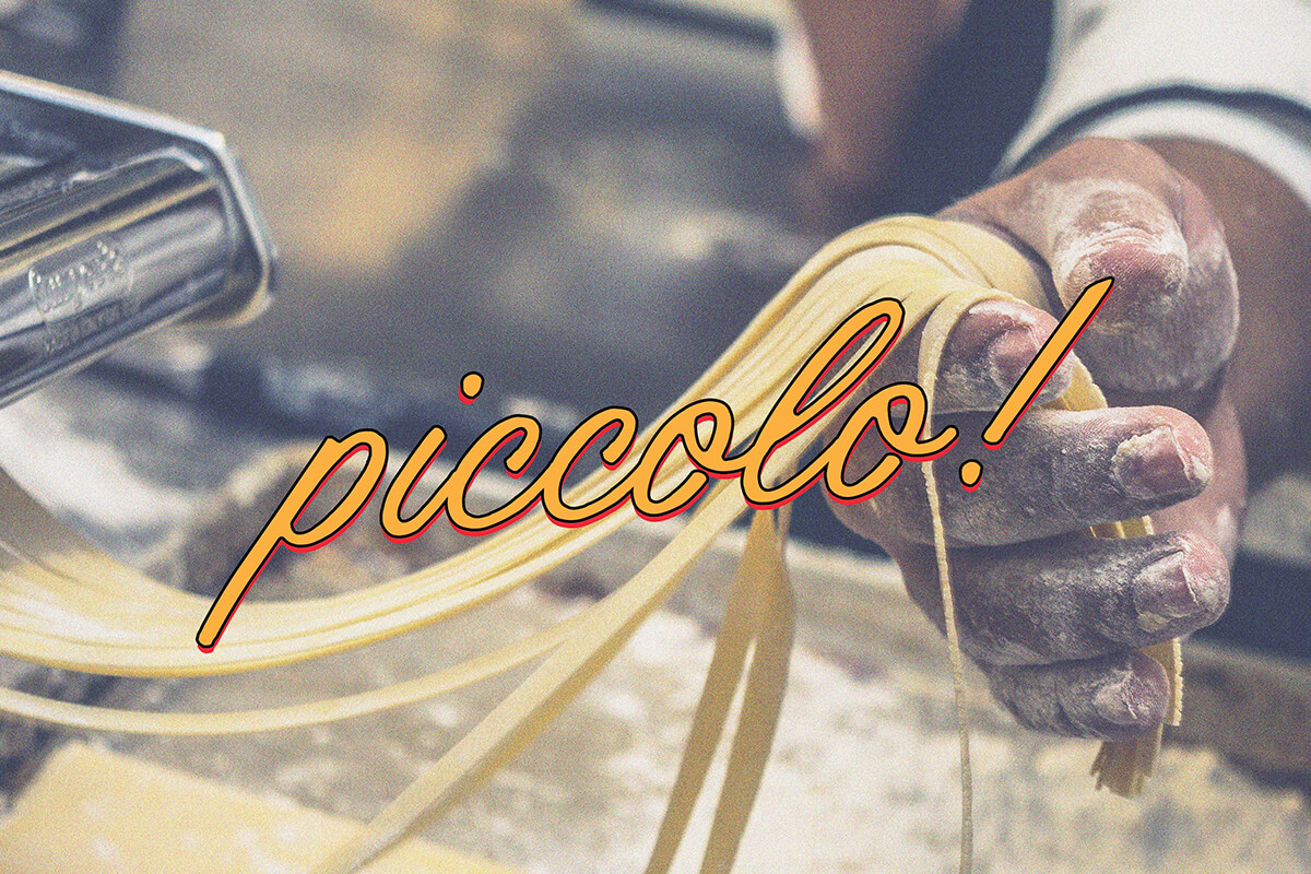
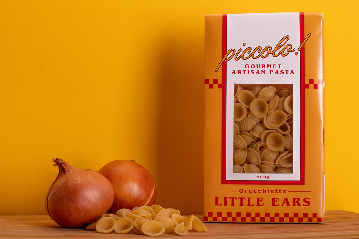
Piccolo! Pasta
Branding | Packaging Design
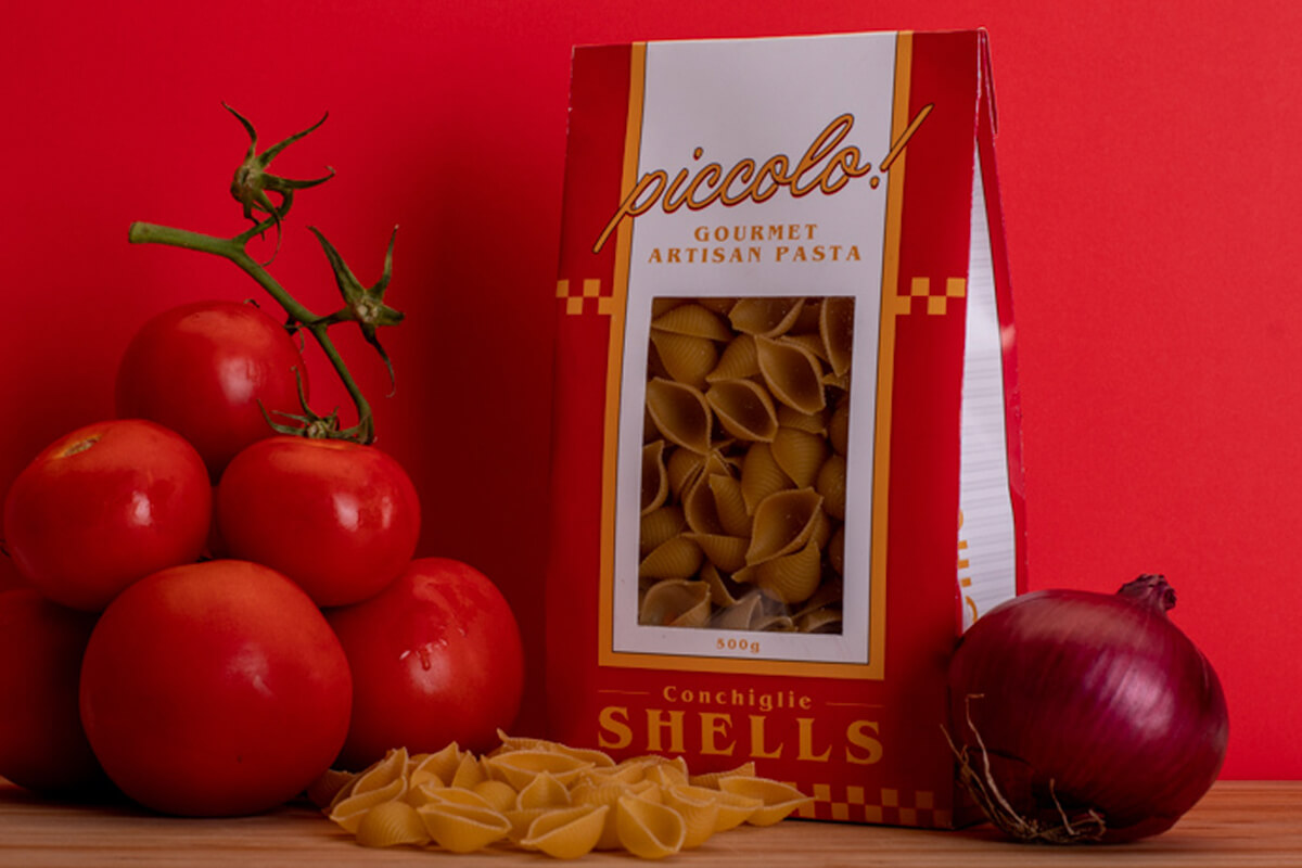
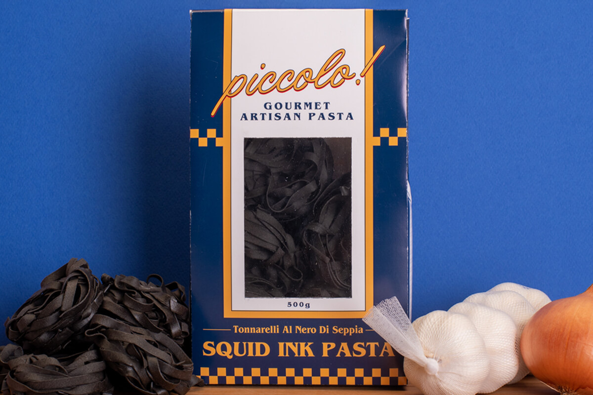
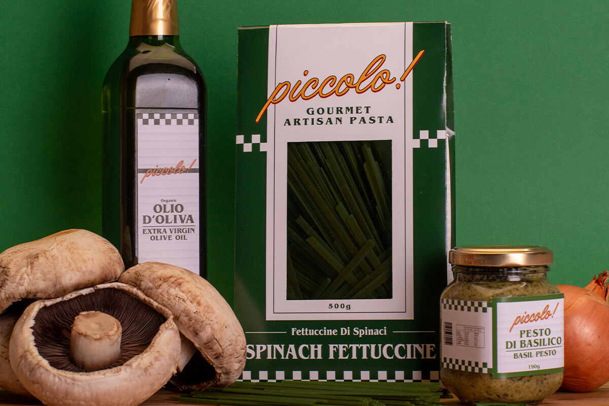
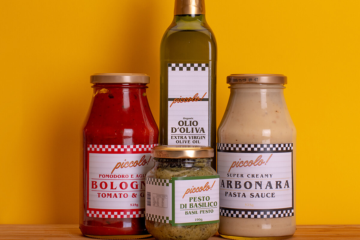
The objective
Hypothetically established in 1953, and with the torch being passed down through 3 generations, Piccolo! is a family-owned cafe and deli, proud to have been a part of Australian lives for over 60 years. The aim was to showcase a brand whos' focus is on bringing Nonna's love of cooking and some of Nonno's cheeky old-school attitude to boot into the everyday lives of their community.
The solution
Creating Piccolo!'s branding started and ended with a primary focus on combining the multi-generational aesthetics of NYC diner's of the '50s, '60s and '70s and classic Italian culture while expressing the years of love and passion that small businesses deliver and bringing it all into the 21st century. Picking and choosing iconic elements from the design of each generation held key to bringing together the company's distinct branding.
Keep browsing
More Stars like this


