
Biography
Hi, my name is Michelle Reimer. I am a Sydney-based Graphic Designer. I enjoy the process of visual communication and problem-solving through the use of typography, photography, and illustration.
I enjoy producing noticeable, modern designs that unite fresh ideas with trend driven creative directions. It is important to me that works are successful, timely, professional and on target to meet with the defined objectives and deadlines set by the client.
Contact
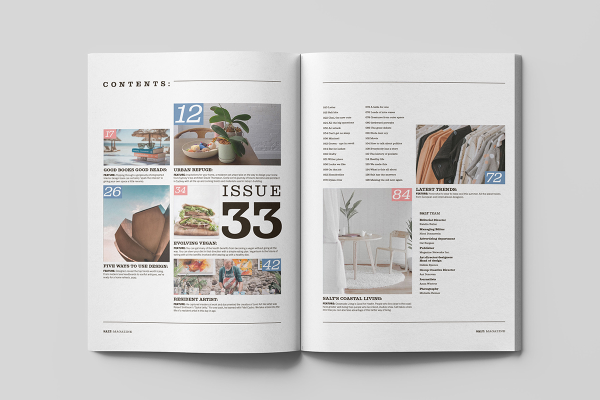
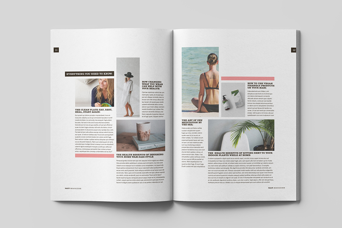
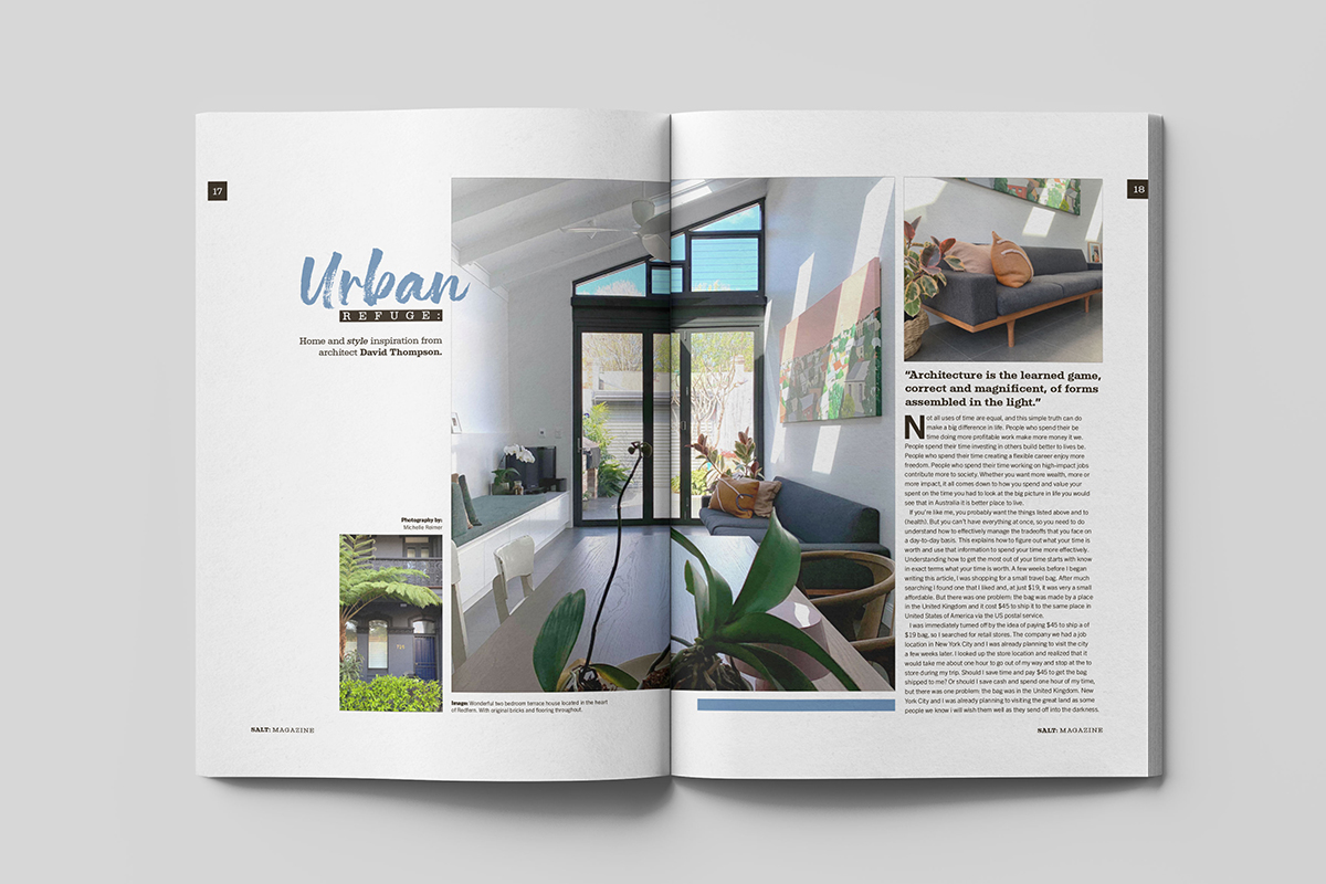
Salt Magazine
Publication
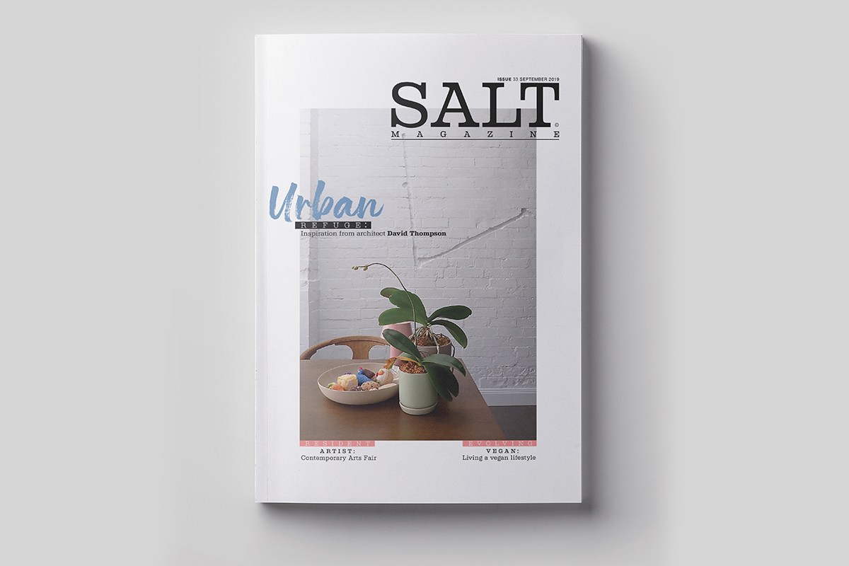
The objective
To create a unique magazine, focusing on a subject based on personal interest that is not yet catered to.
The solution
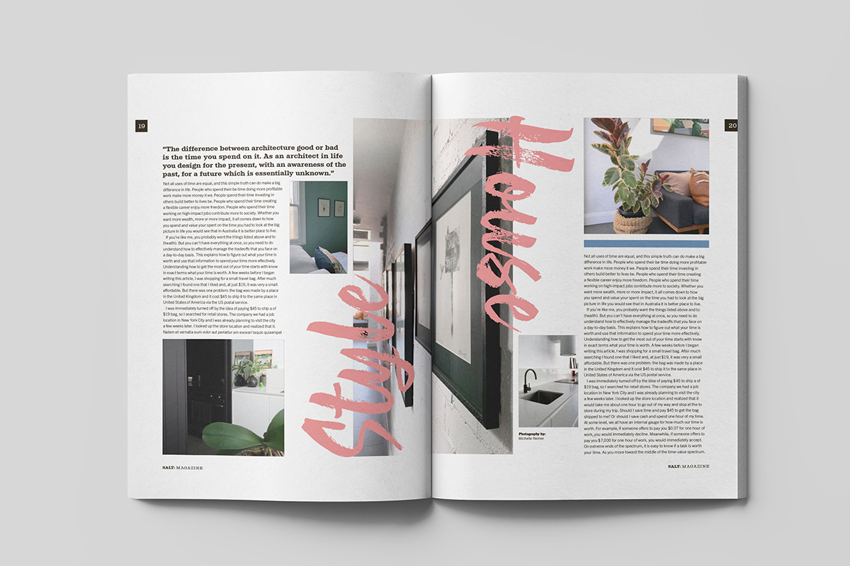
Designing a magazine for women interested in architecture, health and wellbeing. Creating a brand and masthead design with a refined, timeless and minimal aesthetic, ustlizsing the structure of type and its relationship to negative space. The grid structure reflects the spaciousness and sense of freedom that architecture can provide. The colour palette reflects the natural world and its relationship to health and wellbeing.
Obi Organics
Branding and packaging design
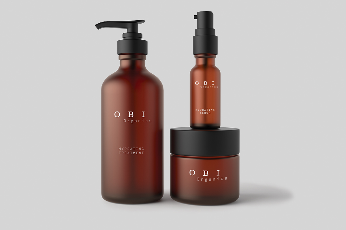
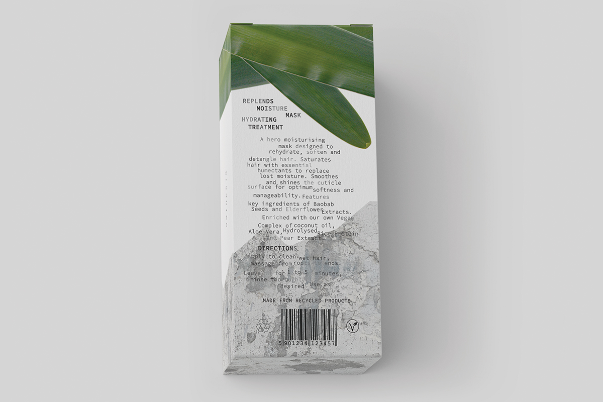
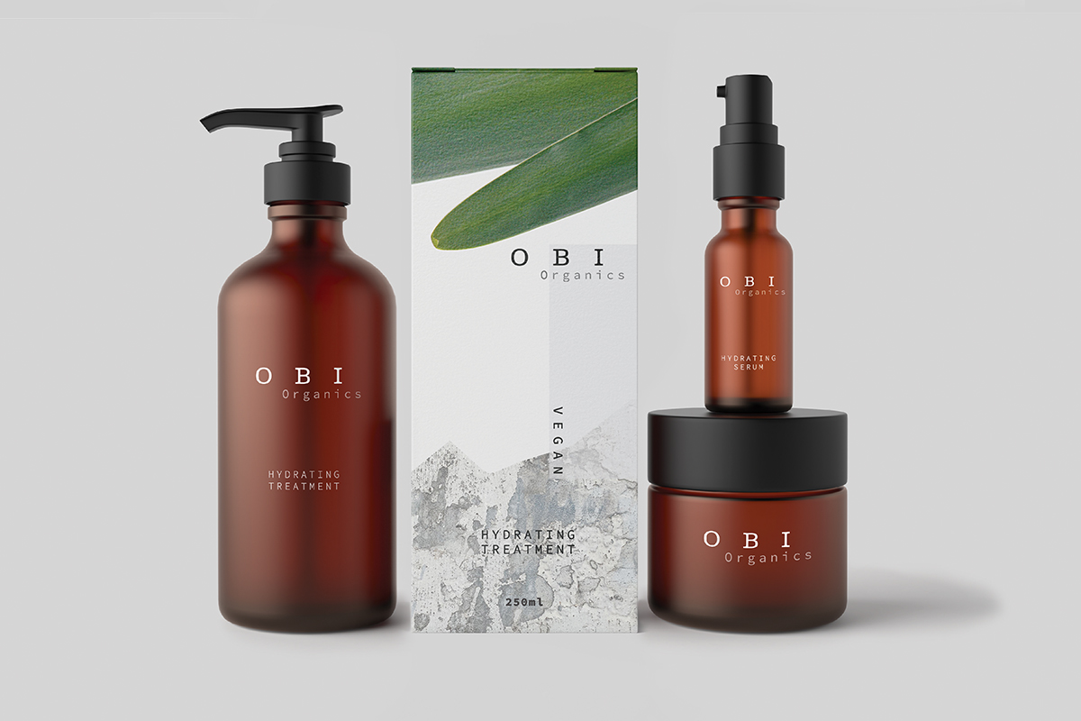
The objective
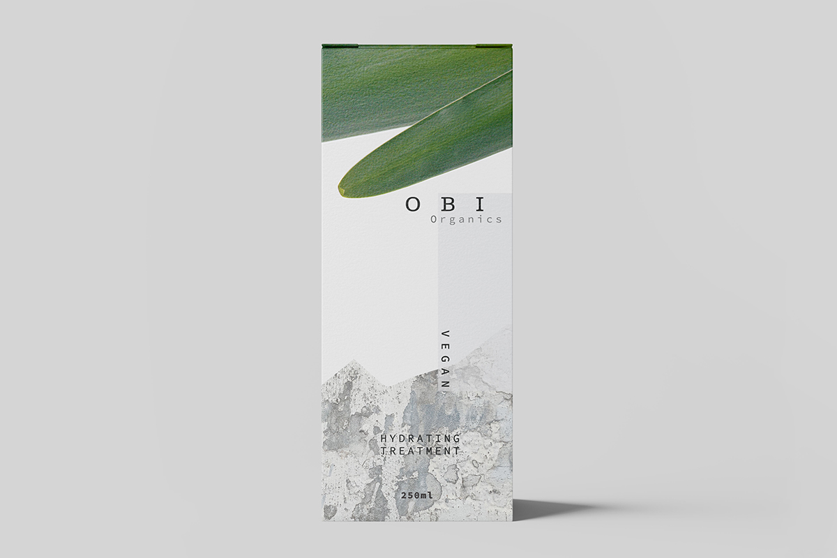
Design work based on the philosophy of Wabi-Sabi, the acceptance of the imperfect and incomplete.
The solution
Brand and packaging design for Obi Organics. The packaging design uses reduced design elements, photography of natural elements and texture created by the erosion of man made materials. The branding, logo design and refined aesthetics, create an overall balance and harmony that gives the product a strong and sophisticated presence.
NIDA
Rebranding for the National Institute of Dramatic Art
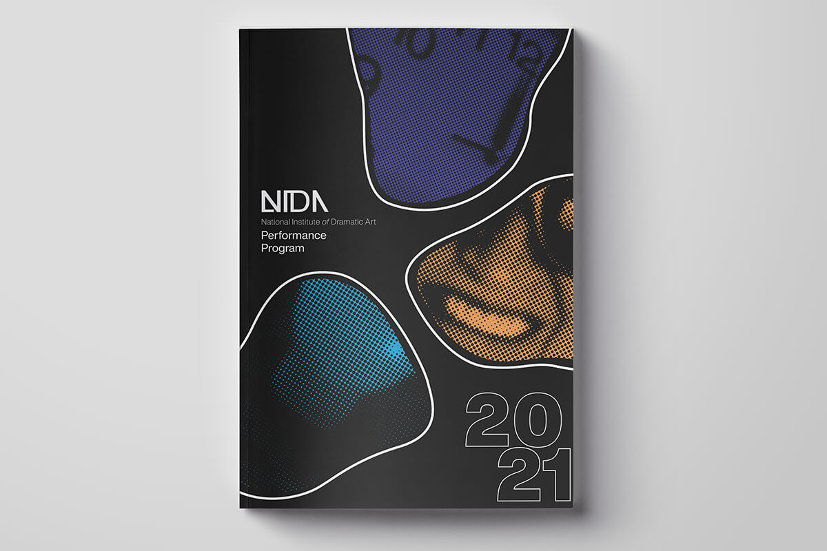
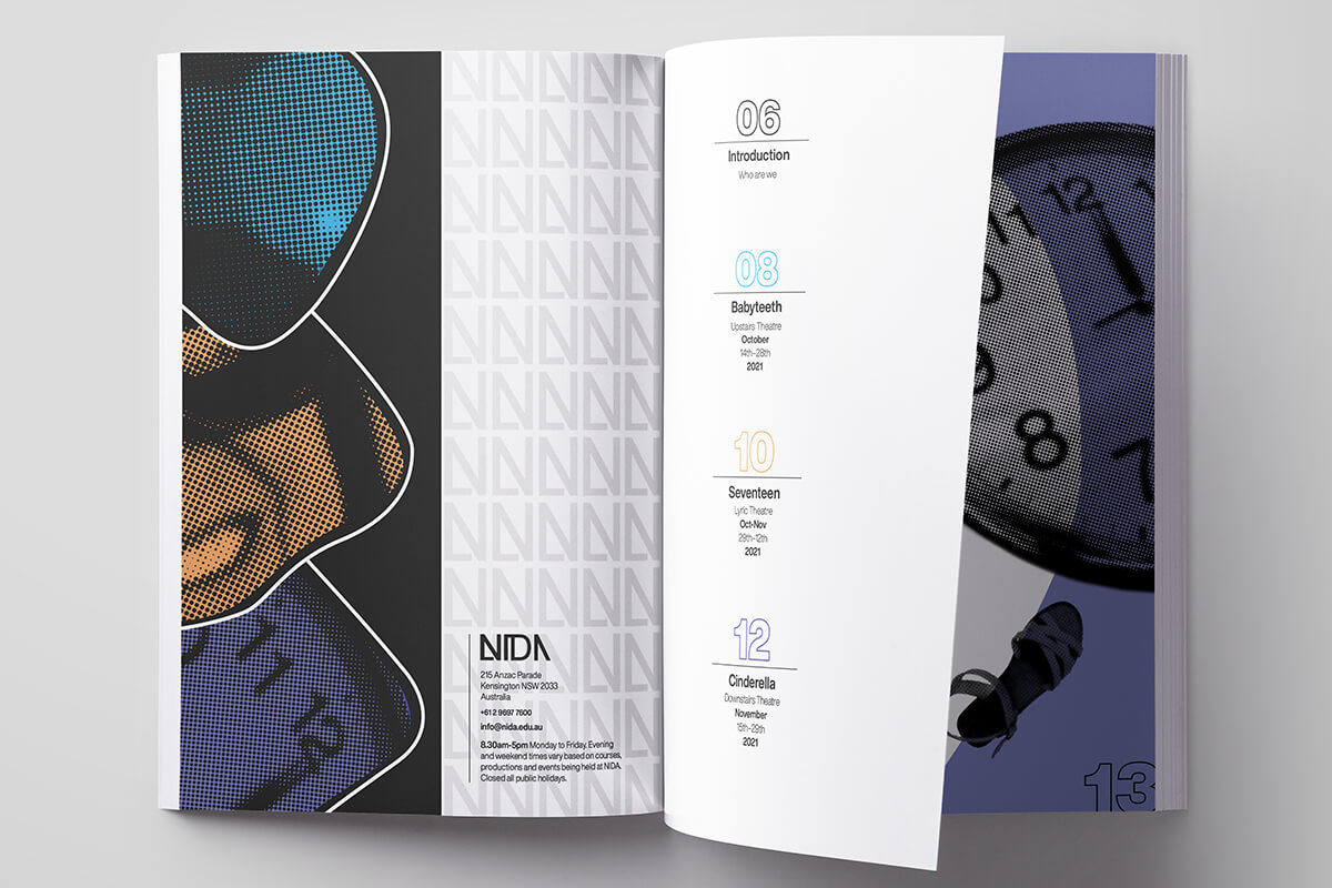
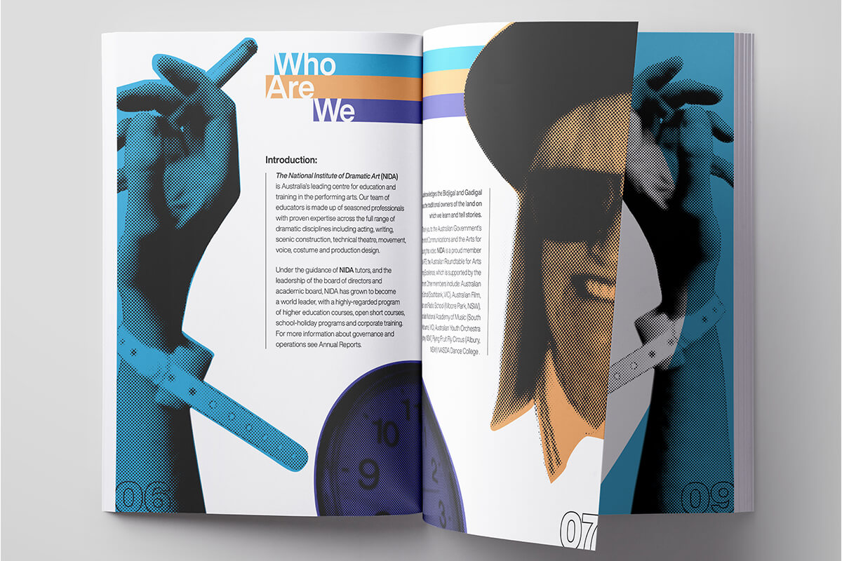
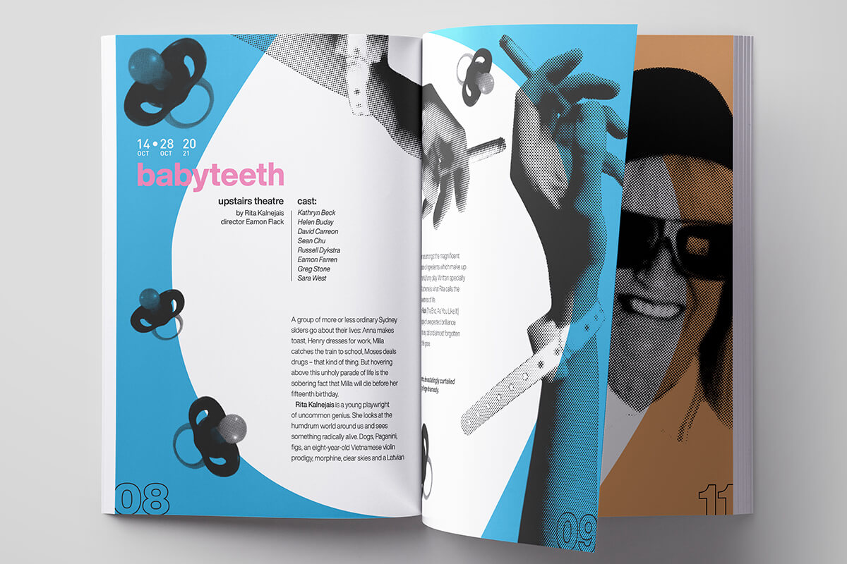
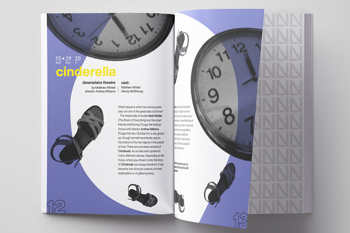
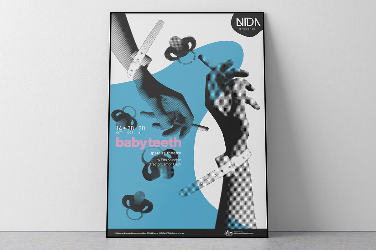
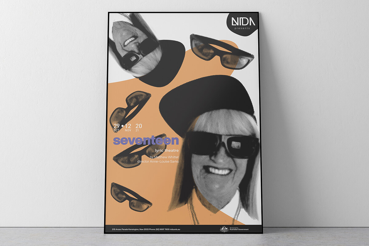
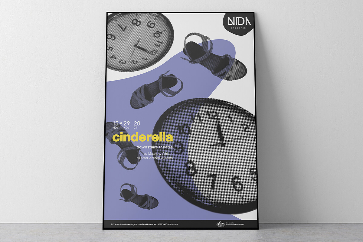
The objective
Design a dynamic logo and branding identity for the National Institute of Dramatic Arts. Design three posters to promote three different plays as well as a program guide.
The solution
The posters use photography and design emulating screen printing techniques, paired with bold and simple typography for a contemporary feel. The minimal colour and design elements highlight each plays individual themes and ideas. The branding design utilises dynamic angles, positive and negative space, typography and black and white to reflect the dynamic creativity and history of NIDA and its place within the entertainment industry. The logo is a distinct branding mark and can be used on posters and other collateral.
Swift Airways
UX-UI App design
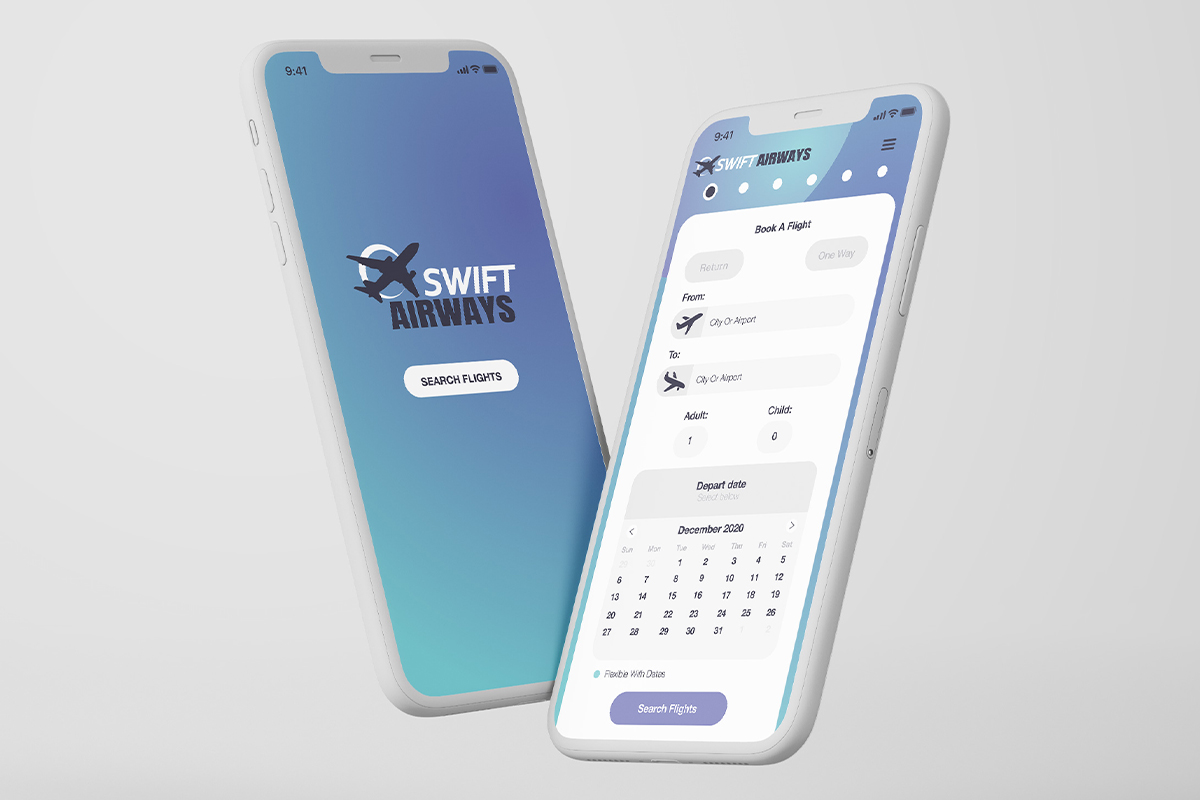
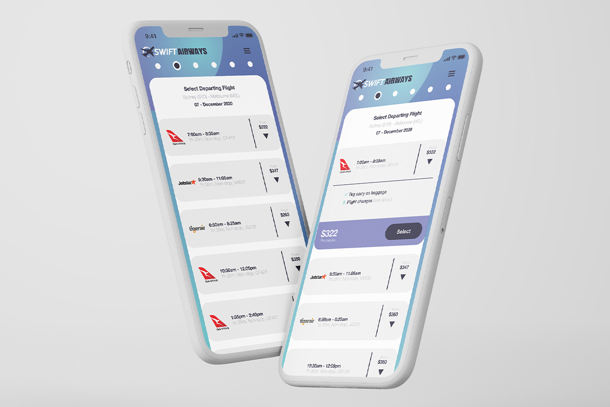
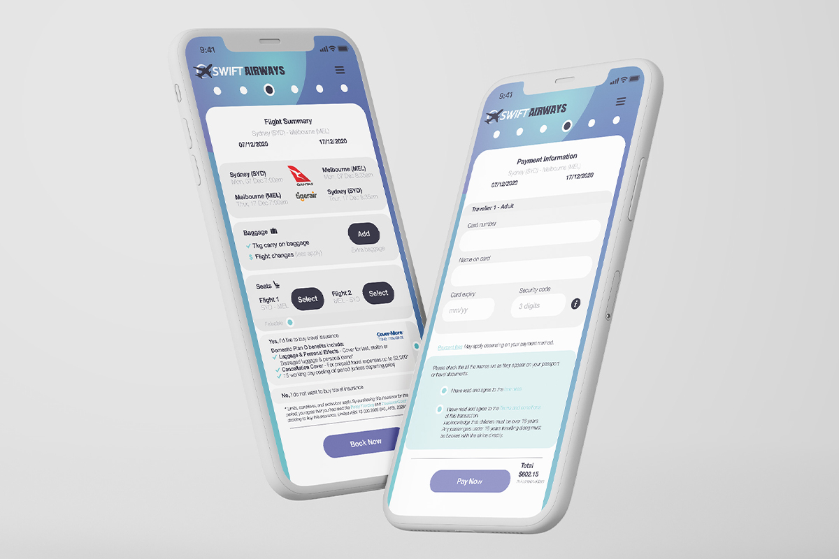
The objective
Design an online booking and ticketing system for a domestic airline.
The solution
Designing a sophisticated booking system for a mobile device/app. A simple, easy to use app for the non-tech savvy consumer. The app has one input point rather than multiple pages. The end result is a simple, clear and easy to navigate user experience.
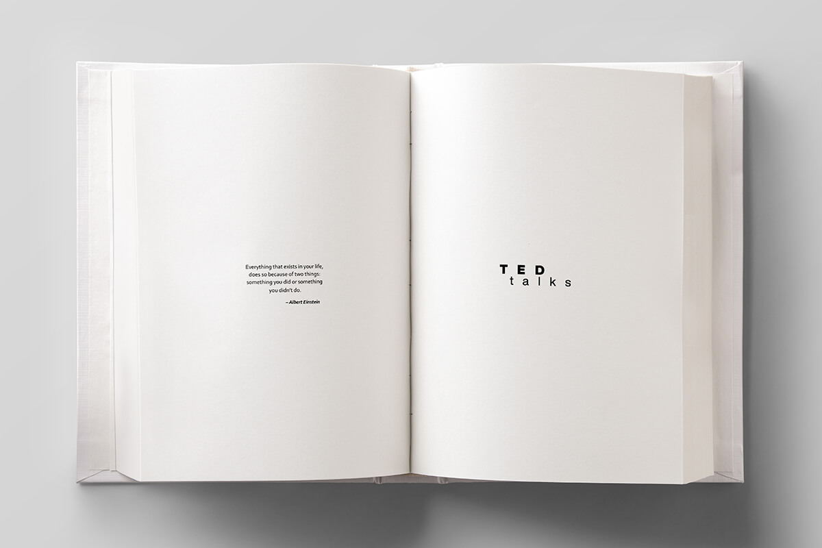
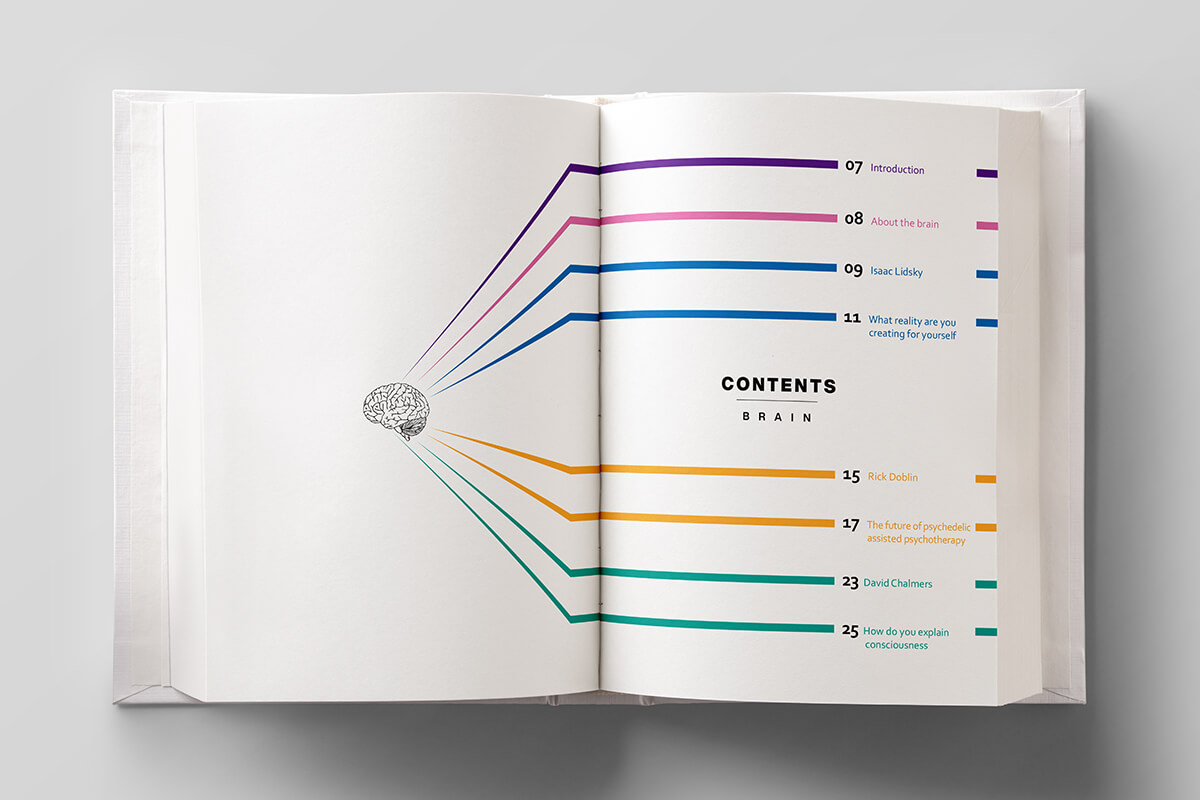
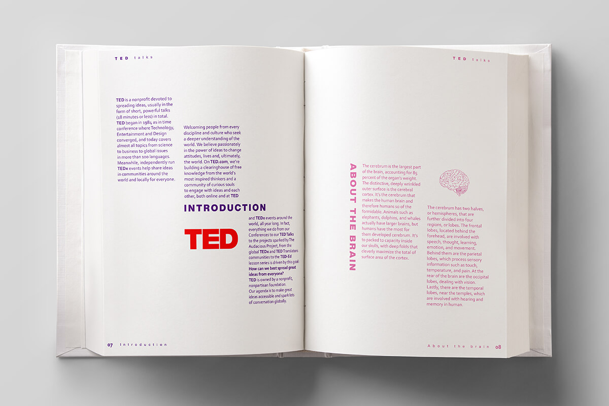
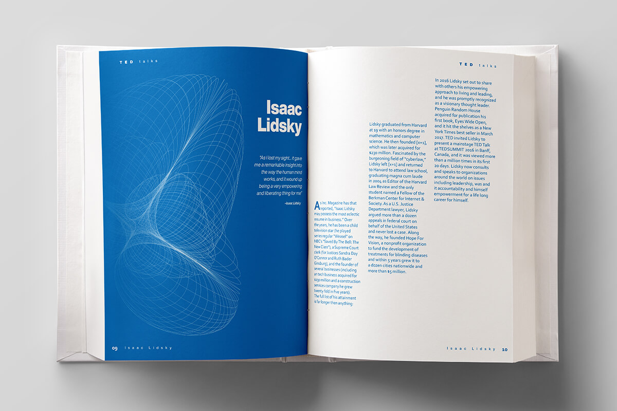
TED Talks
Publication
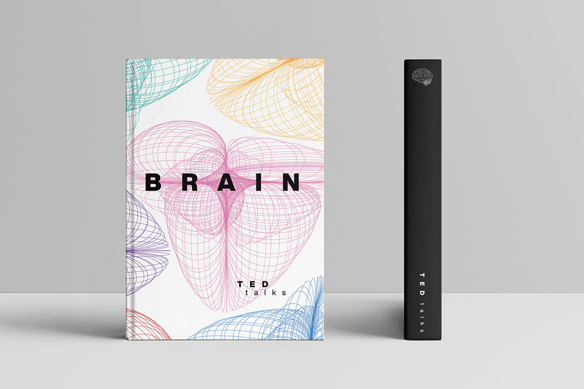
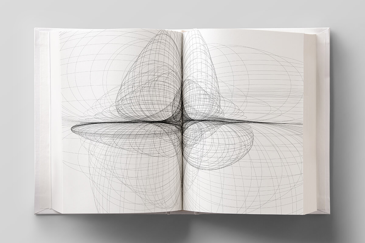
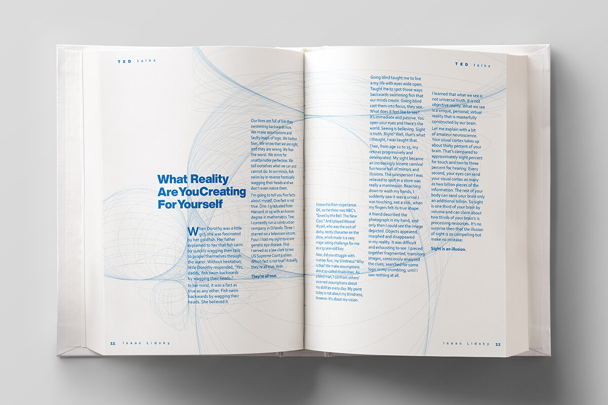
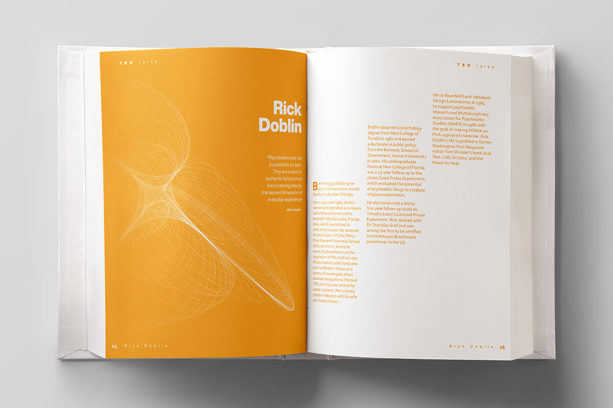
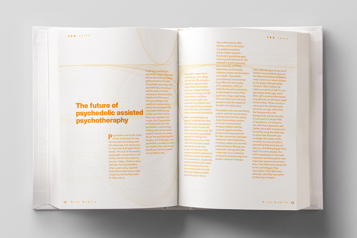
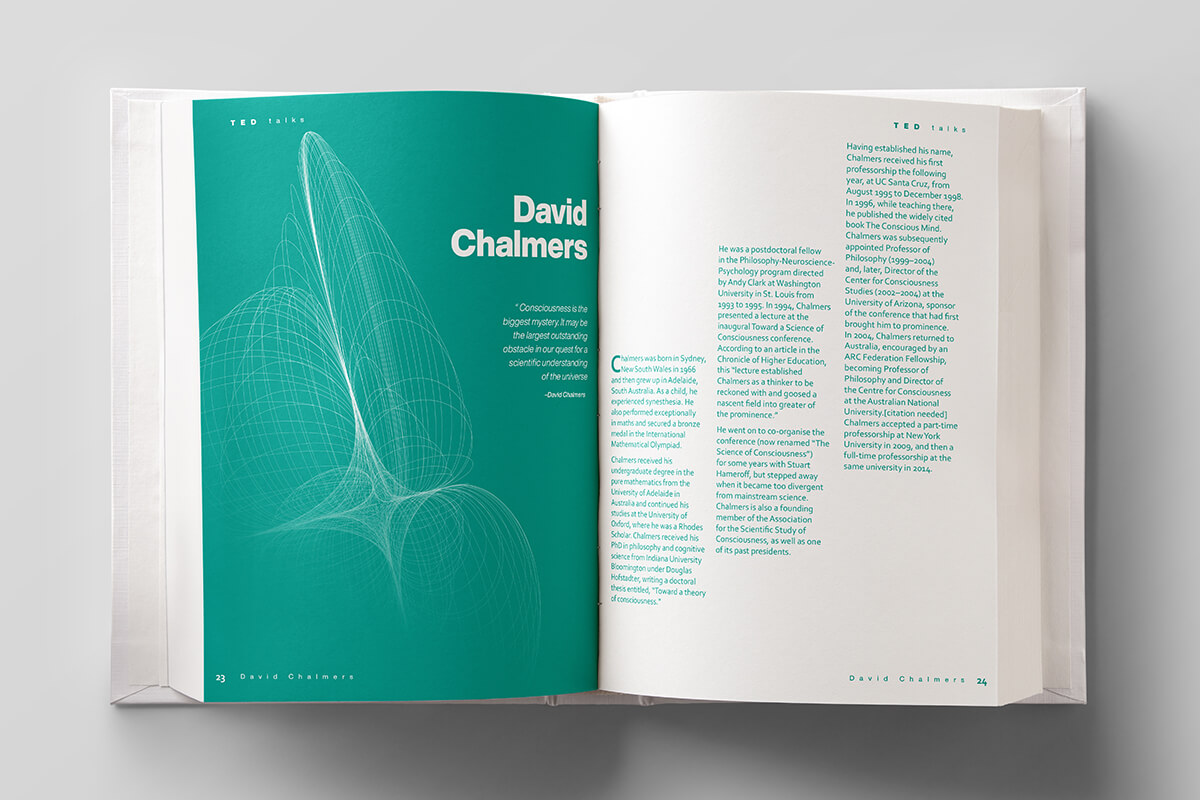
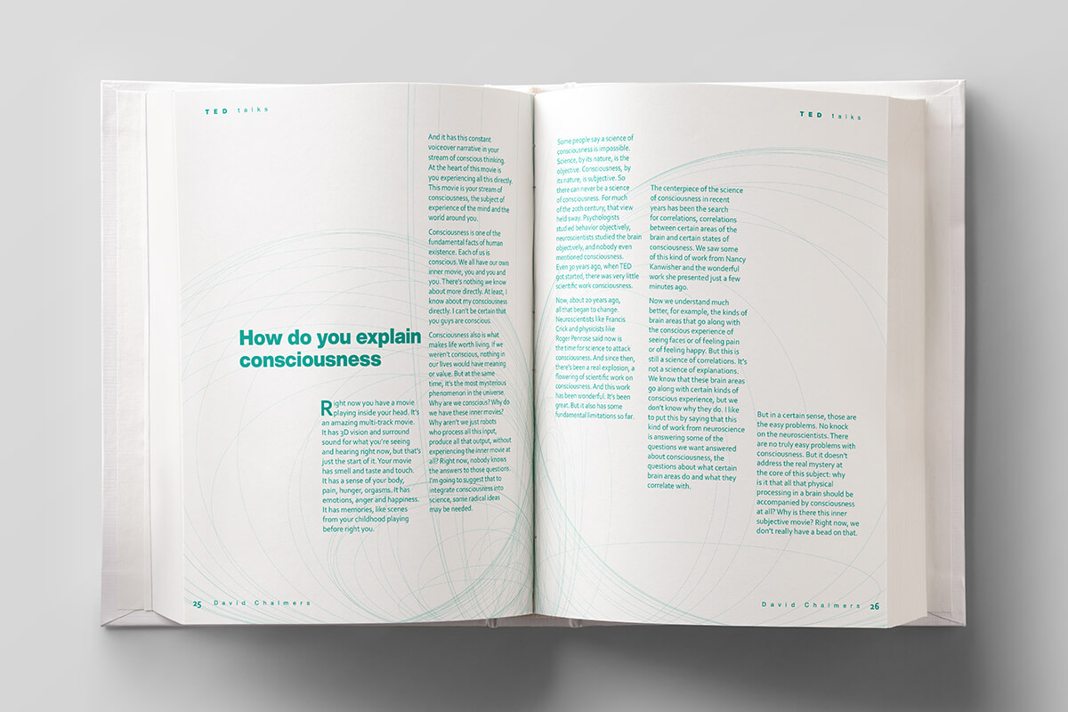

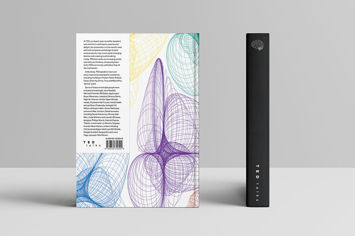
The objective
Book design for a collection of TED talks on the subject of the brain.
The solution
Each talk utilises a bright colour based on different states of emotion, each talk addresses the relationship between thought and feeling, in one way or another. The grid structure is based on thought-forms and brain waves. The illustrations are an abstract representation of the physical structure of the brain as well as brain wave patterns and medical imaging.
Keep browsing
More Stars like this


