The Dark Mofo
Print Design, Motion Graphics
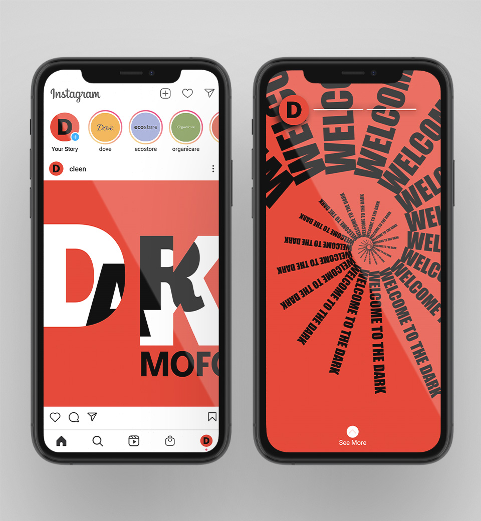
The Dark Mofo augmented reality campaign advertises the dark art centred festival...

As a designer, I help people to communicate stories and connect with their audience, inspiring action and change. I create work that is considered, accessible, clever in its simplicity, and communicates what is important.


The Dark Mofo augmented reality campaign advertises the dark art centred festival...
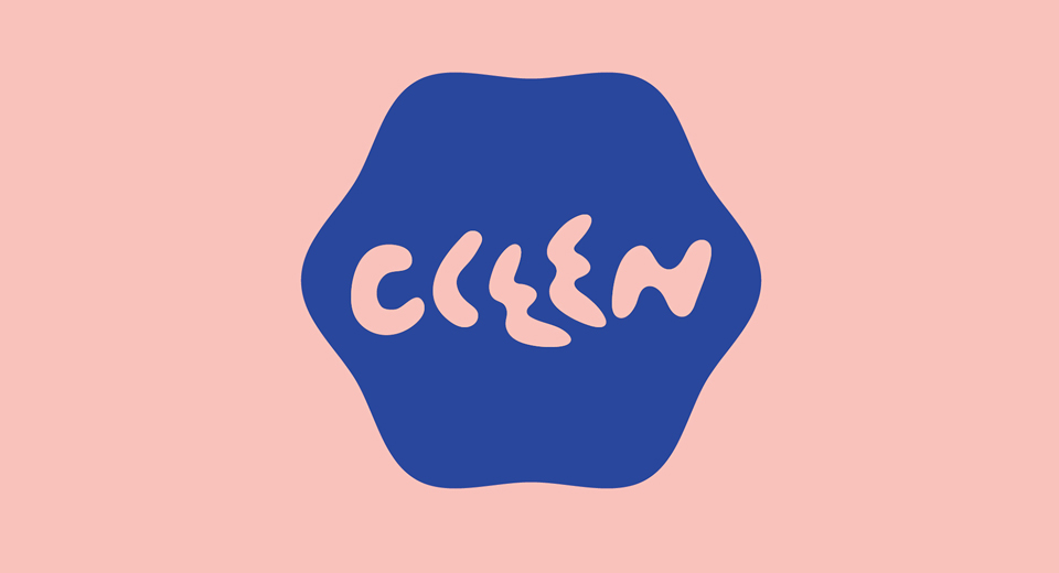
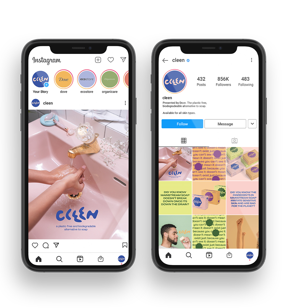
Dove's biodegradable, plastic free alternative to soap. The sub-brand identity and awareness...
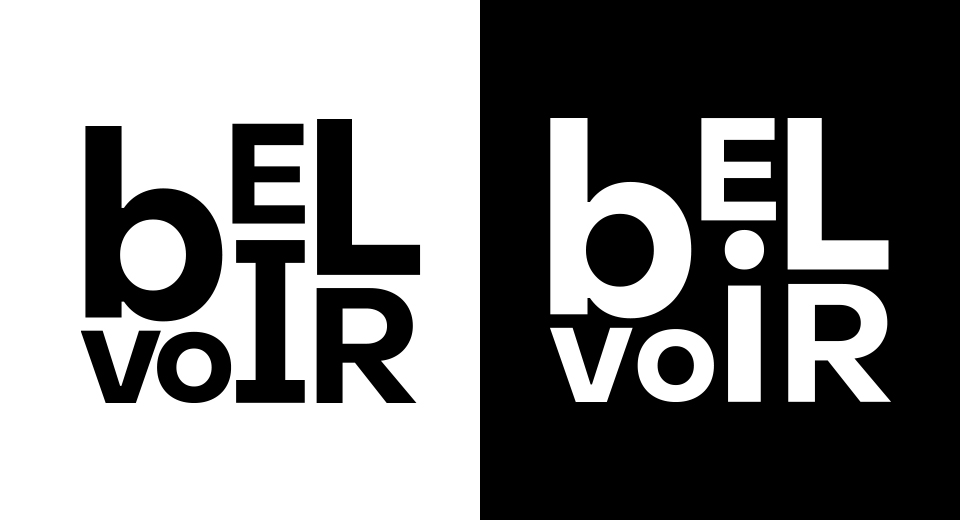
The Belvoir Theatre was in need of a seasonal brand refresh for their 2023 season...
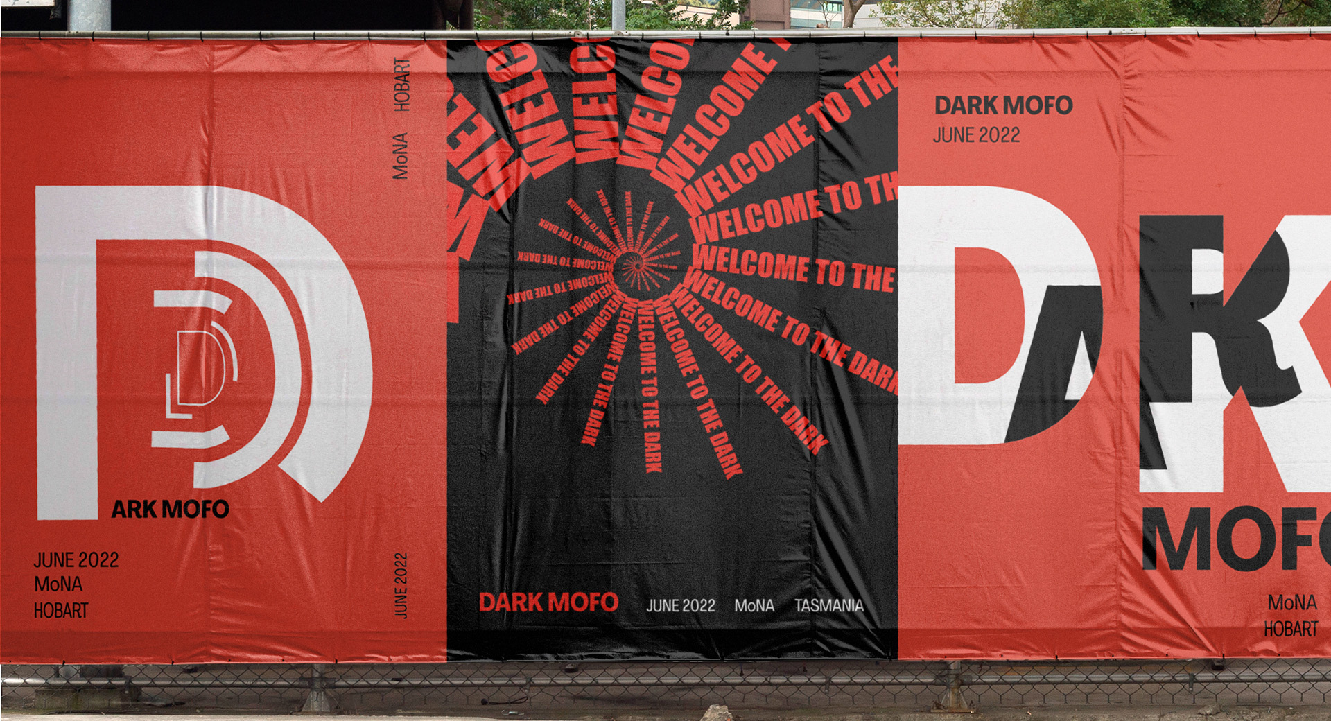
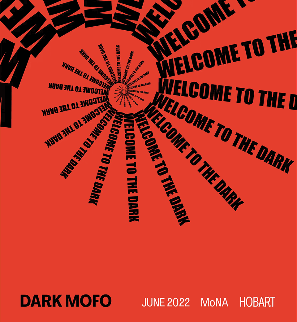
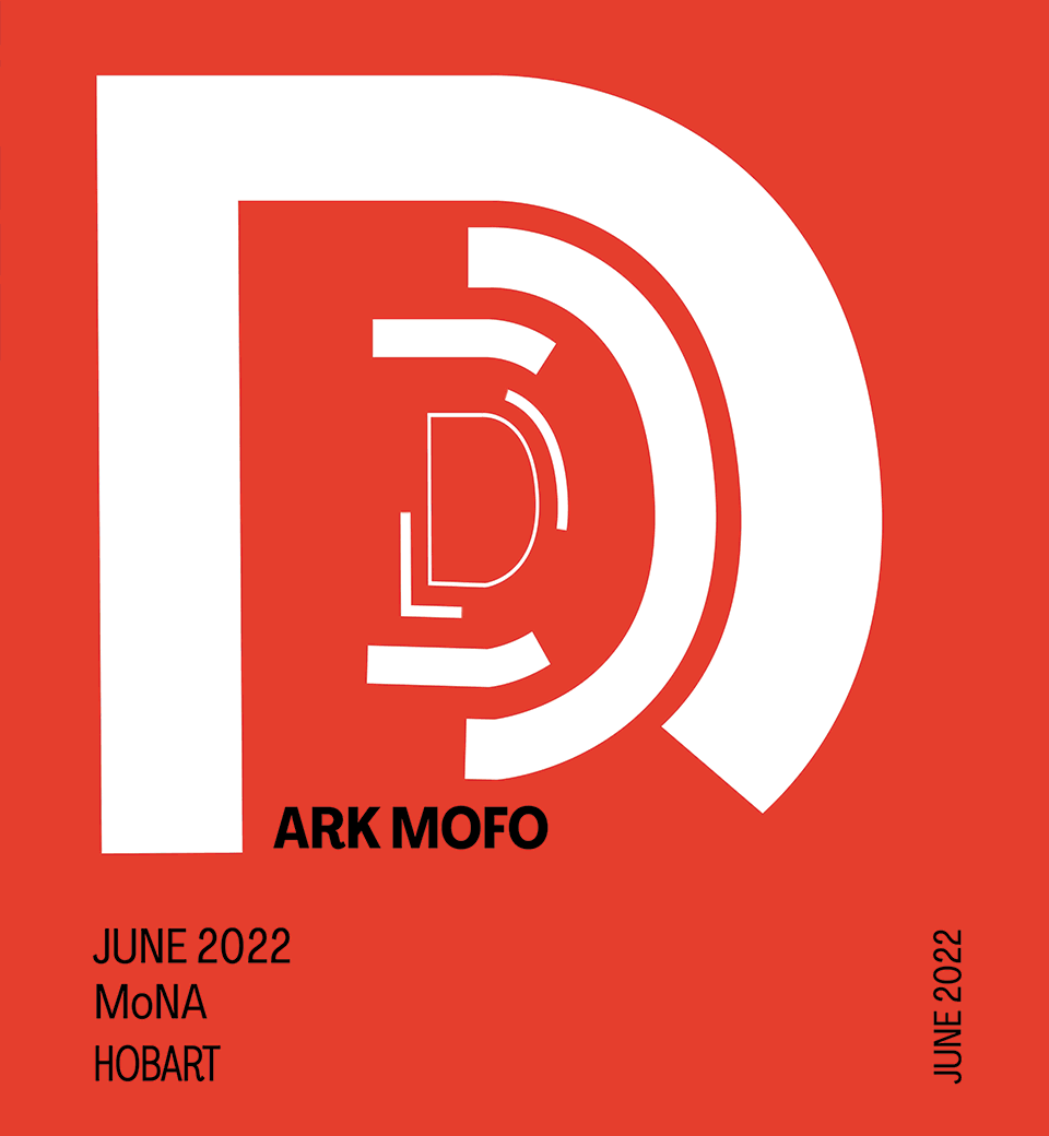
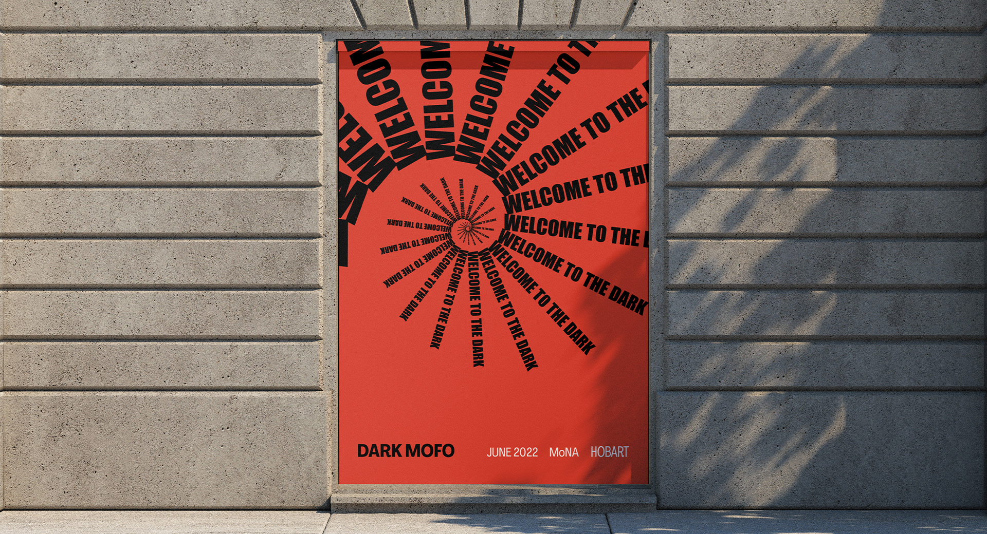
The Dark Mofo augmented reality campaign advertises the dark art centred festival at the Mona in Hobart, Tasmania. Inspired by mid-century, Bauer House design, stark graphic typography and sharp motion were adapted to echo the confronting essence of Dark Mofo in a haunting way. By foregrounding the title and tagline of the festival with jarring colour change, the campaign teases the viewer of what is to be expected in attendance; things are not as they appear in the realm of the dark.
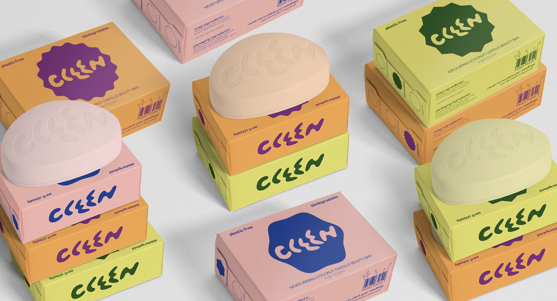
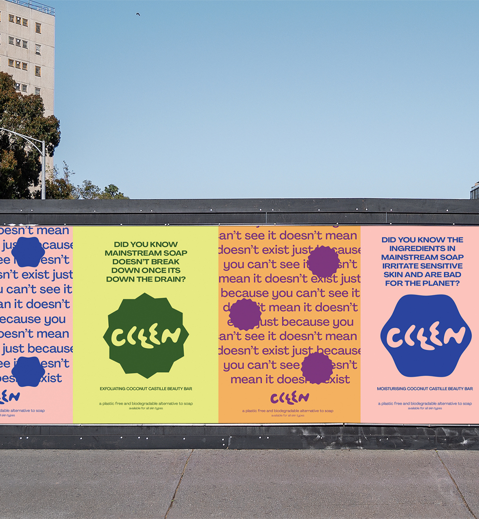
Dove's biodegradable, plastic free alternative to soap. The sub-brand identity and awareness campaign educates consumers on the impact of common bar soap, aiming to shift purchases to ethically and sustainably produced items. To remain appealing to Dove's current consumer the identity maintains spaciousness and modern simplicity, simultaneously engaging a new customer with an overall brand refresh. The result is a playful identity system that clearly communicates, whilst warmly encouraging a shift in behaviour and consciousness rather than aggressively forcing it.
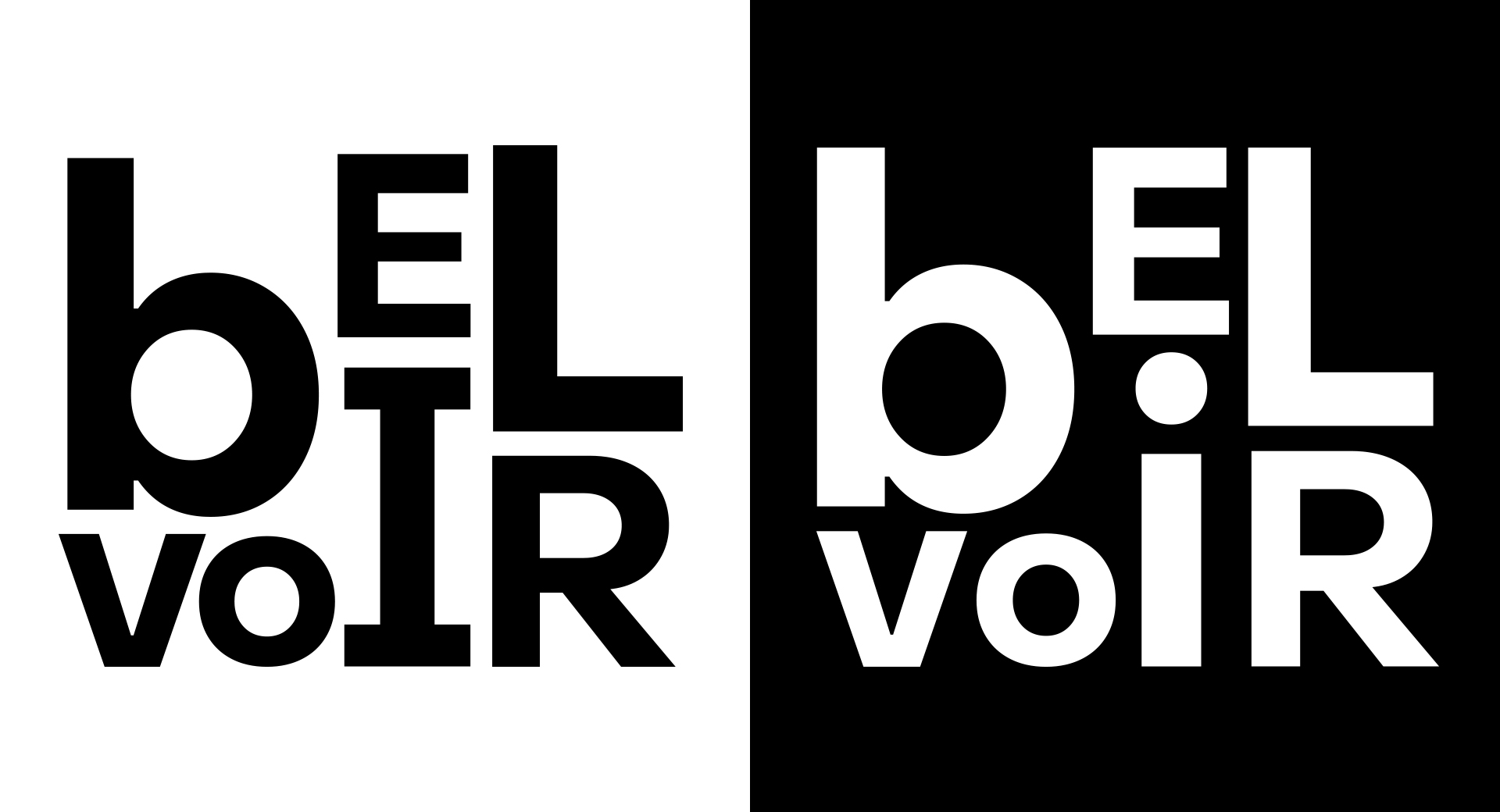
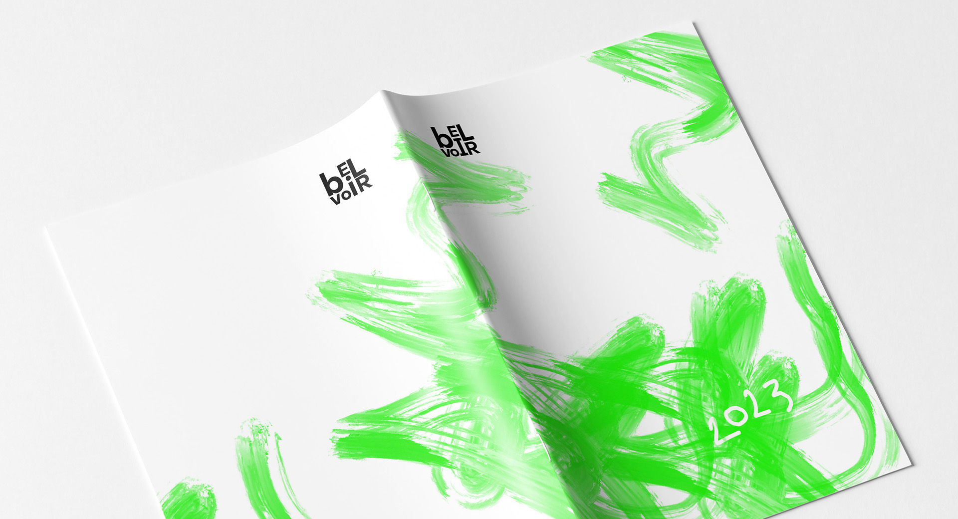
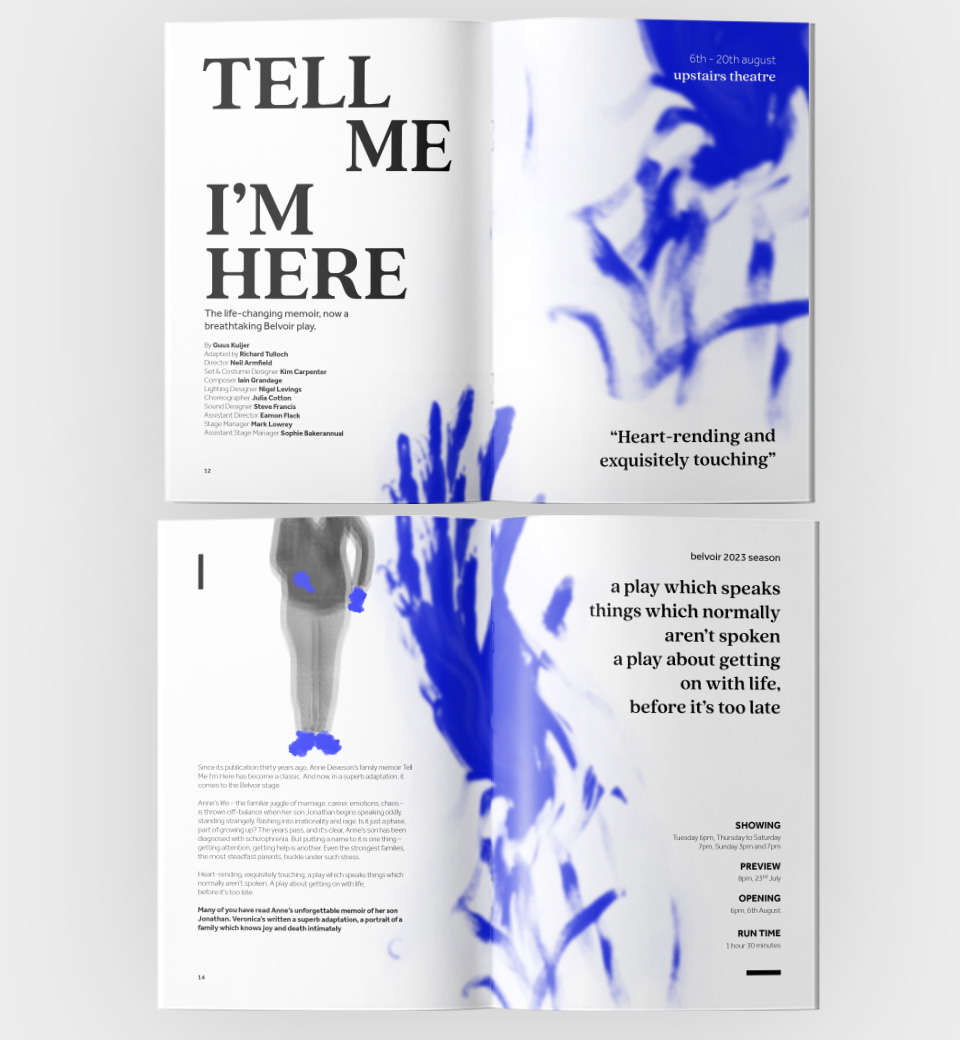
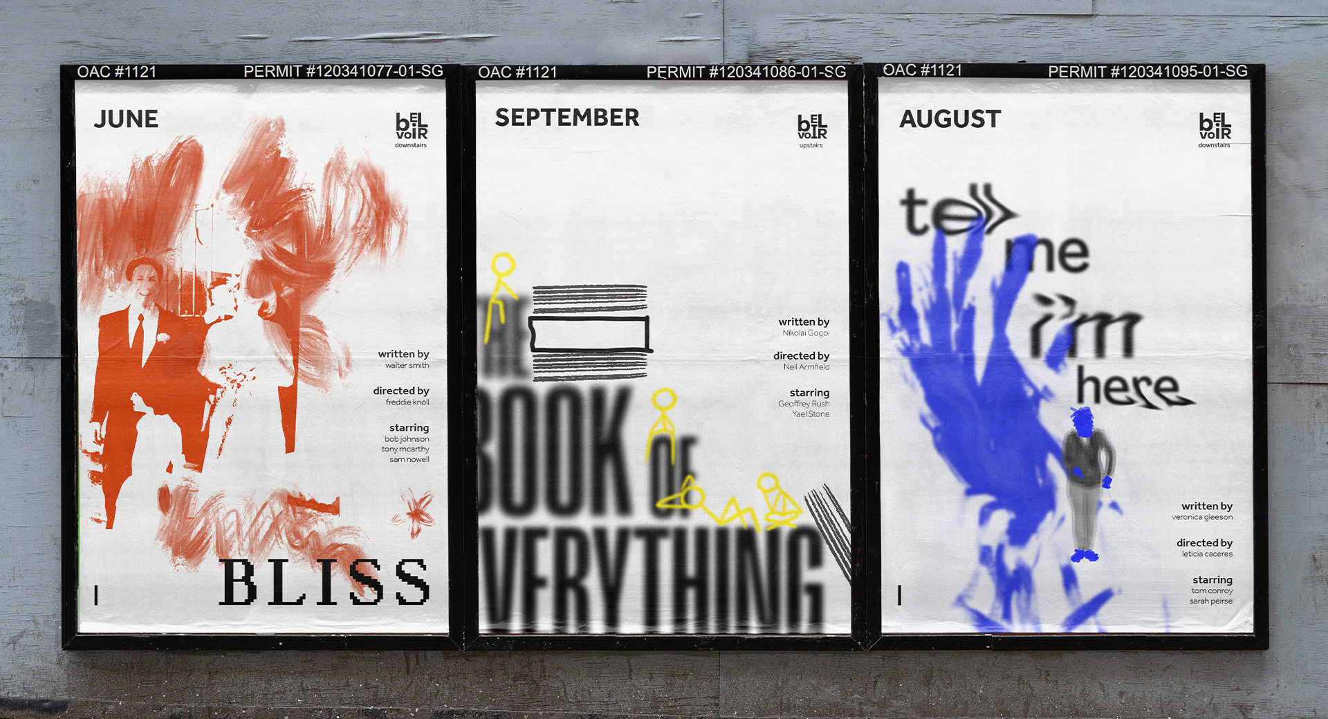
The Belvoir Theatre was in need of a seasonal brand refresh for their 2023 season. They endeavour to embody their values of loyalty, inclusivity, and challenging the status quo in all aspects of their business. They are loyal to their people and what Belvoir Street Theatre set out to do nearly 50 years ago; create a space where all kinds of stories can be told and audiences can confront difficult and often avoided issues in society.
As seen with the dynamic logo, a flexible visual identity was employed to represent the differing arms of the organisation (upstairs and downstairs). Intended to be recognised as one in the same, with subtle changes in letter forms indicating a change of focus within the company. The theatrical and unconventional nature of Belvoir is echoed throughout the print design, using hand painted, organic, and harsh strokes. An expressive identity results for a place where uncomfortable topics are braced head on.