Emerge
Magazine Design
Emerge is an educational magazine intended for green thumb young adults...

I hope to inspire curiosity in others through graphic design so that the world can become a more creative place. The wonders of typographical arrangement and packaging design are two driving forces behind my design practice, these fields excite me as I continually discover interesting design solutions. I am keen to learn new practices to elevate my skills and working within a group has allowed great personal growth. Graphic design is a powerful medium for connecting people and I see myself as the platform to help others achieve their creative vision.


Emerge is an educational magazine intended for green thumb young adults...

The Hoyt's packaging and campaign design addresses environmental sustainability...

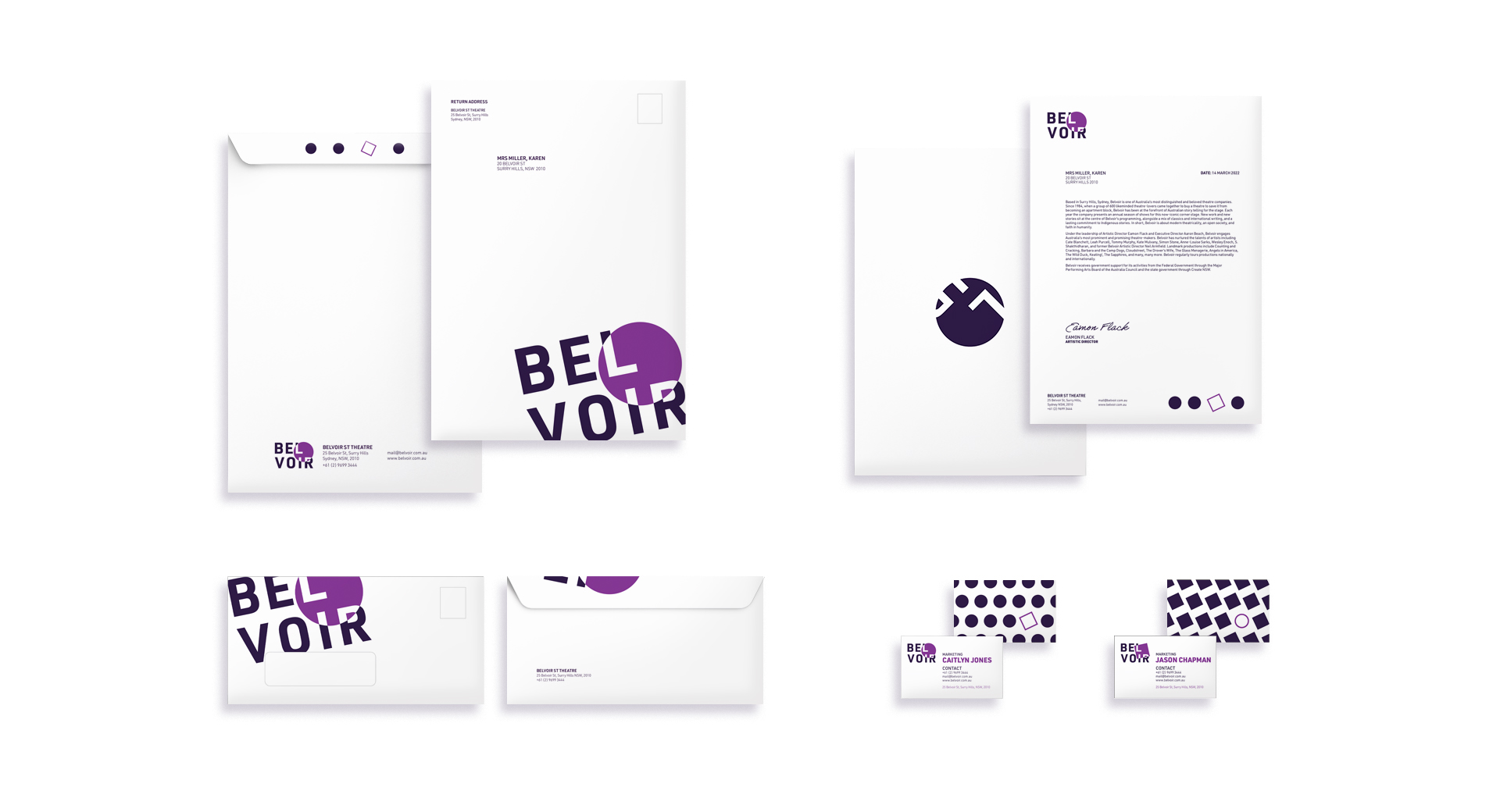
The branding suite created for Belvoir Theatre reflects upon the dynamic interplay...


Emerge is an educational magazine intended for green thumb young adults. Defined by a clean modern style, Emerge aims to educate contemporary audiences about the benefits of gardening and sustainable practices to reduce their environmental impact. The masthead title 'Emerge' is intended to foreshadow the growth of the individual as well as mirror the surrounding flora. A customised font has been developed with organic lines and varying stroke widths to match the natural forms of plants, with many of the letters (for example the letter 'r') resembling sprouts 'emerging' from the ground. Coloured blocks have been applied as motifs throughout the page layouts to attract audience attention and unify content. Incorporation of unusual font pairings provides a distinct hierarchy to guide readers through content as well as formulate flexible visual styles to be applied that are consistent with the brands unique character.


The Hoyt's packaging and campaign design addresses environmental sustainability within the mainstream consumer food industry through a reduced resource approach. This project is sustainable in both design and execution, the application of Eco fonts, outlined patterns and a reduced colour scheme limits the resources required to execute the final product. Use of a bandlike strip tightly holds the herbs in place allowing for easy transportation and the clear durable sleeve protects the herbs from damage, maintaining a high quality standard. The package design also demonstrates innovation in the application of renewable resources including algae-based inks, cellulose sleeve packaging and other recycled materials. The sustainable campaign promotes the innovative packaging and acts as an informative platform for Hoyt's to educate the community about plastic alternatives. This strategy would also allow the business to capture a new market in environmentally conscious consumers looking to protect nature but also capture the delicious taste of fresh herbs in their cooking.


The branding suite created for Belvoir Theatre reflects upon the dynamic interplay of spotlight and darkness utilised within theatre performances to communicate social messages. Belvoir's modern storytelling is captured through a cleanly stacked sans serif typeface, aided by overlapping graphic shapes as a representation of stage light revelation. A dynamic logo system was established with these shapes to distinguish the two branches of Belvoir Theatre. A circle graphic was applied to signify recognised playwright performances shown in the upstairs theatre, whilst a square represents the edgy and fresh perspectives of emerging playwrights in the downstairs theatre. Application of purple colours within the branding provides a dramatic quality as well as mimicking the onstage environment. Shadows are illustrated by the dark purple, spotlight by the light purple and the core message of the play by the inverted text.