Belvoir St Theatre
Branding, Editorial
Belvoir is one of Australia's most celebrated and beloved theatre companies...

I'm a designer focused on creating vibrant, fresh brands and illustrations through creative appeal aligned with strategic design solutions.


Belvoir is one of Australia's most celebrated and beloved theatre companies...
Berries as a fruit, have almost everything to gain, between their flavour, colour and healthiness...
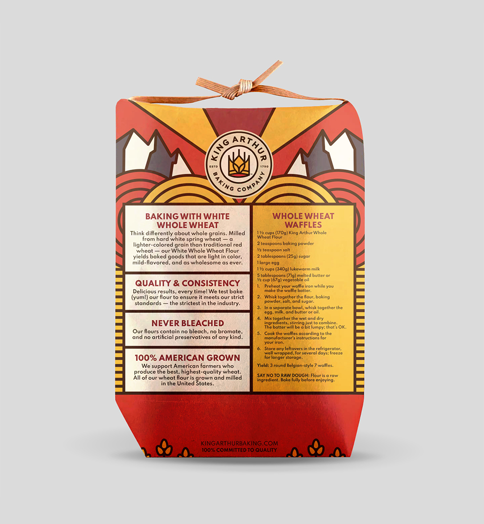
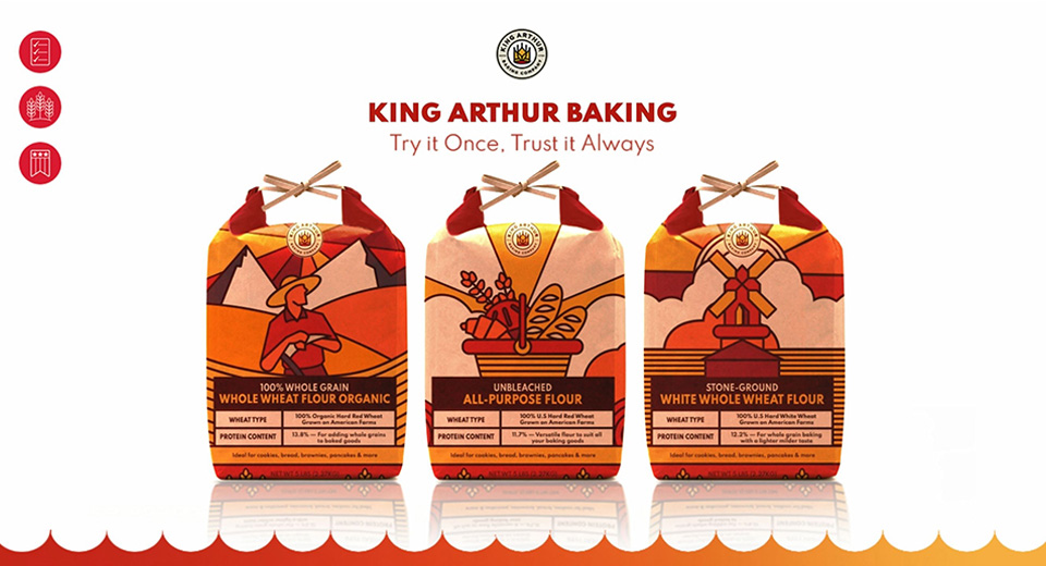
All flour is not created equal. The best baking starts all the way back in the wheat fields...
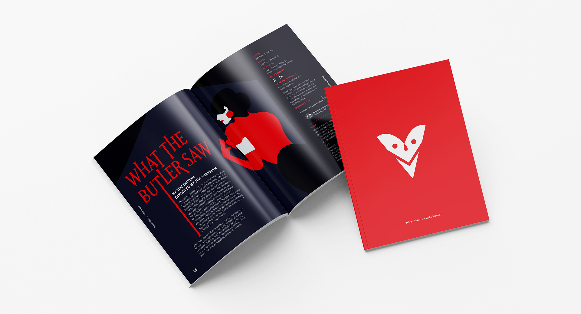
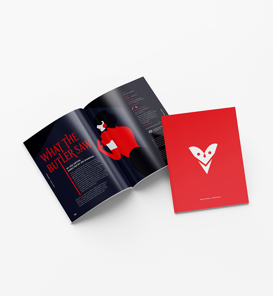
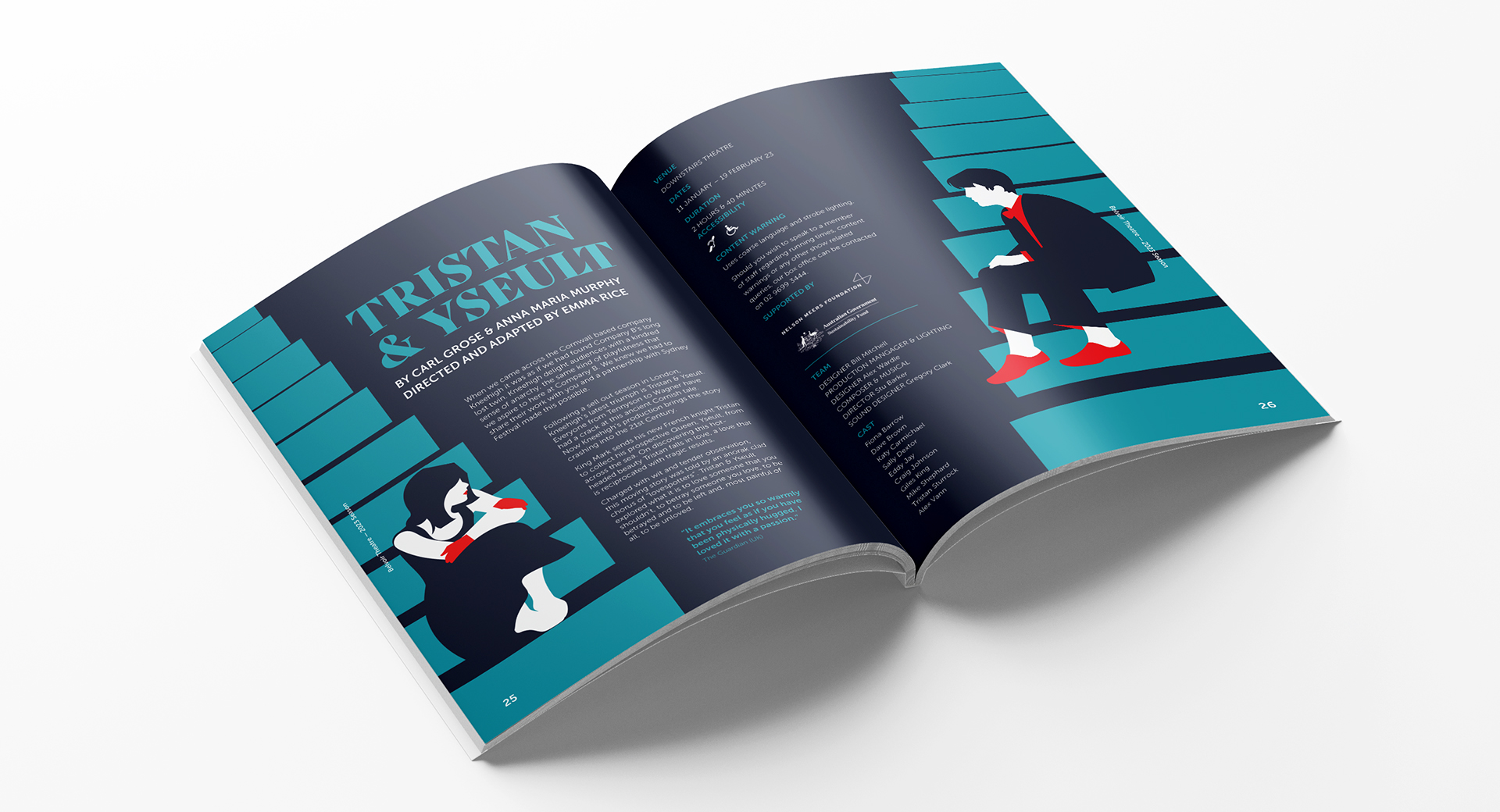
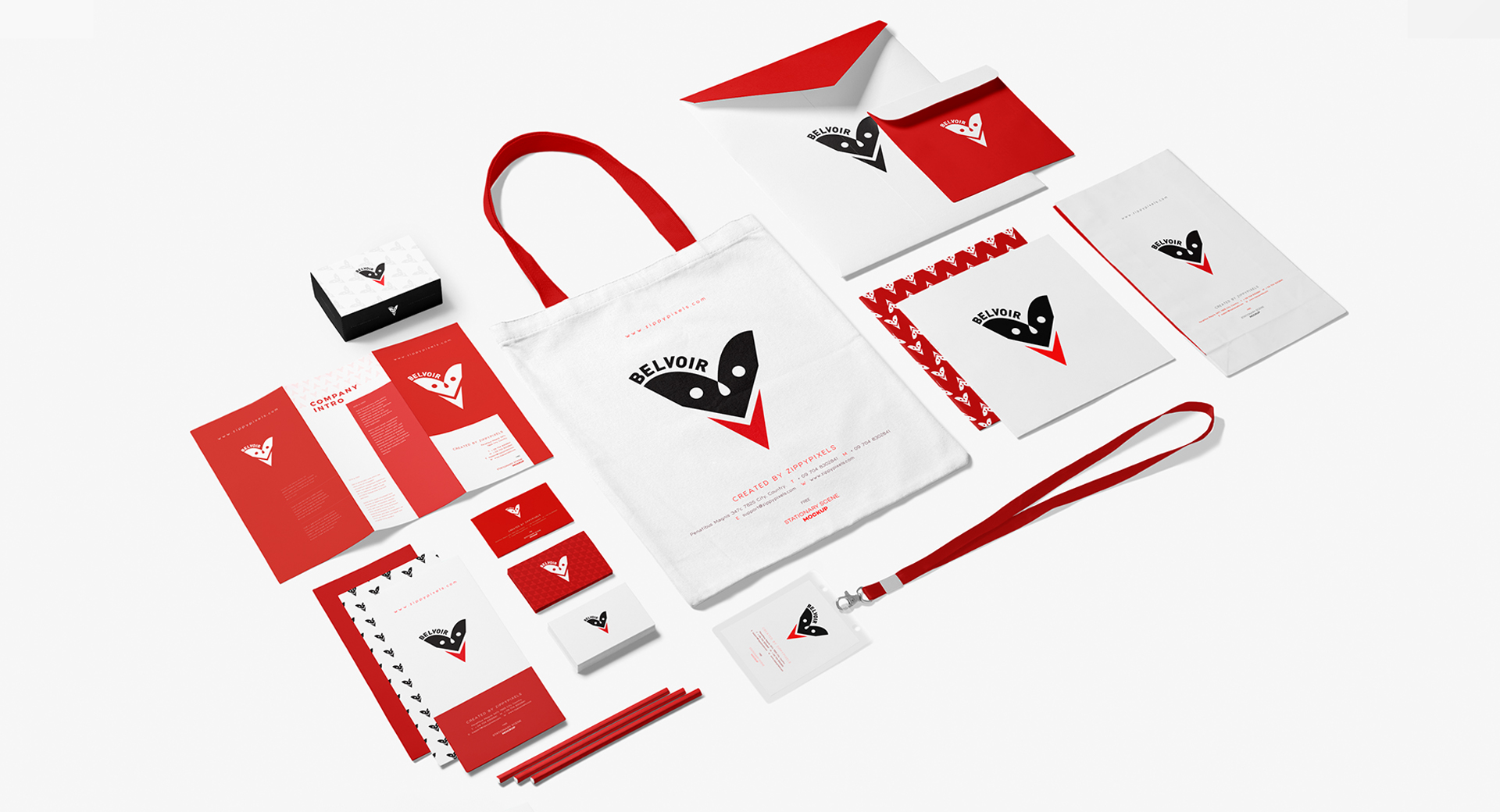
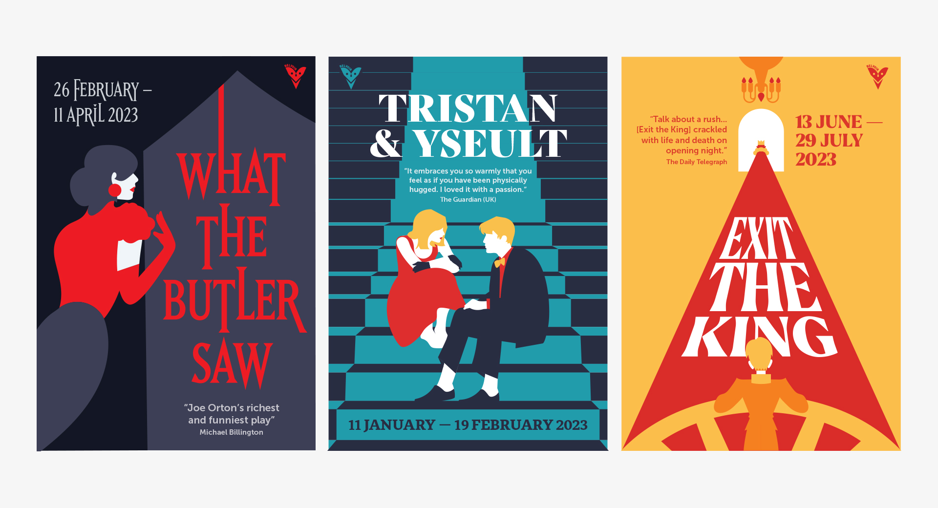
Belvoir is one of Australia's most celebrated and beloved theatre companies. Since 1984, when a group of 600 theatre-lovers came together to buy a theatre and save it from becoming an apartment block, Belvoir has been at the forefront of Australian storytelling for the stage. Each year the company presents an annual season of shows for this now-iconic corner stage.
To reflect its cutting-edge position in the market, a bold logomark along with a suite of materials was designed, acknowledging the breadth of the company’s work and theatrical invention. A limited colour palette and matching art style across collaterals helped create a cohesive brand and a sense of dramatism associated with the performing arts.

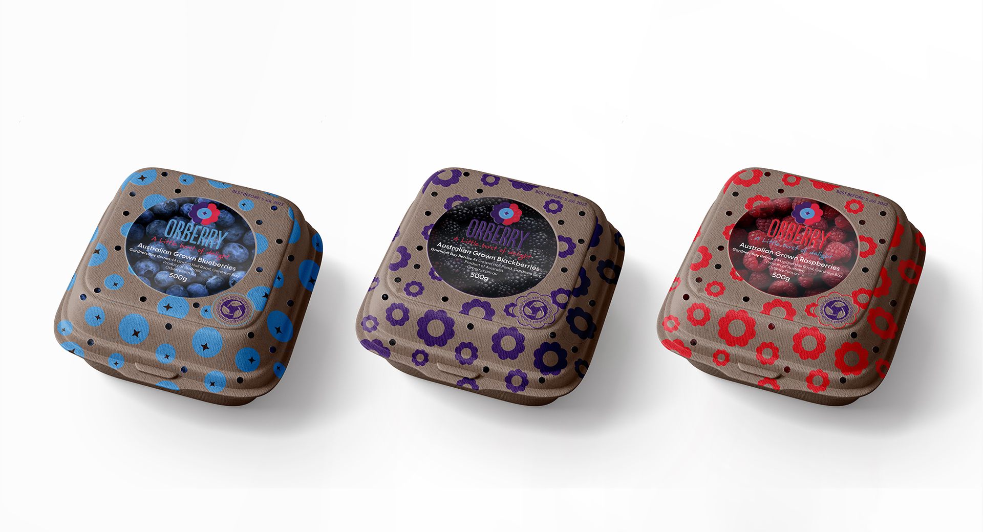
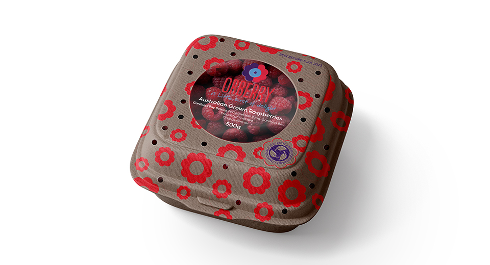
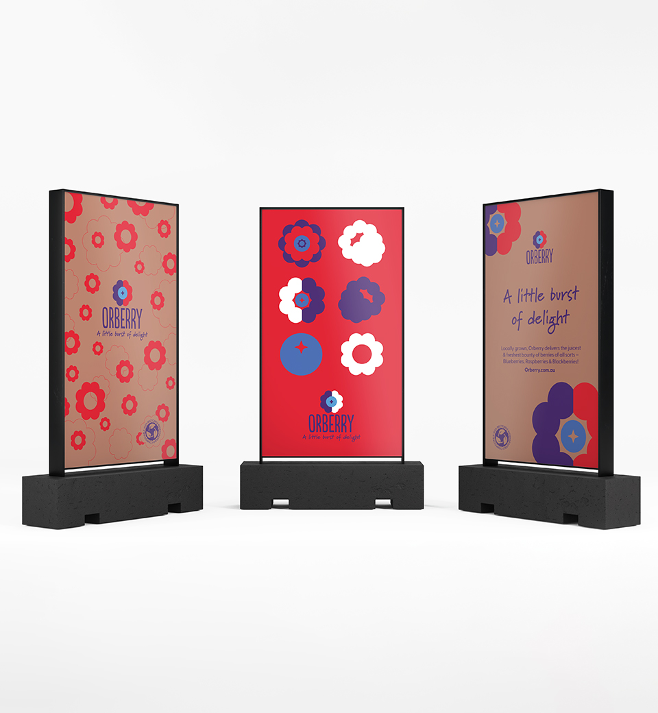
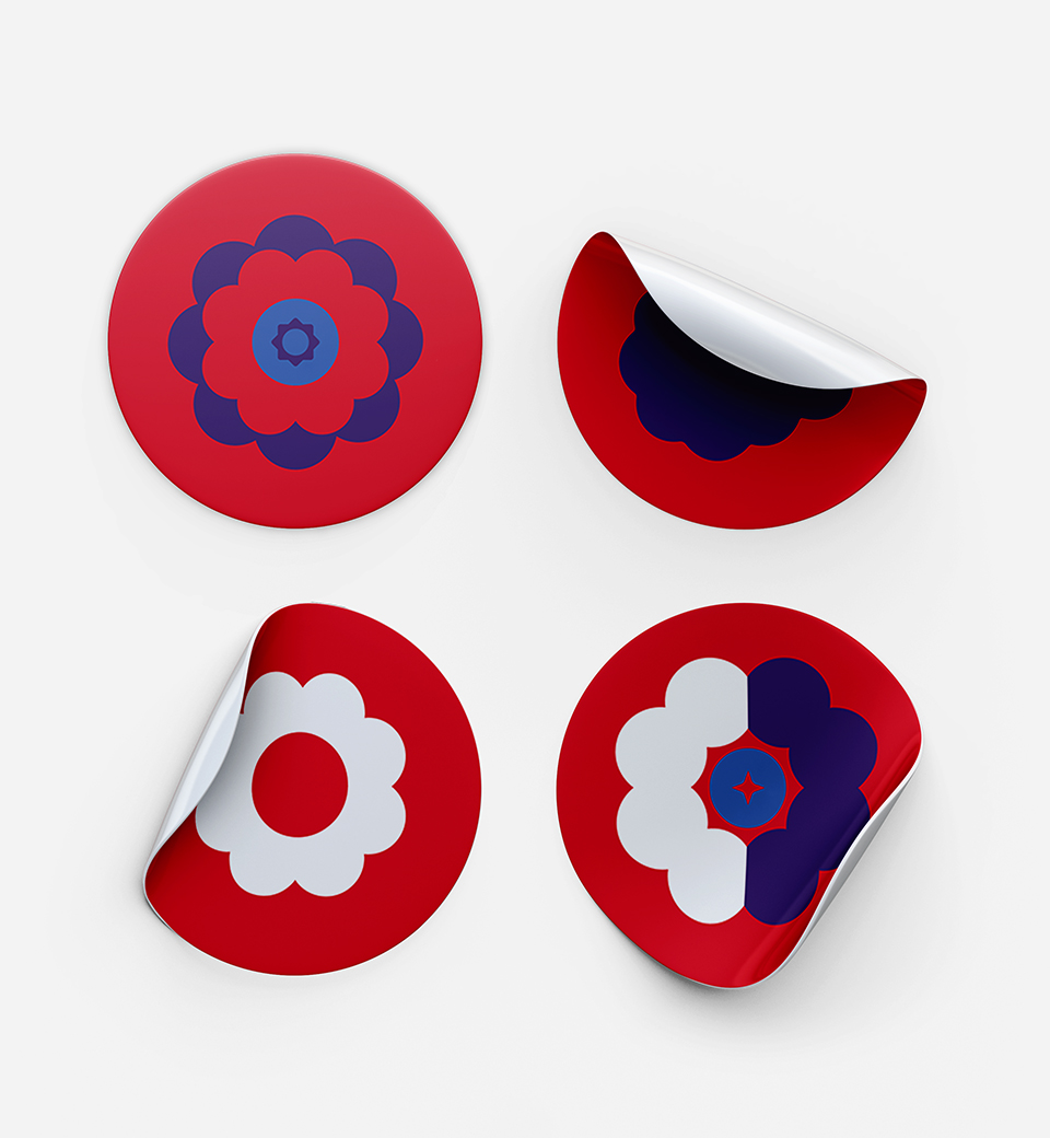
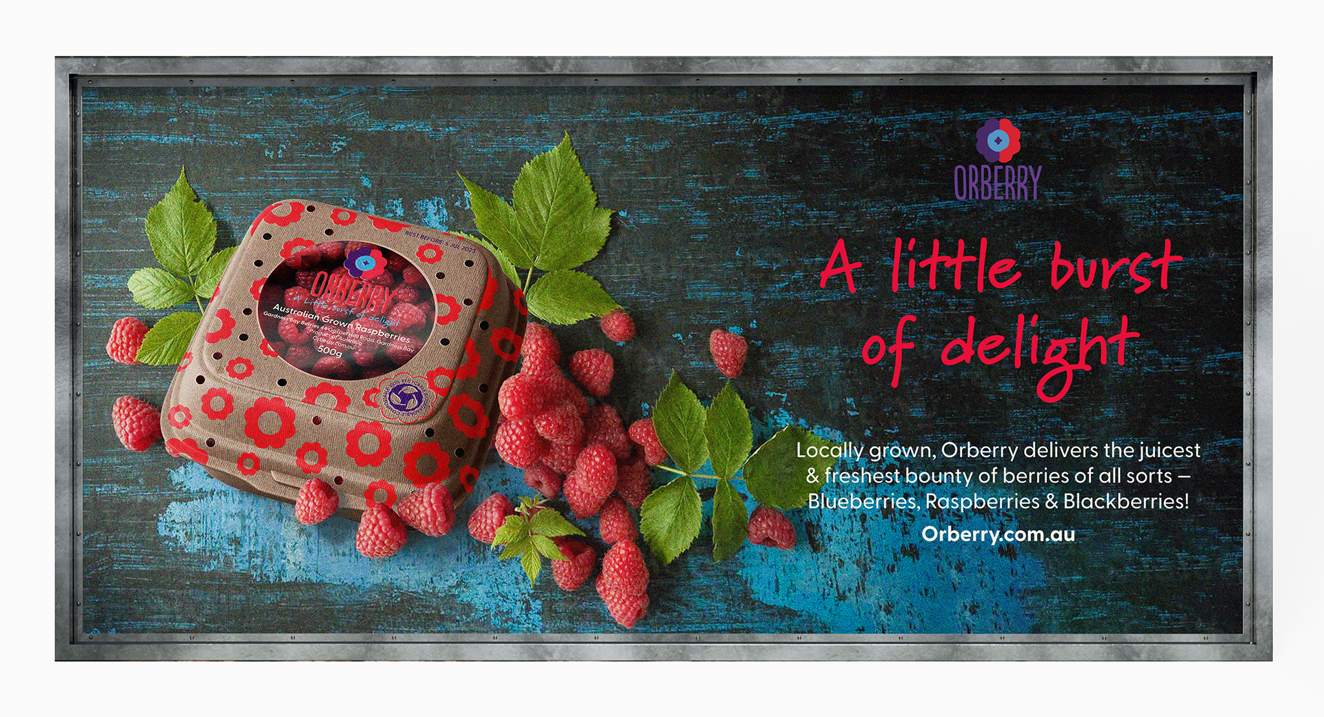
Berries as a fruit, have almost everything to gain, between their flavour, colour and healthiness. But one aspect that weighs heavily on it, is its need for plastic packaging. Fruit packaging is in the sights of the current environmentally conscious consumer.
Orberry is an Australian berry producer, dedicated to delivering a juicy, fresh bounty of locally grown blueberries, raspberries, and blackberries in eco-friendly packaging to fresh food seekers looking to leave the lightest eco-footprint behind.
The design of the packaging reflects the cheerfulness of families enjoying Orberry's 'little bursts of delight.' The clear compostable film window allows consumers to see what they're purchasing. To ensure consumers know they're buying more sustainable packaging, a large label clearly states its sustainability.
All flour is not created equal. The best baking starts all the way back in the wheat fields.
Illustrations of hard-working farmers at the wheat fields and flour mill remind us of King Arthur Baking’s close relationship with the community and the collective effort put into making this quality flour. The packaging's vibrant colours are heavily associated with the King Arthur Baking brand, allowing the product to stand apart from its competition and making it easier to spot for shoppers quickly scanning the shelves.
_KingArthur.jpg)