Stralis
UX Design, Branding
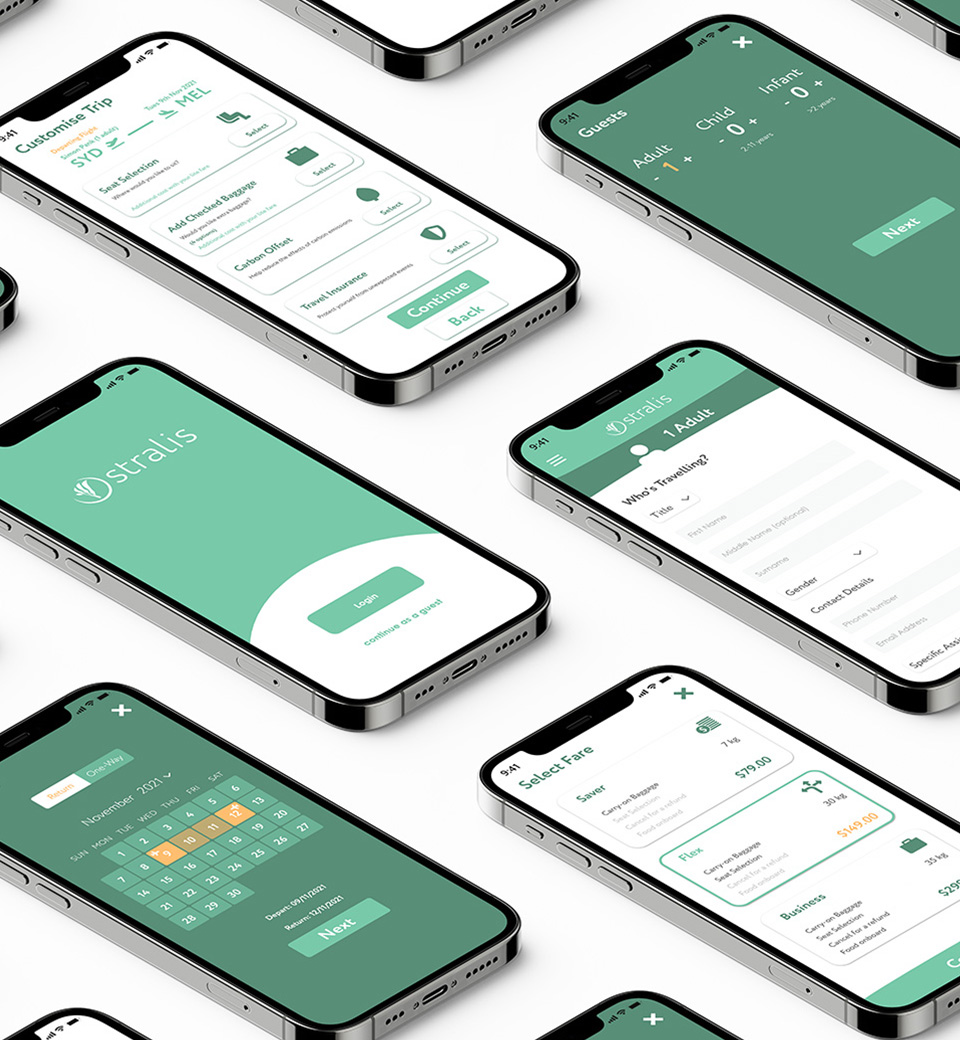
Stralis is an airline booking app that I have developed through Illustrator...

I am a creative thinker with a strong passion for UX design and motion graphics. Growing up you could find me drawing and animating. The love of these hobbies combined with my studies in psychology have led me to become a designer with an ability to empathise with others and think outside the box.


Stralis is an airline booking app that I have developed through Illustrator...
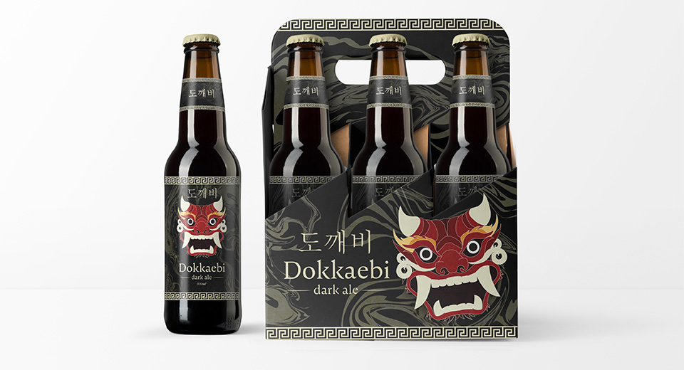
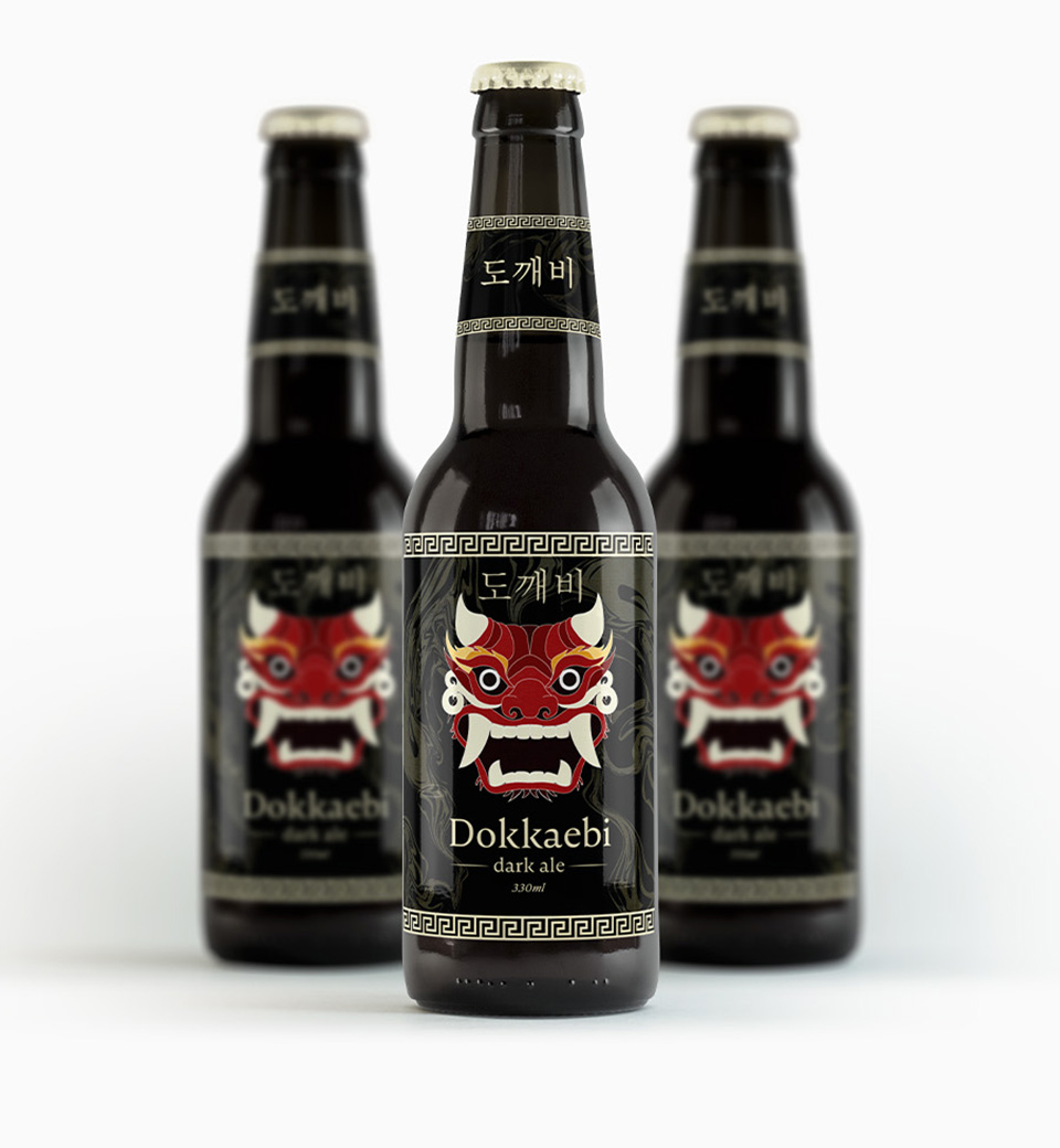
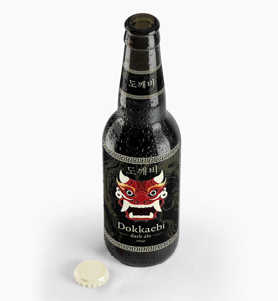
Dokkaebi is packaging project I designed through Illustrator and InDesign...
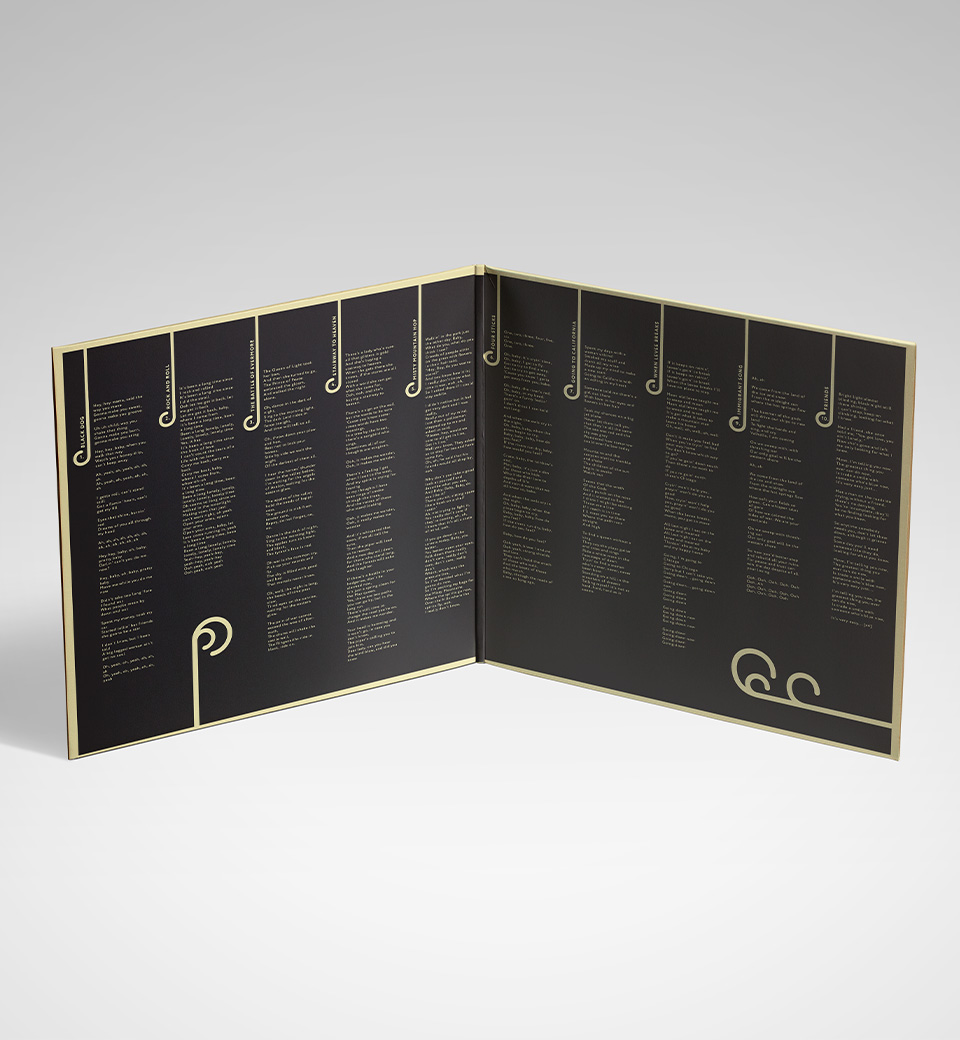
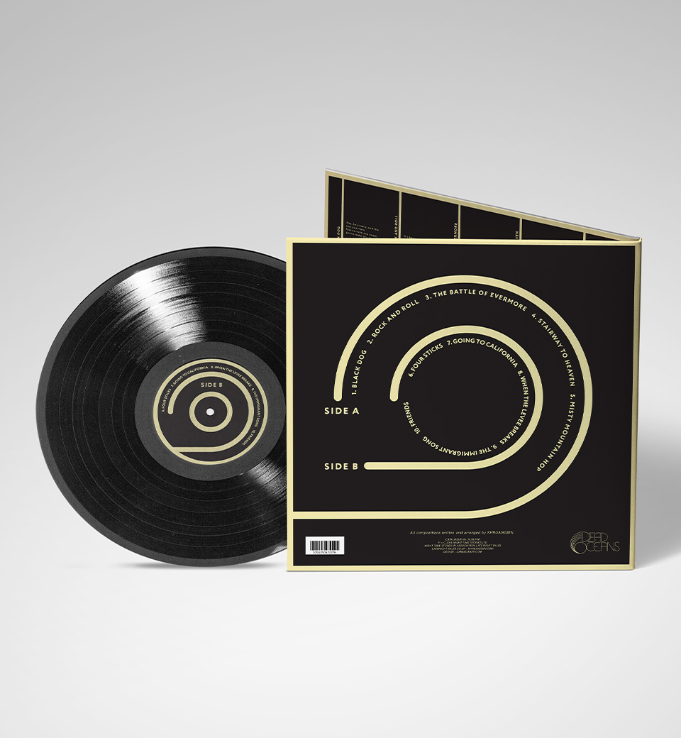
Khruangbin (artist) - Open Door (album), is a typographically focused cover art design...
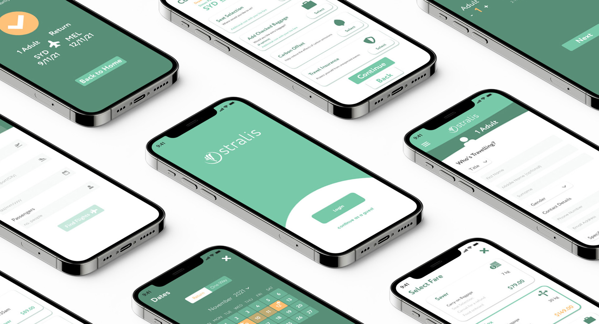
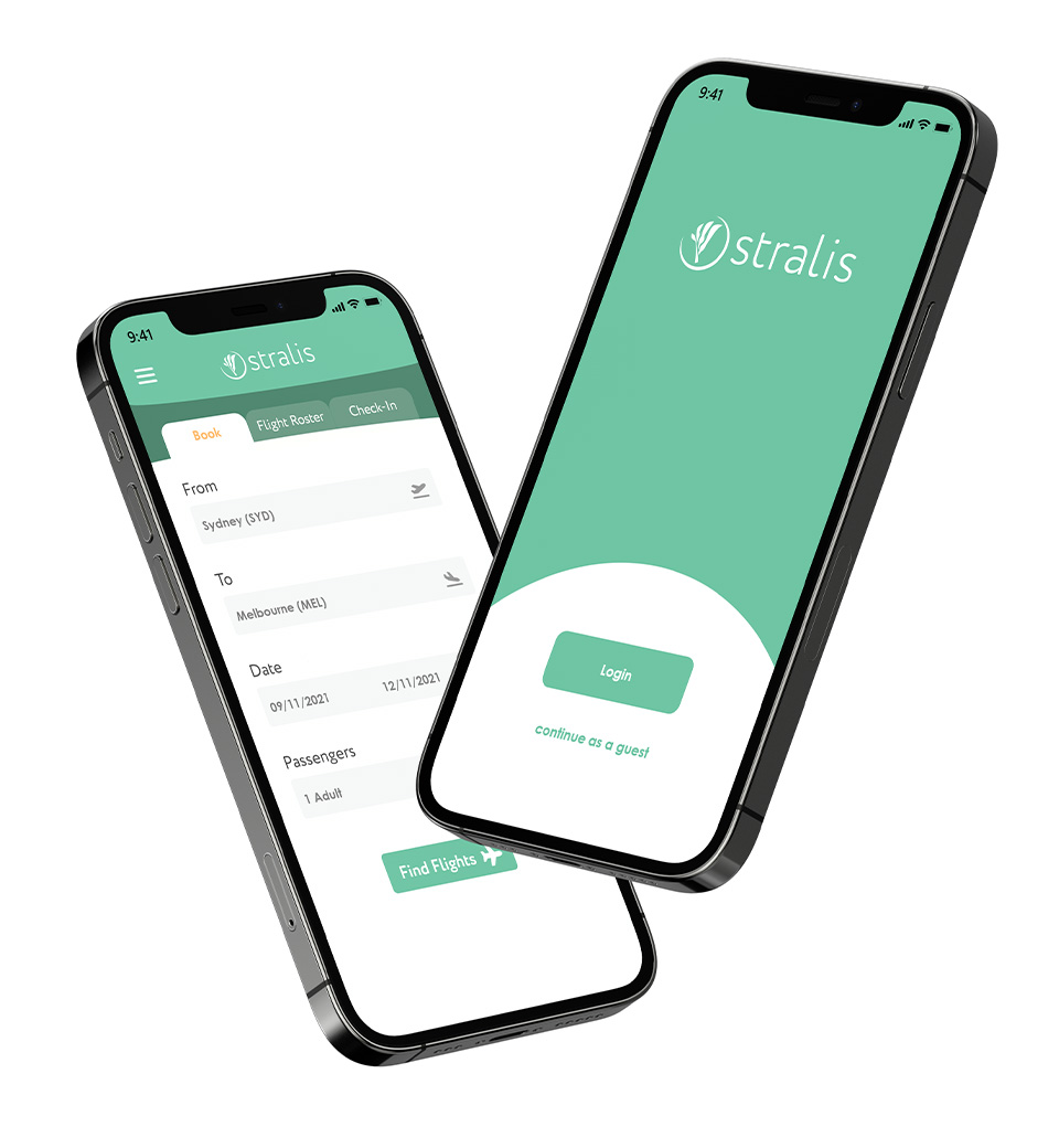
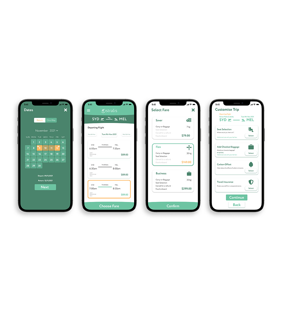
Stralis is an airline booking app that I have developed through Illustrator and UX Design. The process began with the branding, developing the visual style and target market for the airline company.
Once this had been established I had gotten into the UX Design of the booking app. This was heavily structured by seeing competitor apps, and finding the pros and cons of each app. From this assessment, I developed an app that takes the best and removes the worst from this analysis; creating a smooth user experience, clean visual design, and an overall great product.
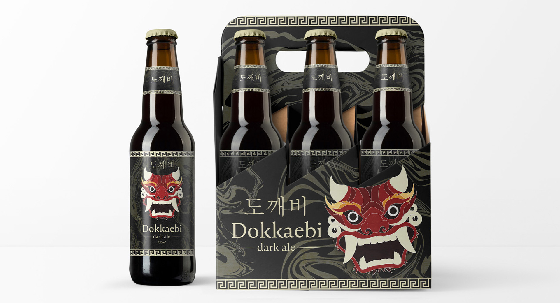
Dokkaebi is packaging project I designed through Illustrator and InDesign. I based the branding off the Korean mythological creature, 'Dokkaebi'. Dokkaebi are seen as spirits who possess powers and abilities which they use to interact with humans, either using them to trick them or help them.
I felt this enabled me to draw from strong visual source material, whilst incorporating my own creativity and style to it. This lead to a six-pack beer packaging that visually entices shoppers from the more stripped back packaging of competitors.
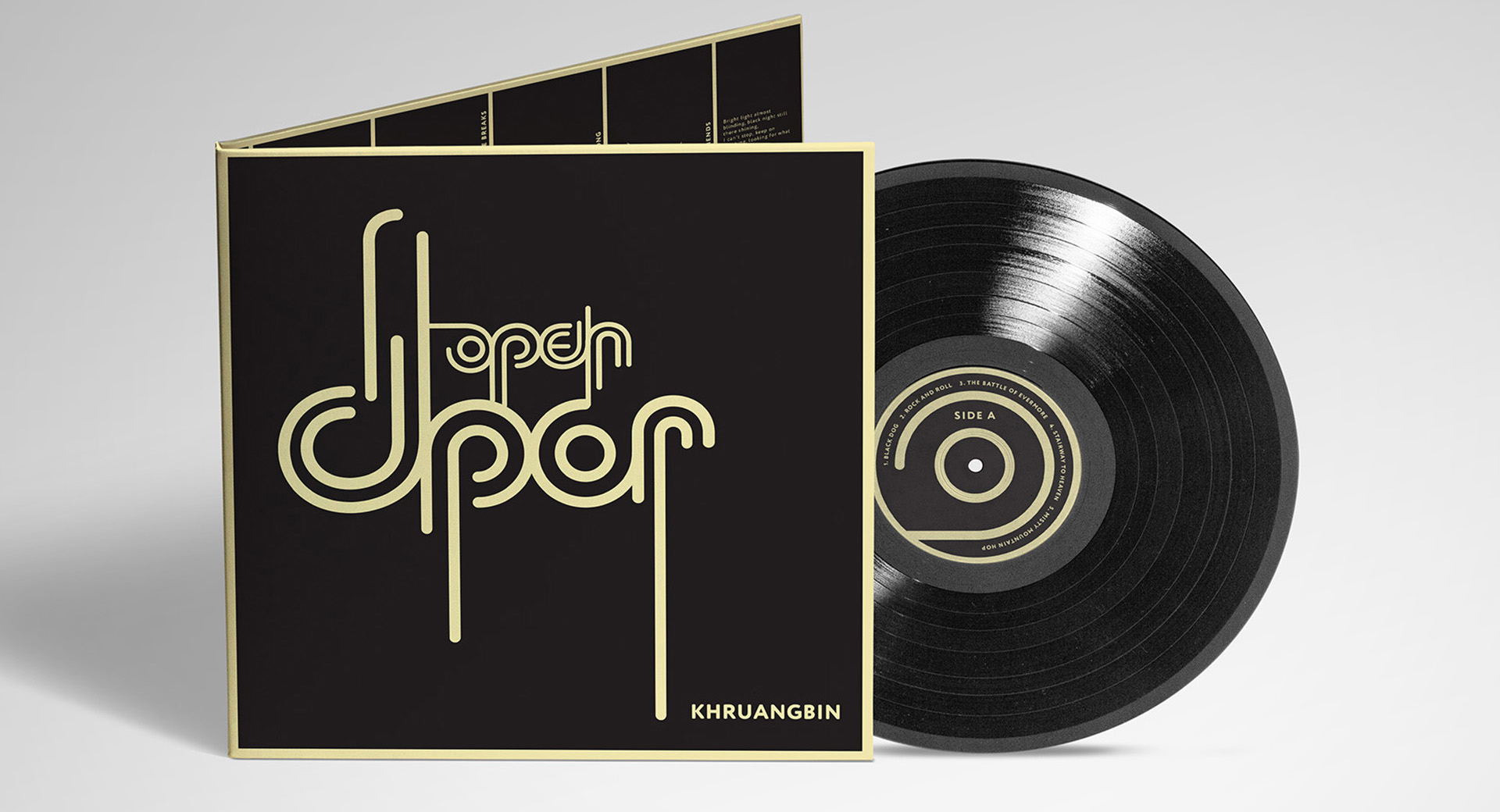
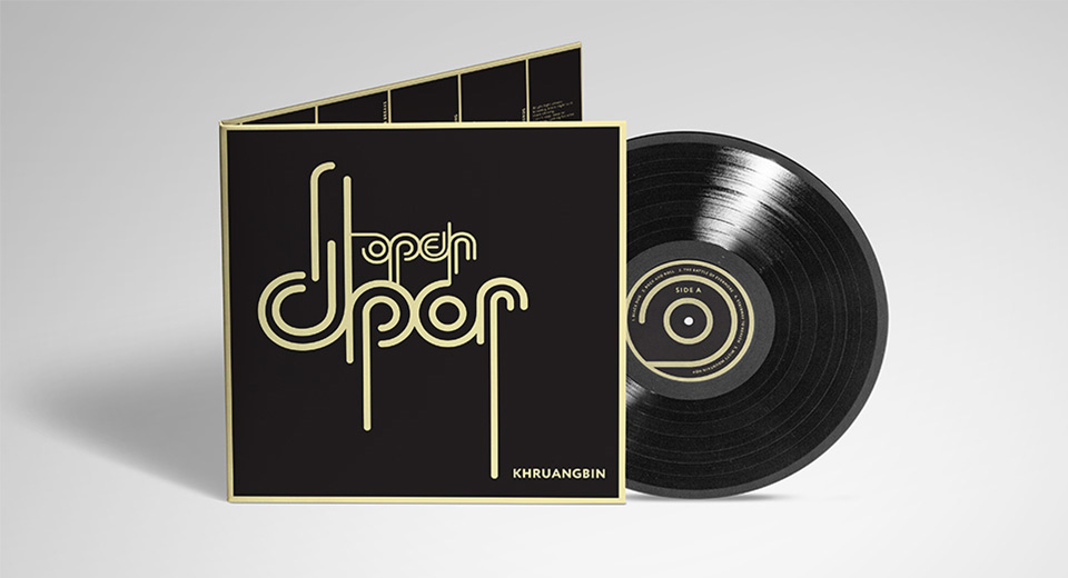
Khruangbin (artist) - Open Door (album), is a typographically focused cover art design. Khruangbin is an artist I'm a big fan of, and the 'Open Door' title is not official, that was design choice by me so I could have complete creative freedom on how I approached this project.
At this point in time, I didn't feel quite confident in my typographic skills, so the resulting product was extremely satisfying for me. I felt I struck the right balance of legibility and an eye-grabbing visual style.