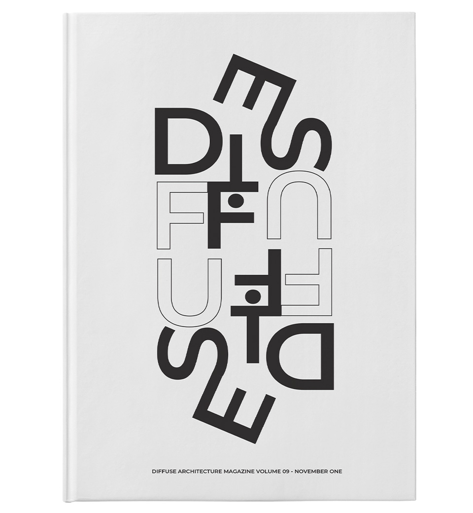
Diffuse Magazine
Typography
I wanted to create a magazine that was minimal and clean with the design...

My work strongly revolves around type, graphics and illustrations. I enjoy working collaboratively with others, being able to push ideas about new designs with other creative minds. I love being able to express myself through my designs and creating a unique style that pushes a little outside of the box.


I wanted to create a magazine that was minimal and clean with the design...
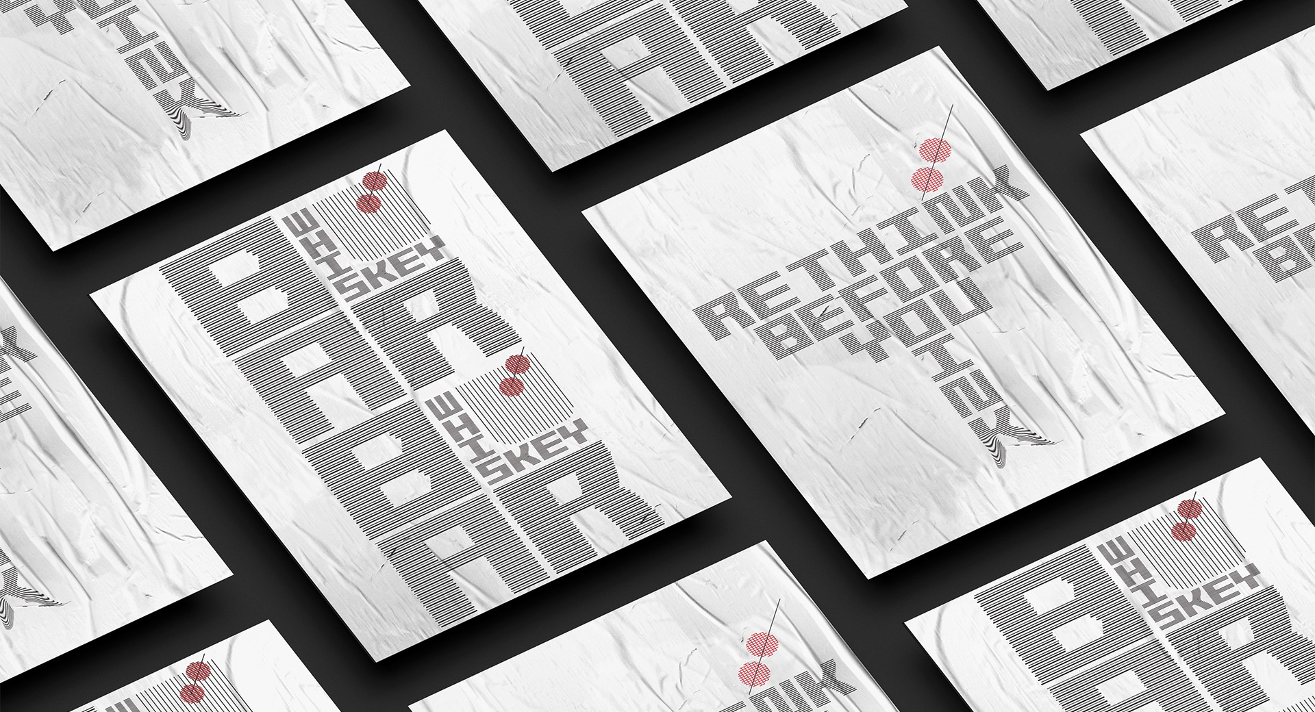
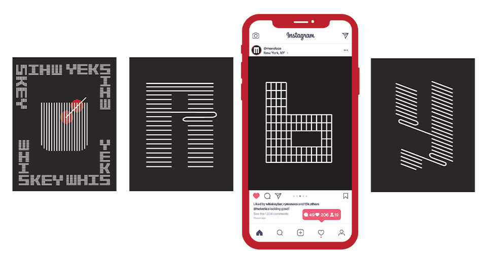
I decided to create a display eco font that stands out from the rest...
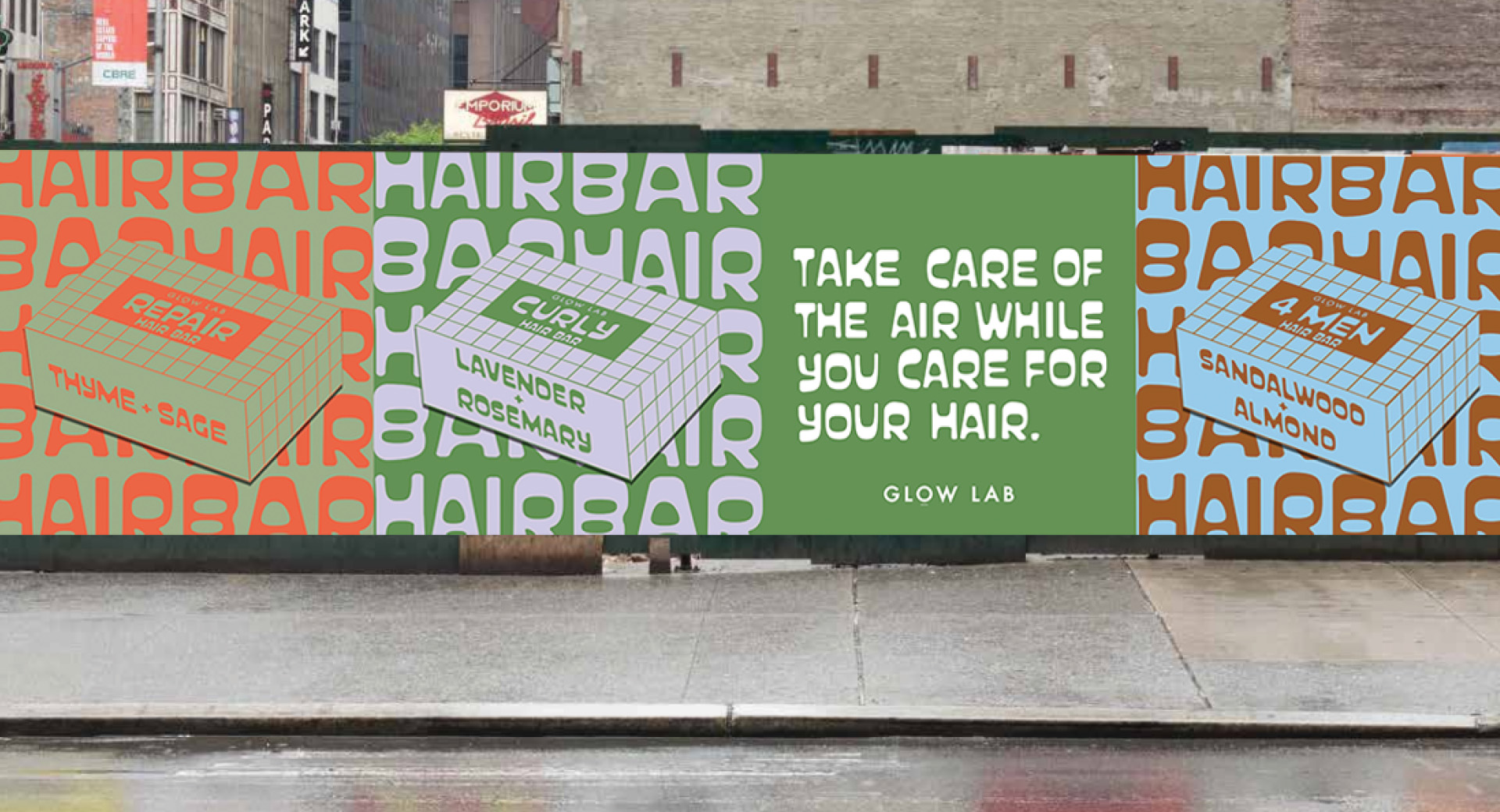
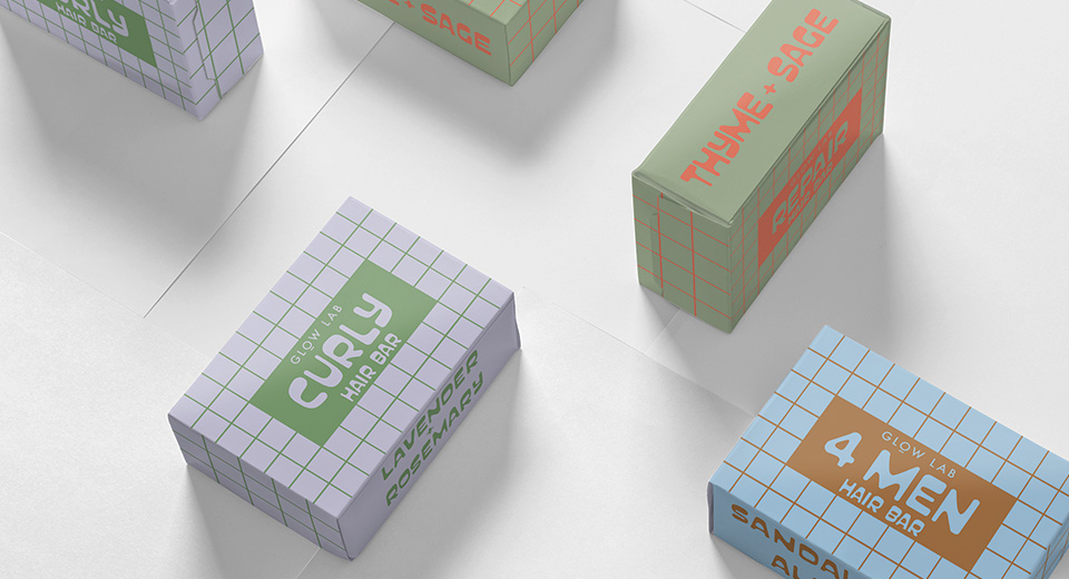
Glow Lab have a range of products on the market already ethically sourced...
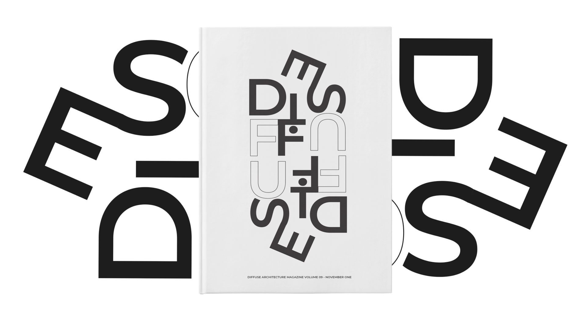
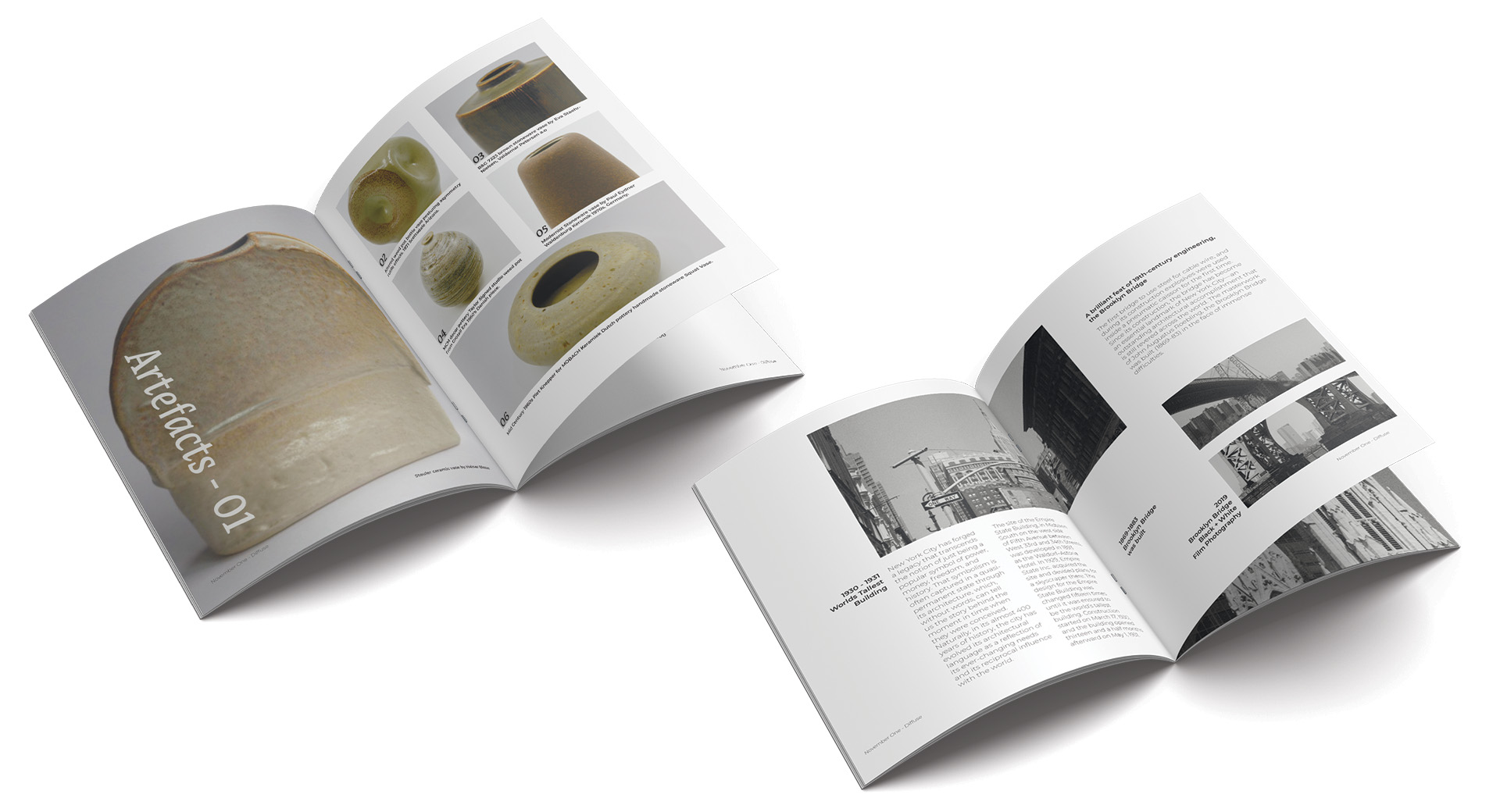
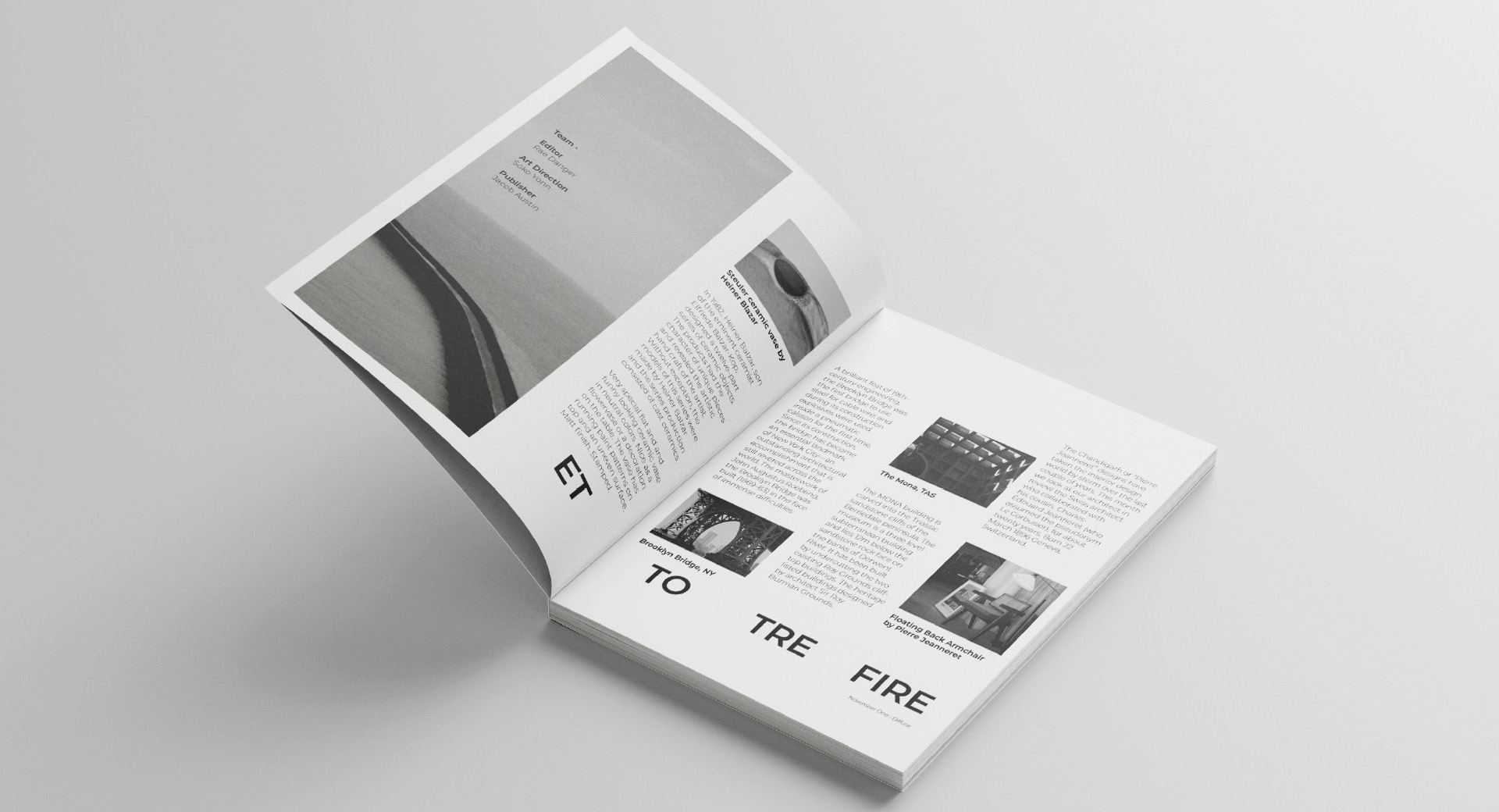
I wanted to create a magazine that was minimal and clean with the design focus on the use of white space, heavy imagery and easy to read large type. An architecture magazine for all who are interested in beautiful buildings and the arts. Giving a glimpse into furniture makers and beautiful artefacts. Using Film Images i have taken in numerous countries and settings.
I decided to create a display eco font that stands out from the rest. Being someone who likes typography i found during my research there aren't any eco fonts out there that I would like to use in my designs. My aim was to balance between saving ink and creating a font that in itself is beautiful and the main focus so you can use limited other resources for your design. I chose the name 'Mono Face' to encourage users to keep to black and white and focus on keeping simple, sleek, bold and minimal.

Glow Lab have a range of products on the market already ethically sourced and environmentally friendly however they don't sell in comparison to other bottled shampoo's. Through the creative process I wanted to create a brand that popped off the shelves. With a clean, bright colour palette and bathroom tile graphics I am aiming to lift the value and push a rise in shampoo bars over bottles.