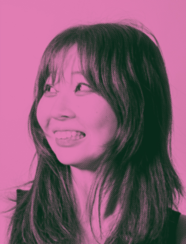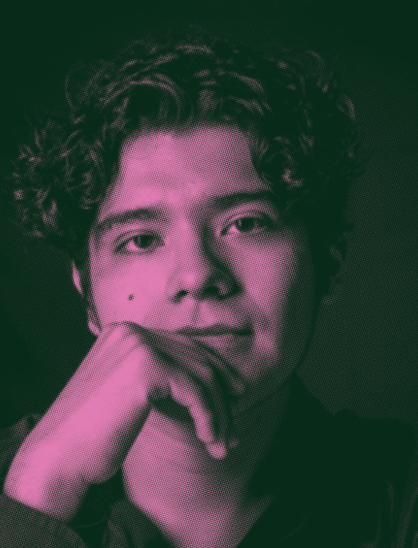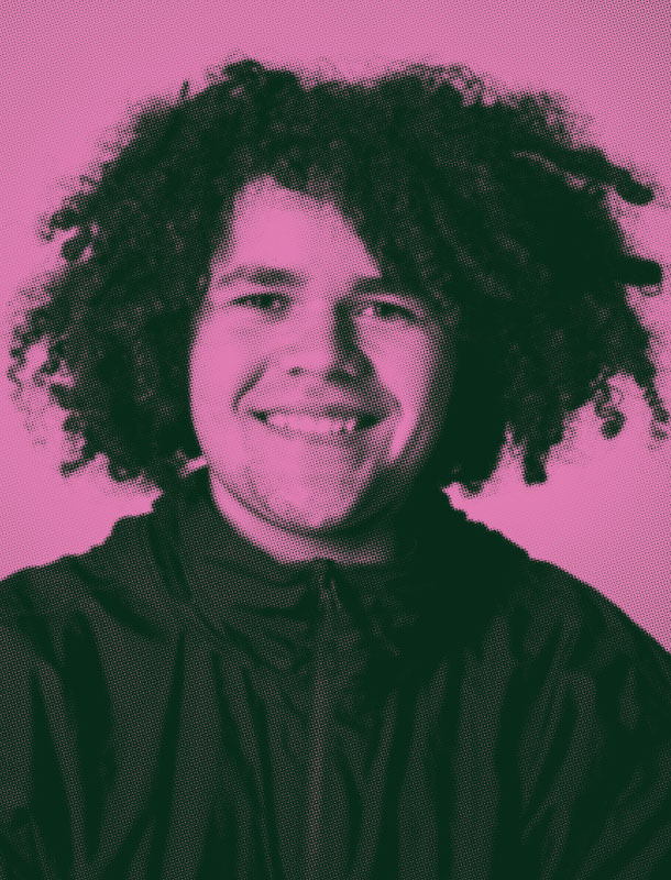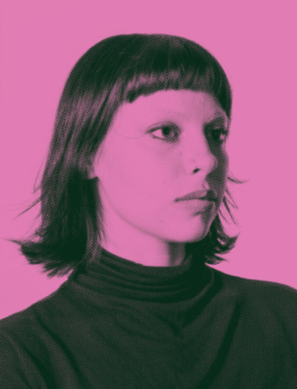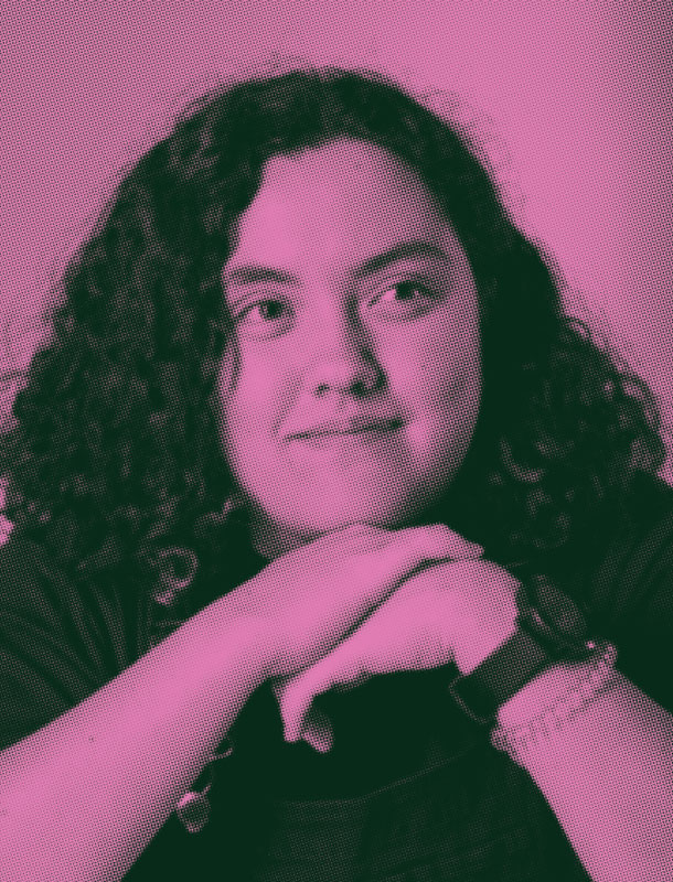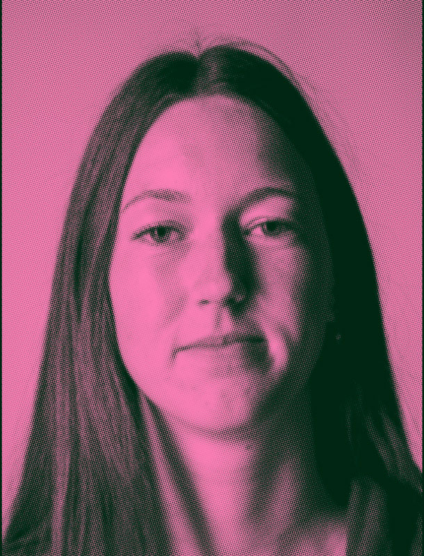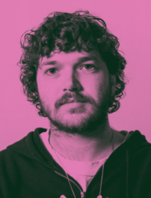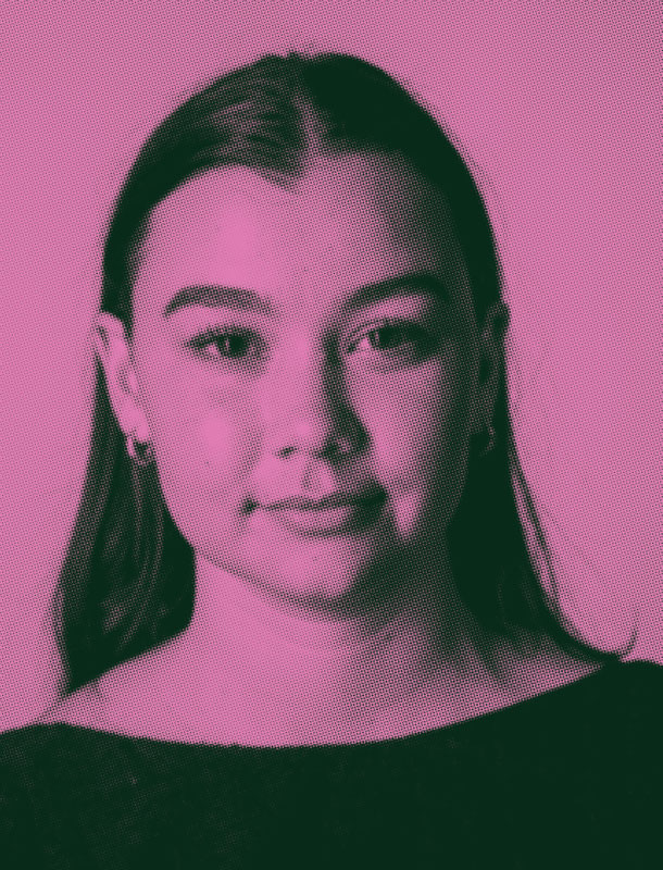
As a quiet person, I have developed my practice through observation, reflection, and steady experimentation during my time at Design Center Enmore. Small moments of feedback and shared learning have gently shaped my thinking. This work reflects personal growth, emotional awareness, and an evolving confidence in my creative voice.



Rebranding
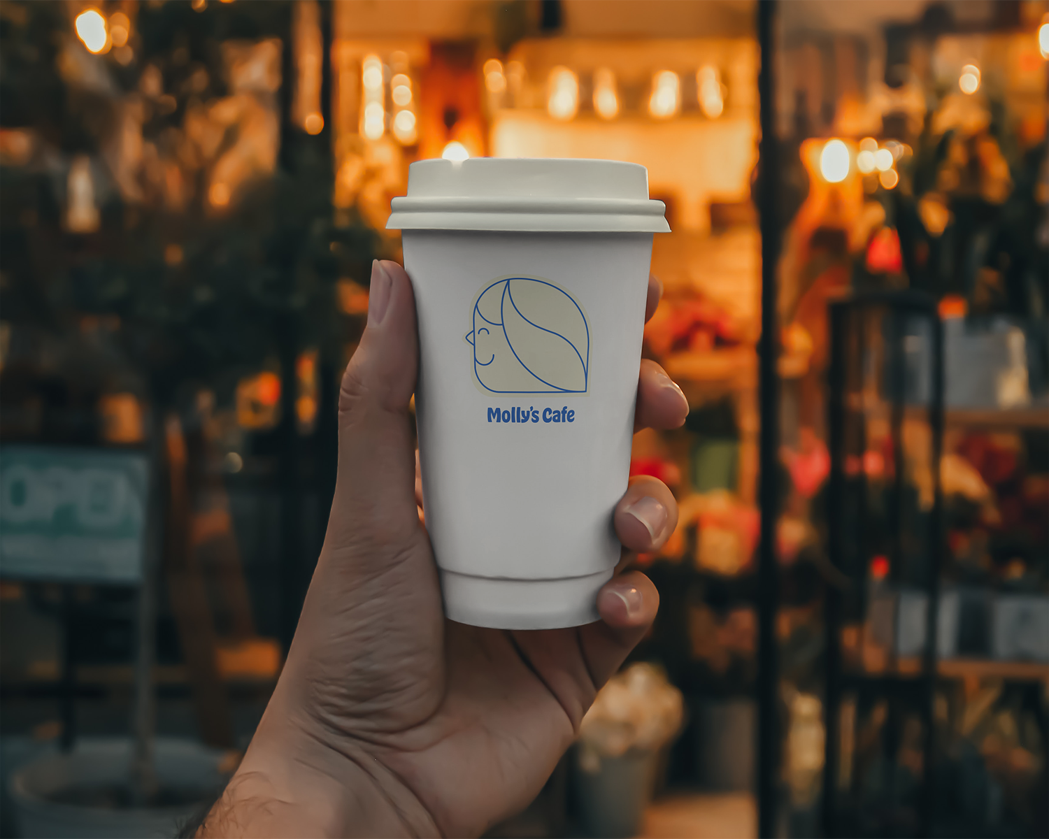
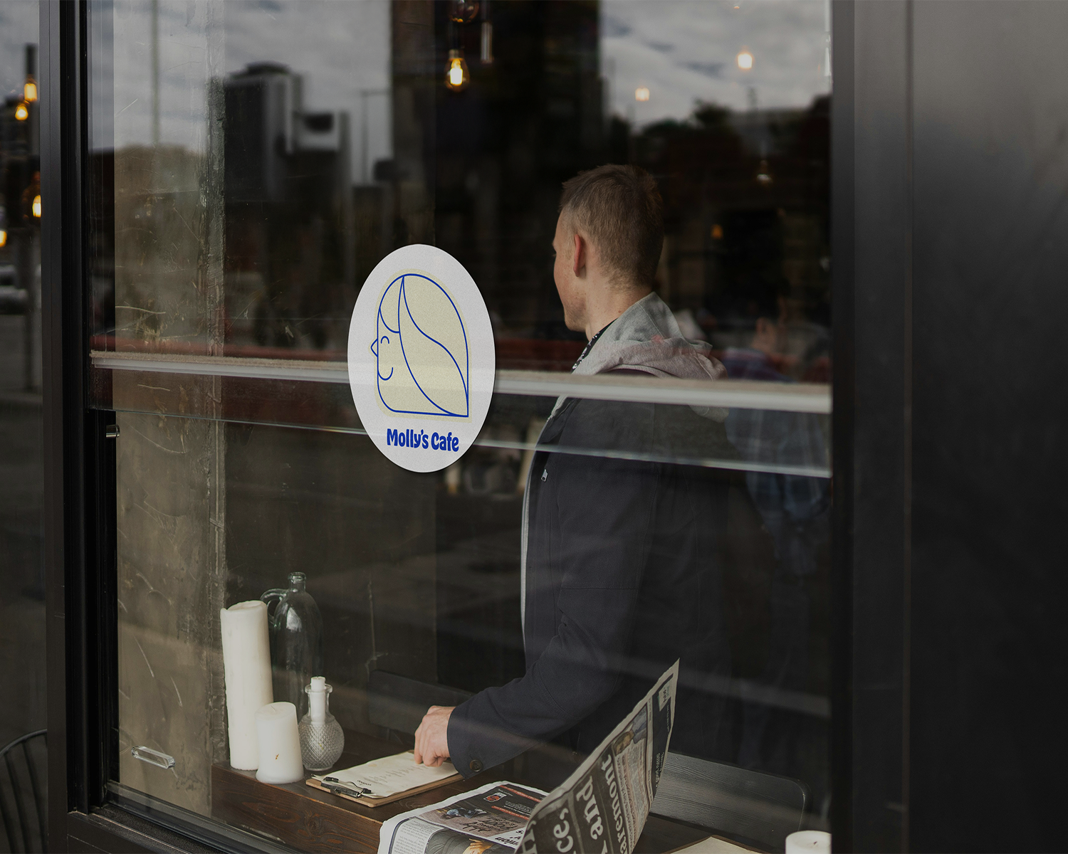
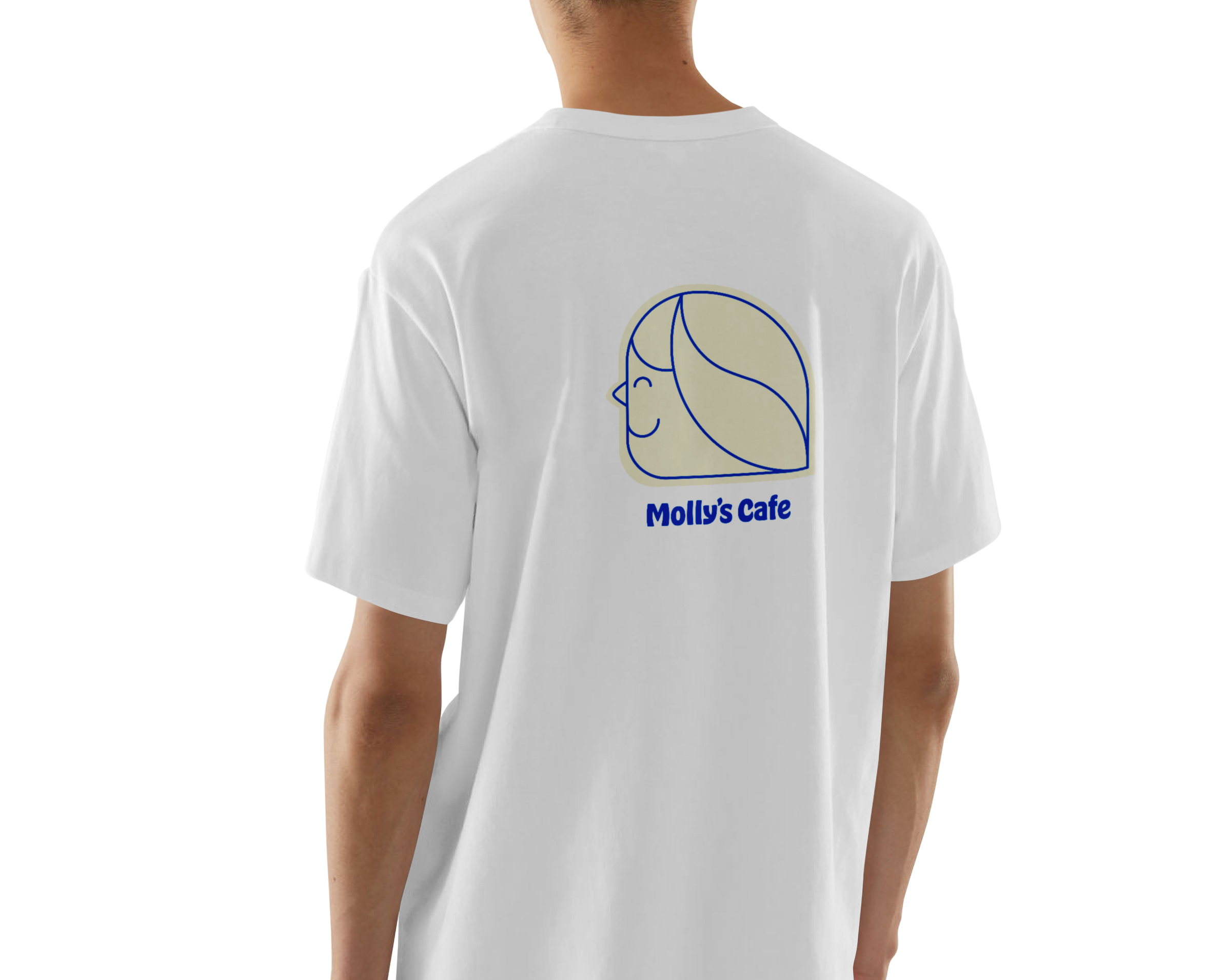
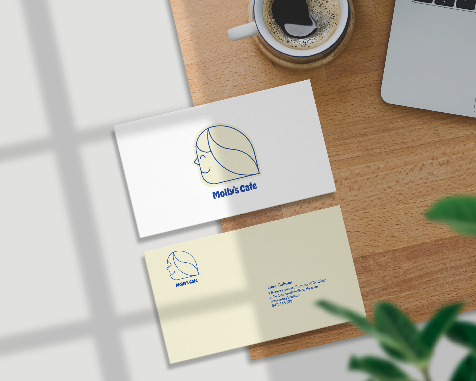
Molly’s Cafe needed a logo that felt warm, human and community driven. Soft curves were used to form Molly’s profile with a subtle coffee bean detail, creating a minimalist mark that balances personality with brand recognition for its North Sydney audience.


Branding × Illustration
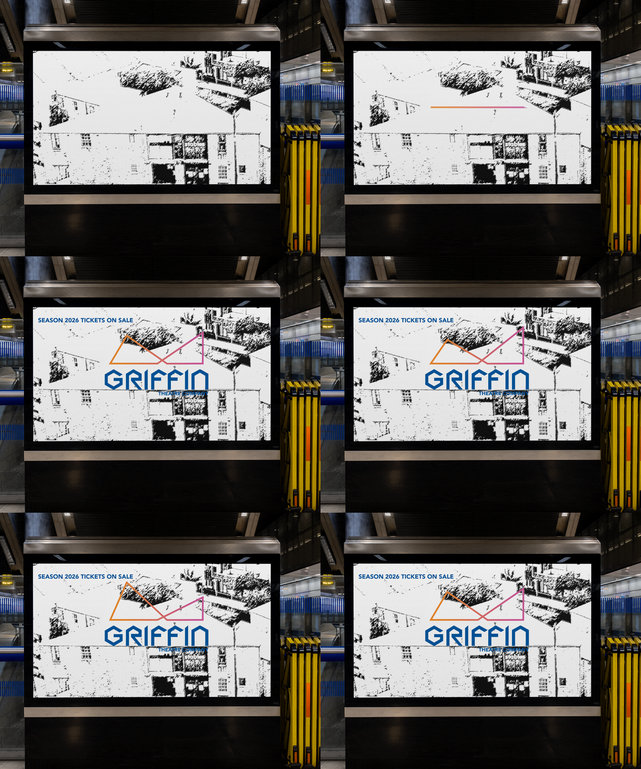
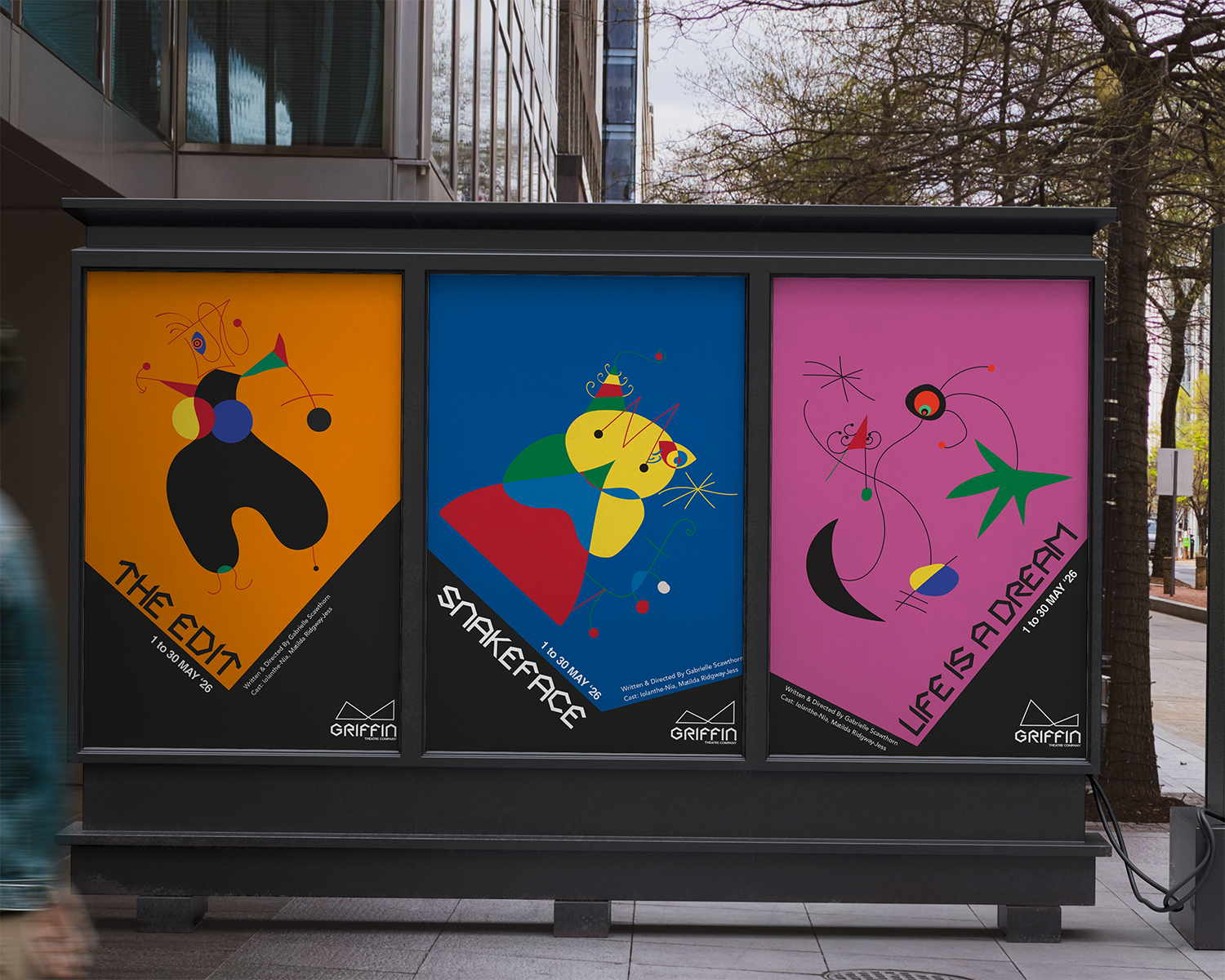
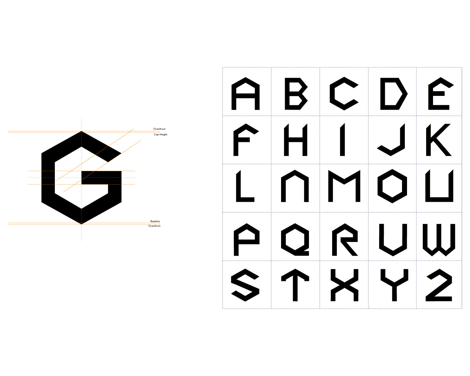
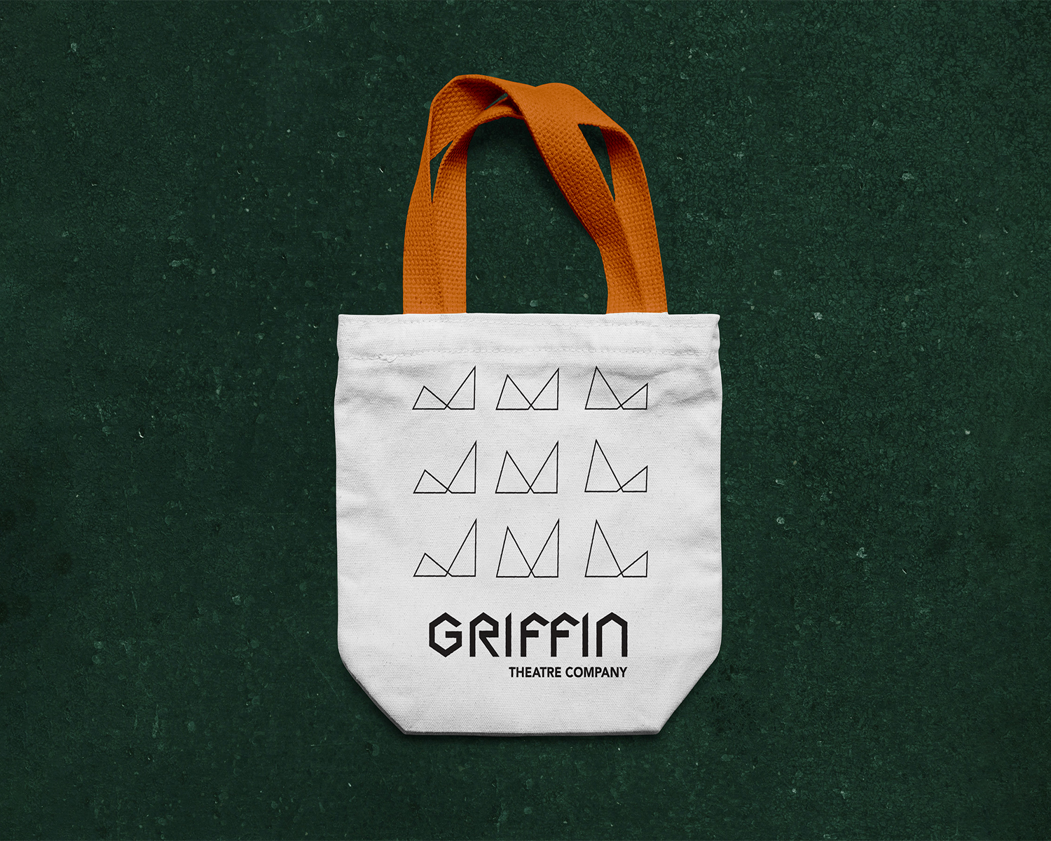
Griffin Theatre Company’s expansion into a new theatre calls for a refreshed identity that reflects its evolving creative direction. Inspired by the architecture, connected triangles represent storytelling, collaboration, a modern future.
Motion Graphic
Hai Ha's new app lacked awareness. An infographic-style explainer video was created to communicate the app's ease of use and key features, driving downloads across YouTube and social media.
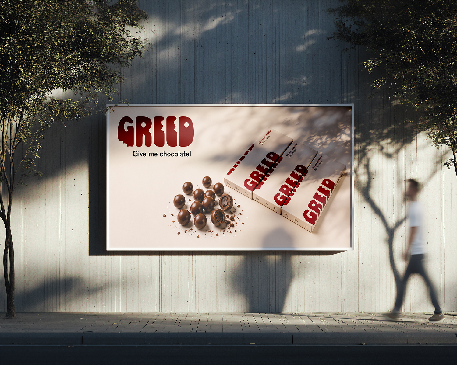
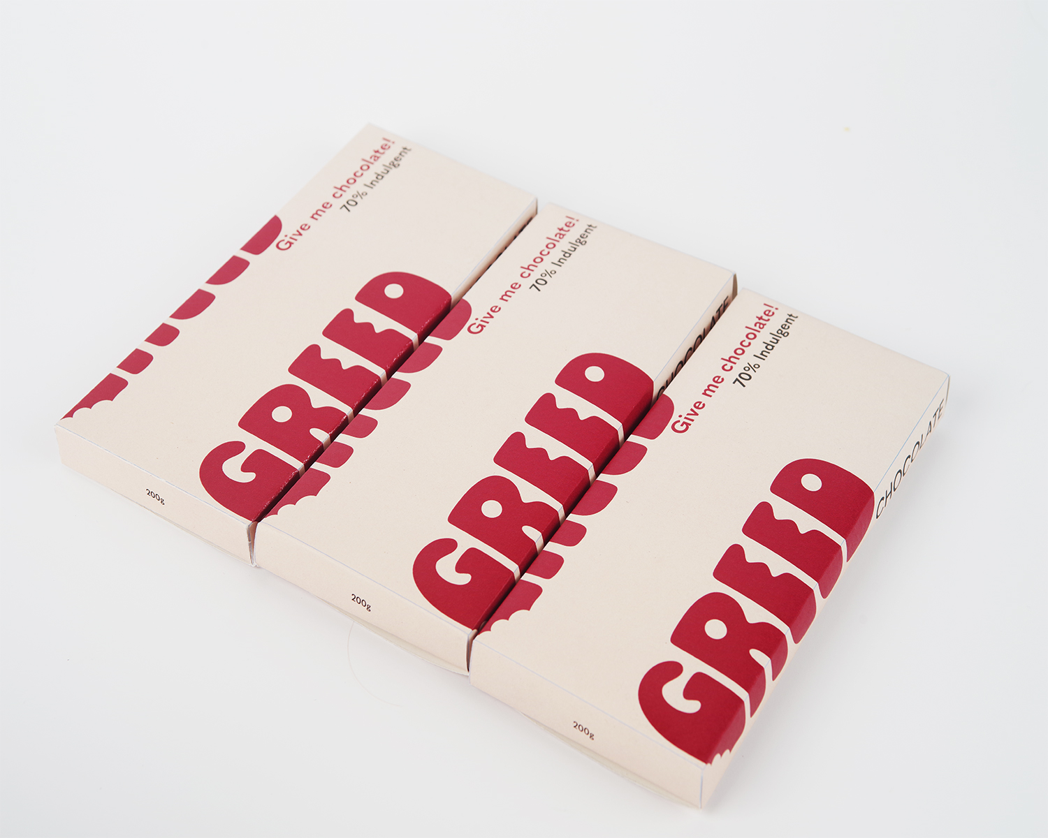
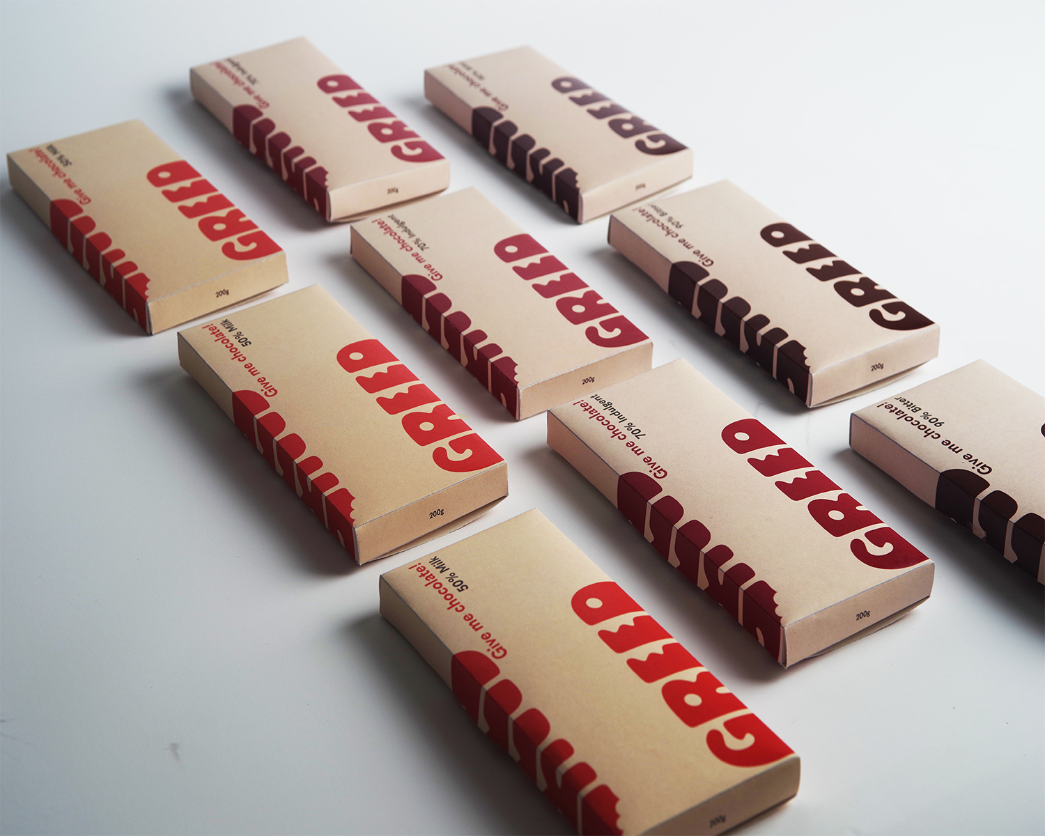
Packaging
As private label chocolate is often perceived as cheap and low quality, the redesign uses bold typography and confident colour to create a modern, accessible premium identity targeting younger consumers.