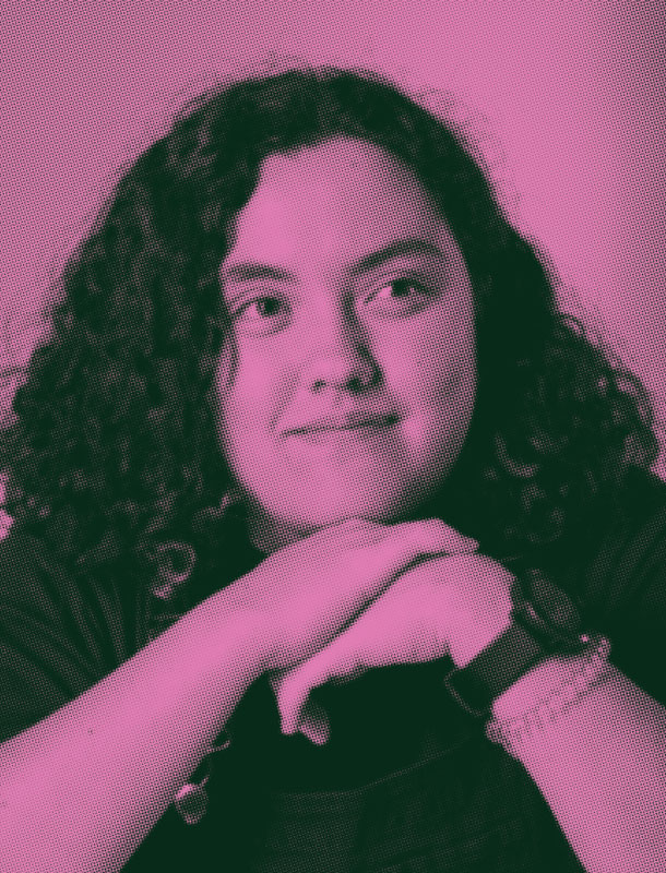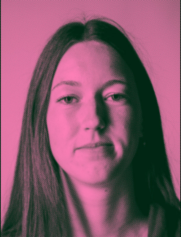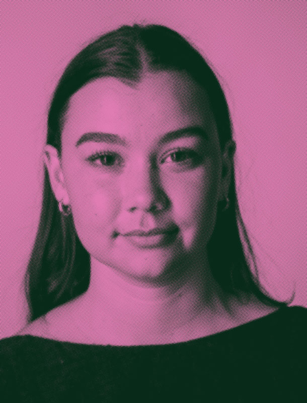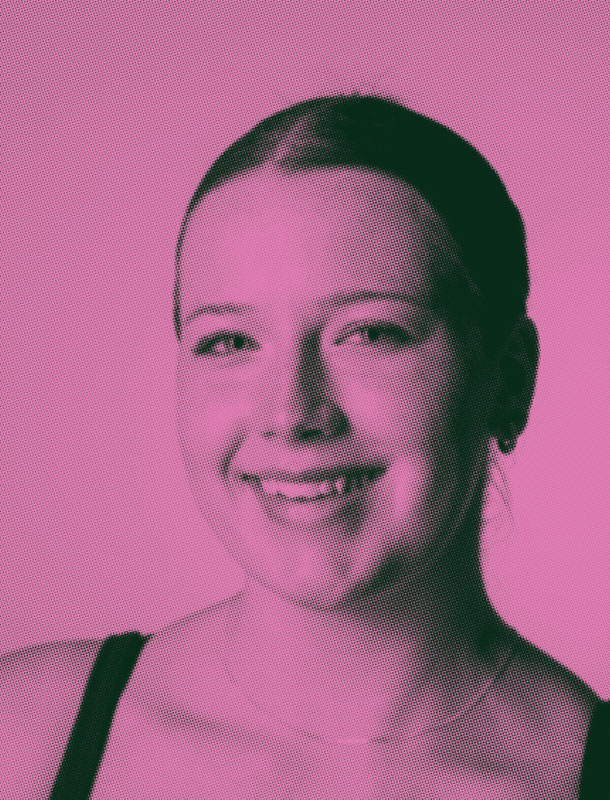
My time at TAFE has been one rollercoaster of a ride; through many trials and tribulations II have learned so much about graphic design and the creative process. My cohort for the past two and a half years has been invaluable and inspiring to experience. I will continue to draw from everything I have learned here into the future.



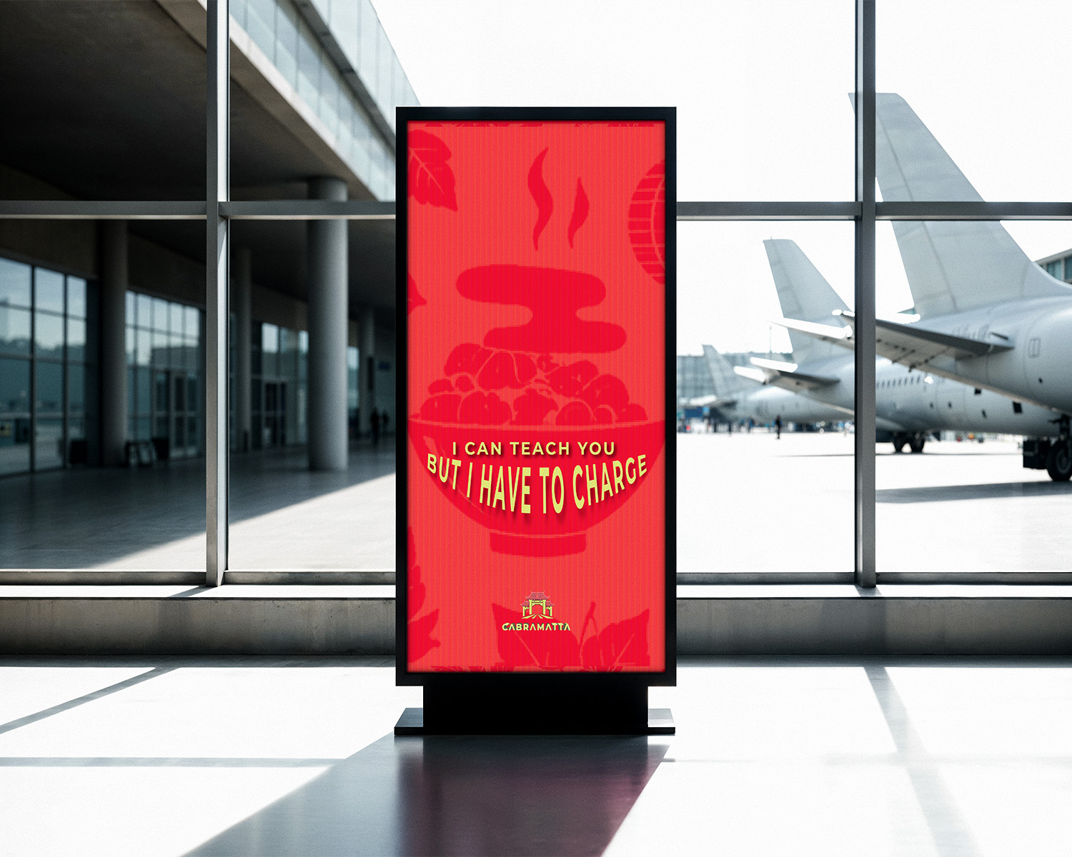

Branding
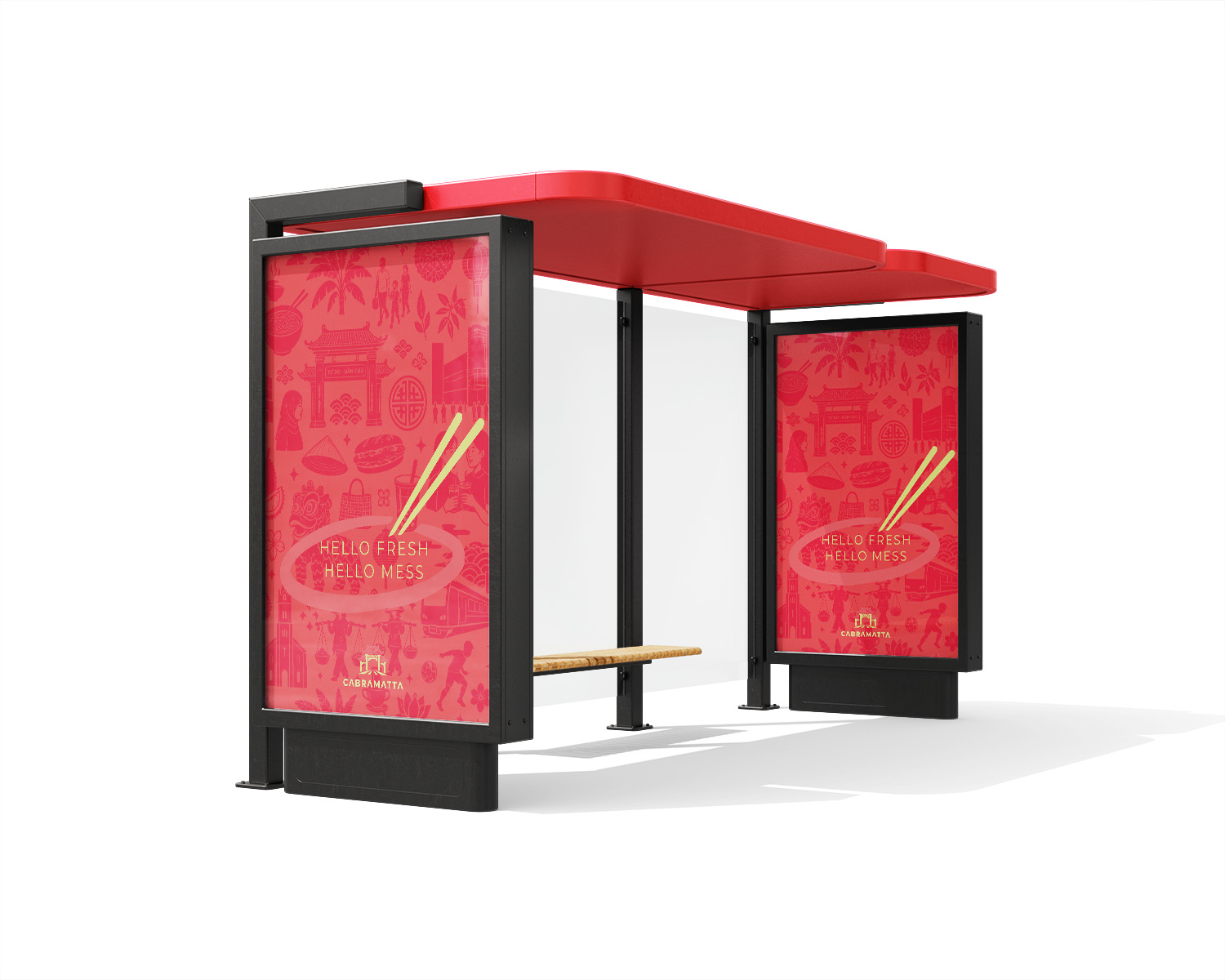
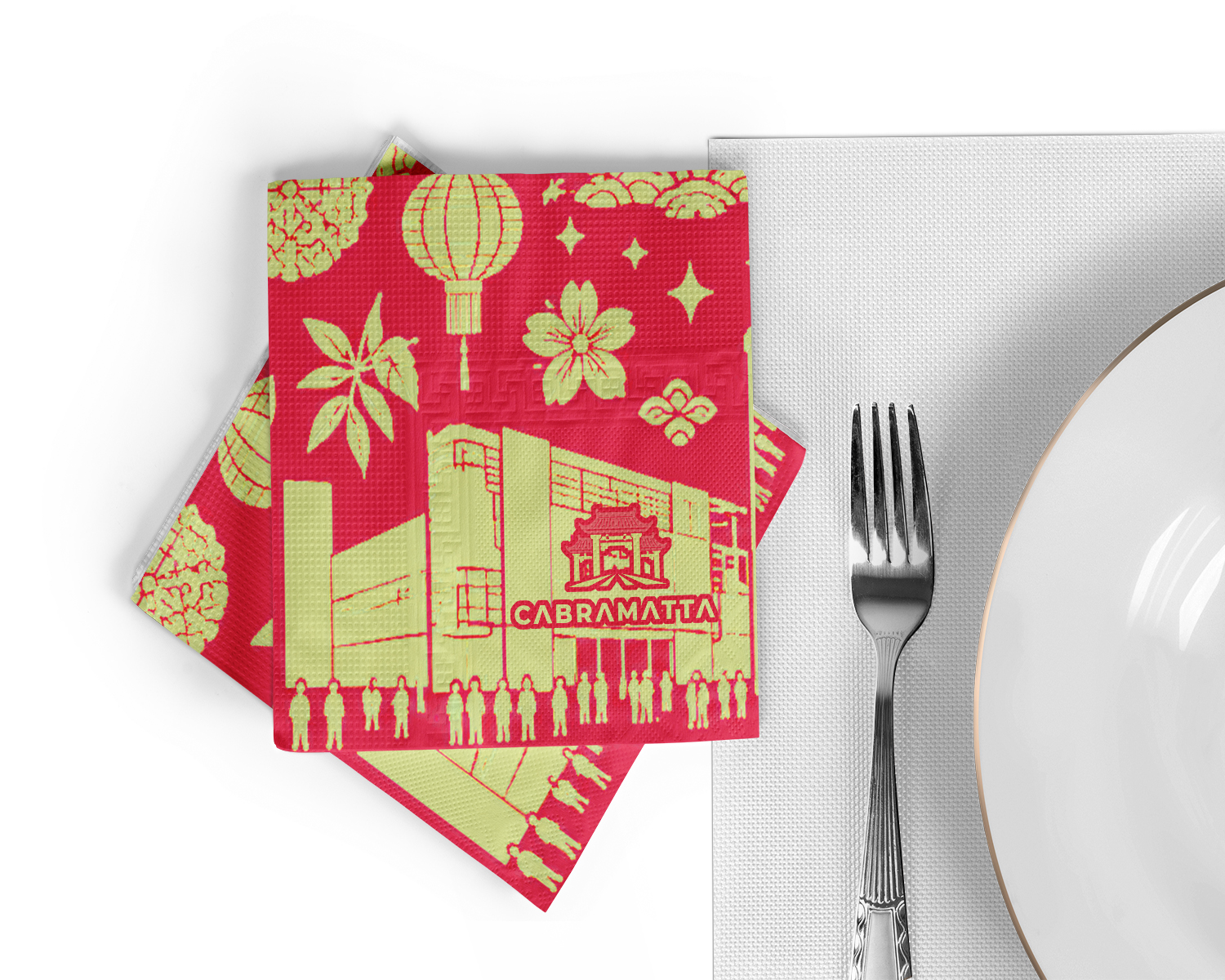
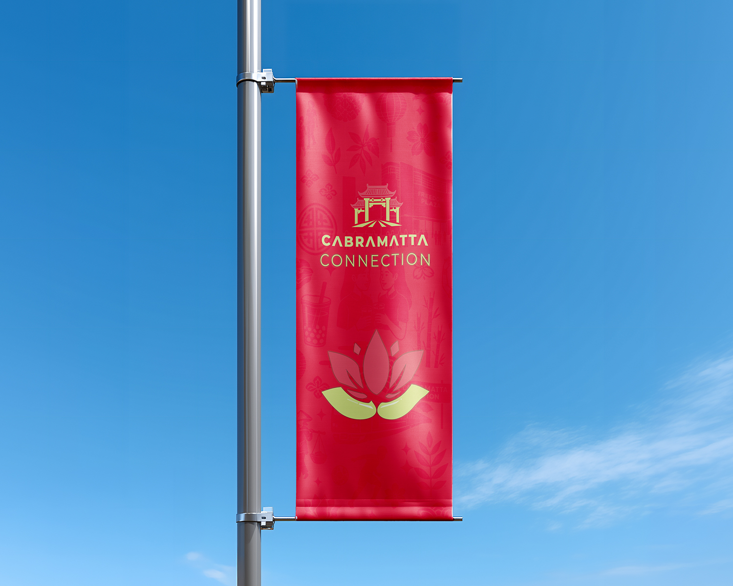
Embrace the Noise is my way of exploring Cabramatta through the energy, movement, and mix of experiences that make it feel unique. I wanted to celebrate noise as part of the suburb’s identity — shaped by culture, community, and everyday life.
Packaging
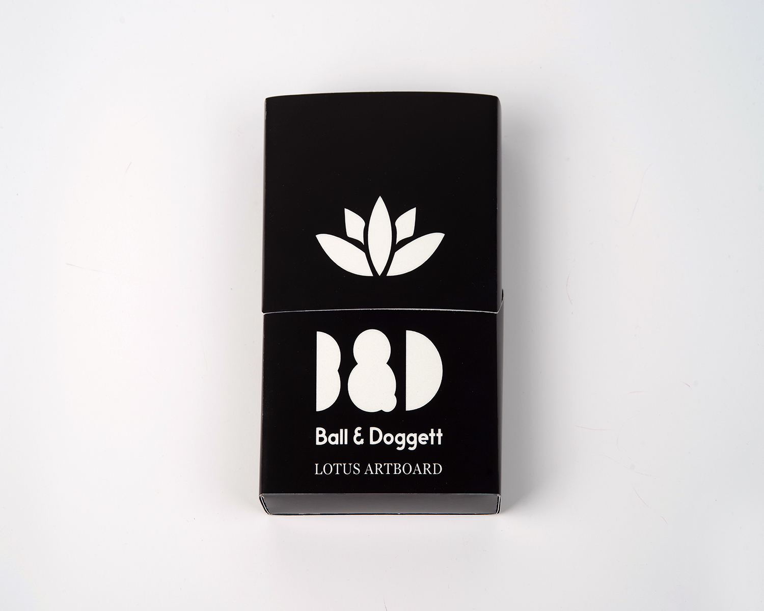
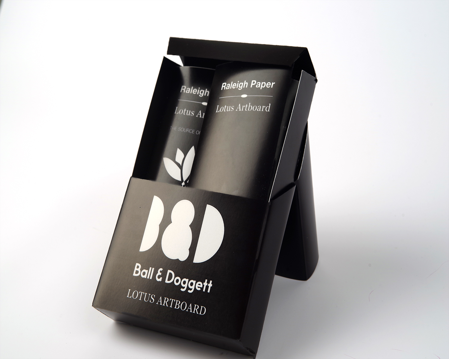
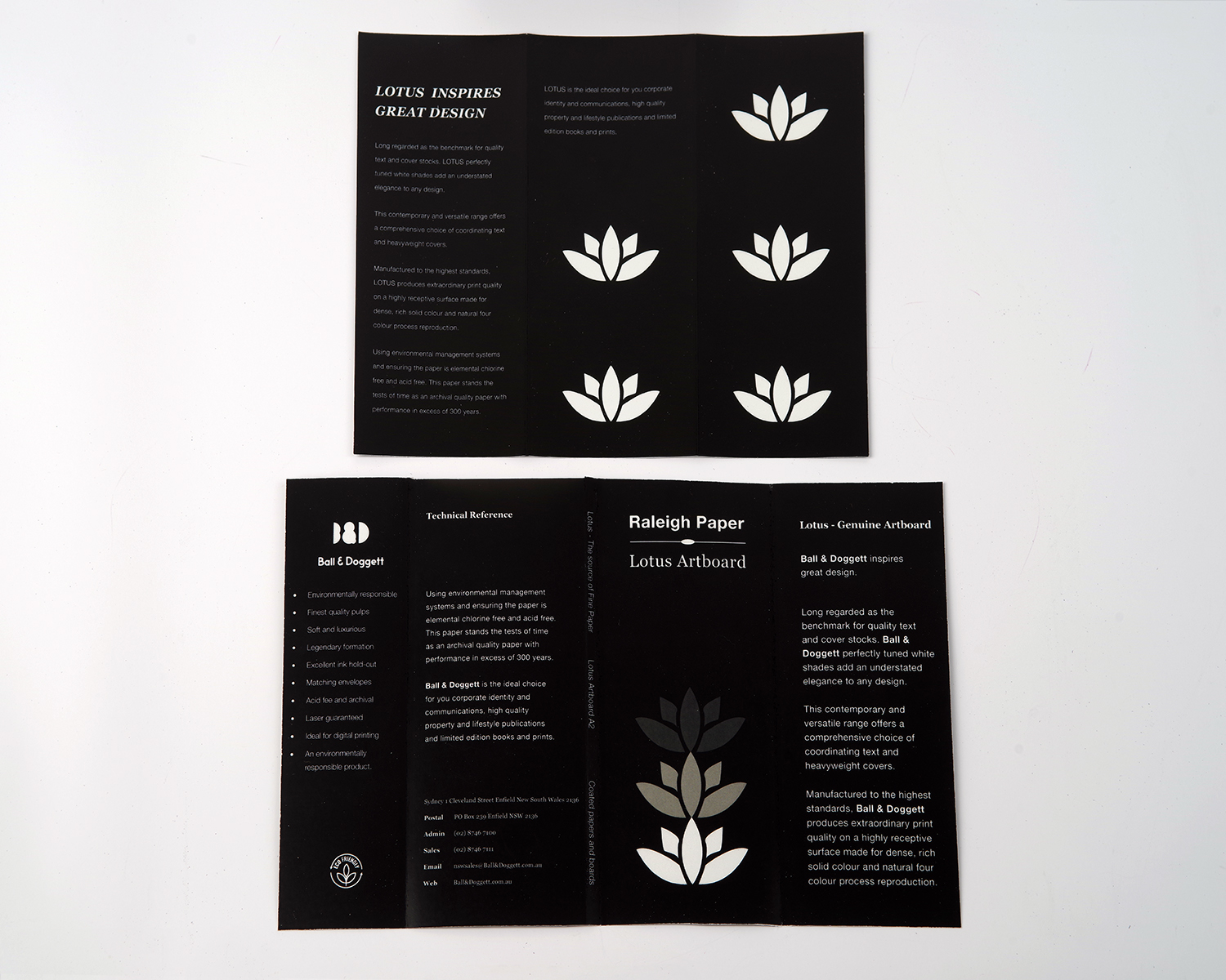
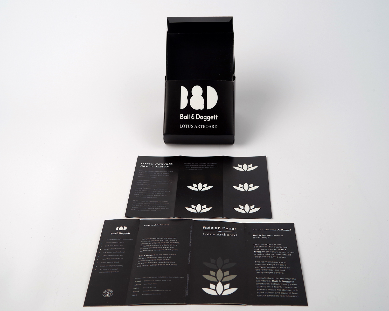
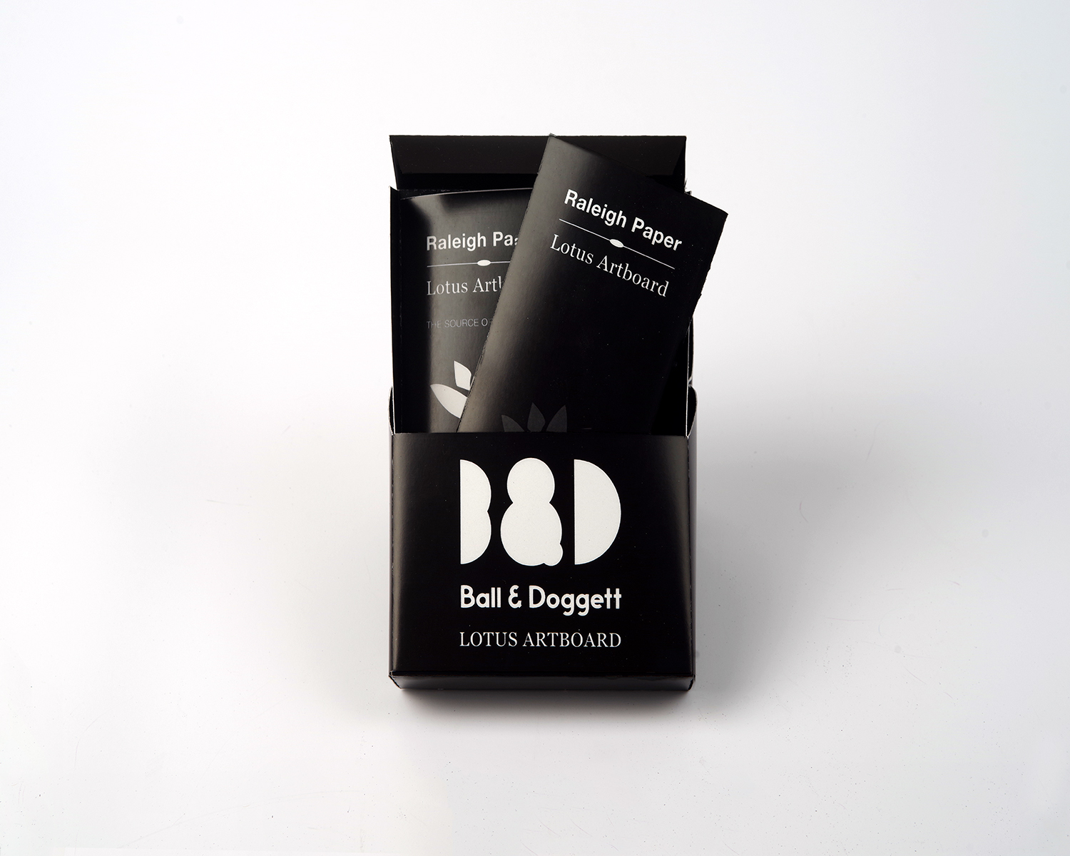
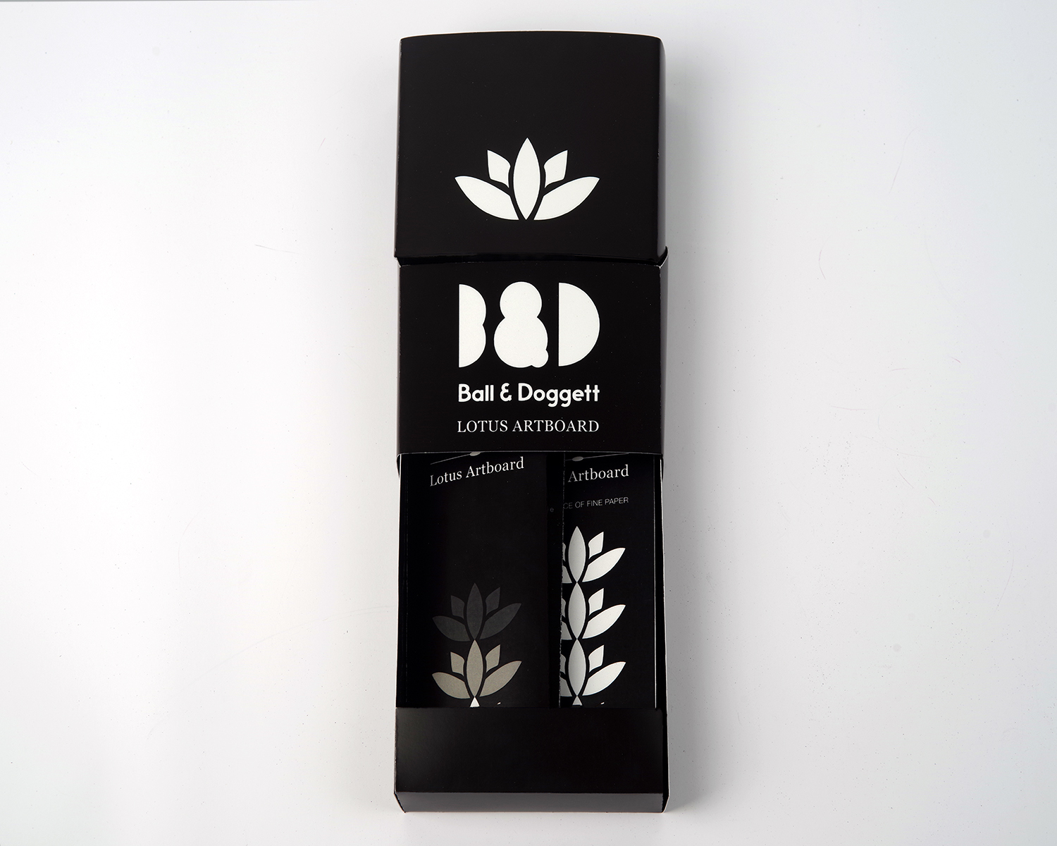
This custom packaging for Ball & Doggett presents swatch selections through a black and white lotus artboard. The simple colour palette highlights the material choices and reflects the lotus flower, creating packaging that feels clean, refined, and easy to understand.
Packaging
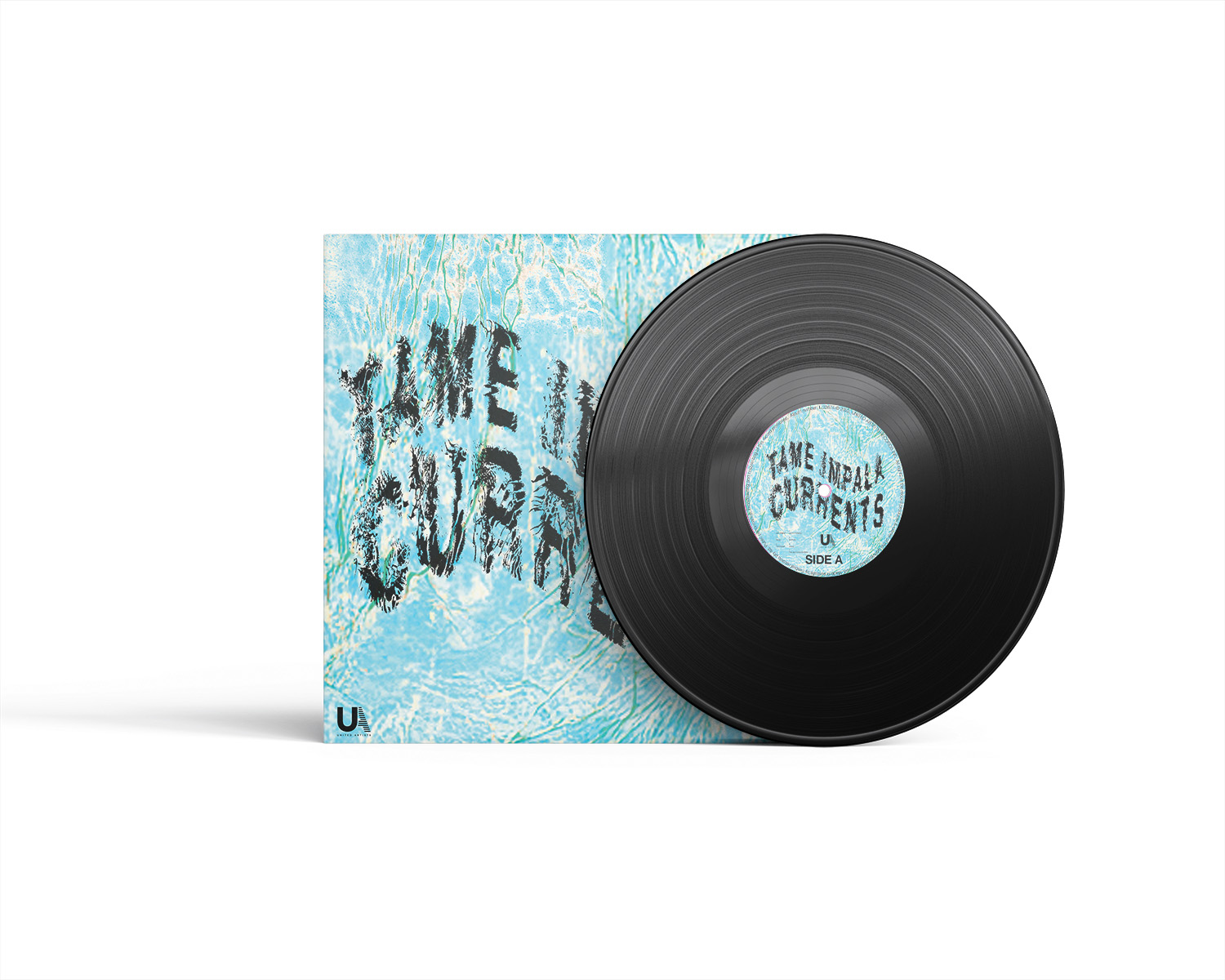
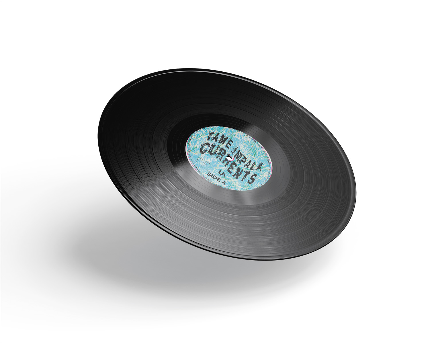
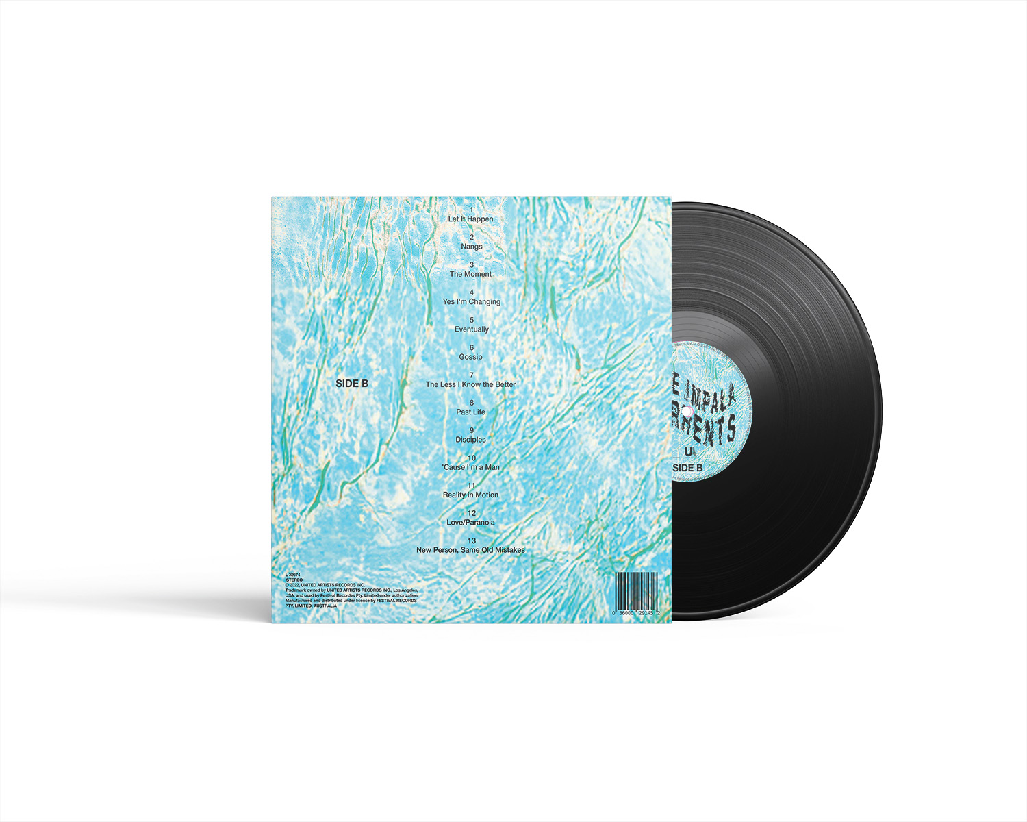
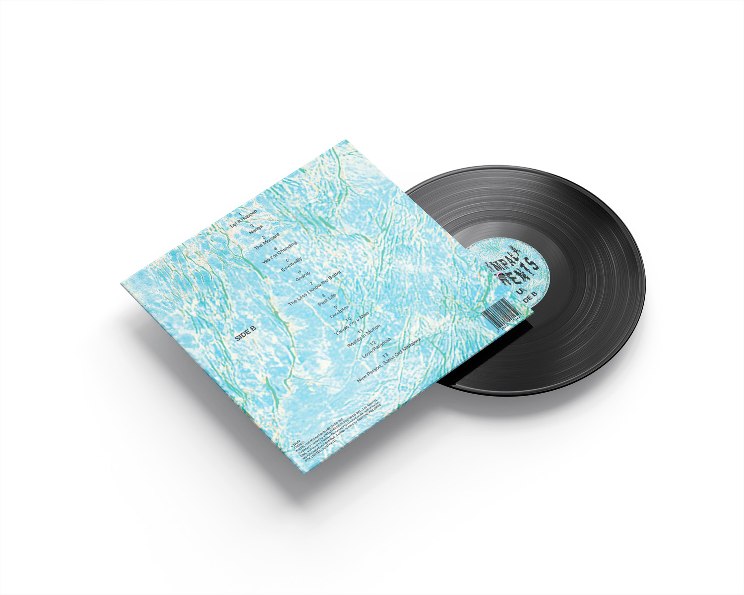
This LP vinyl project redesigns Tame Impala’s Currents through typography and visual experimentation. Inspired by the messiness of life’s tides, I explored how change, uncertainty, and shifting emotions reflect the album’s themes and creates a visually expressive experience.
Packaging
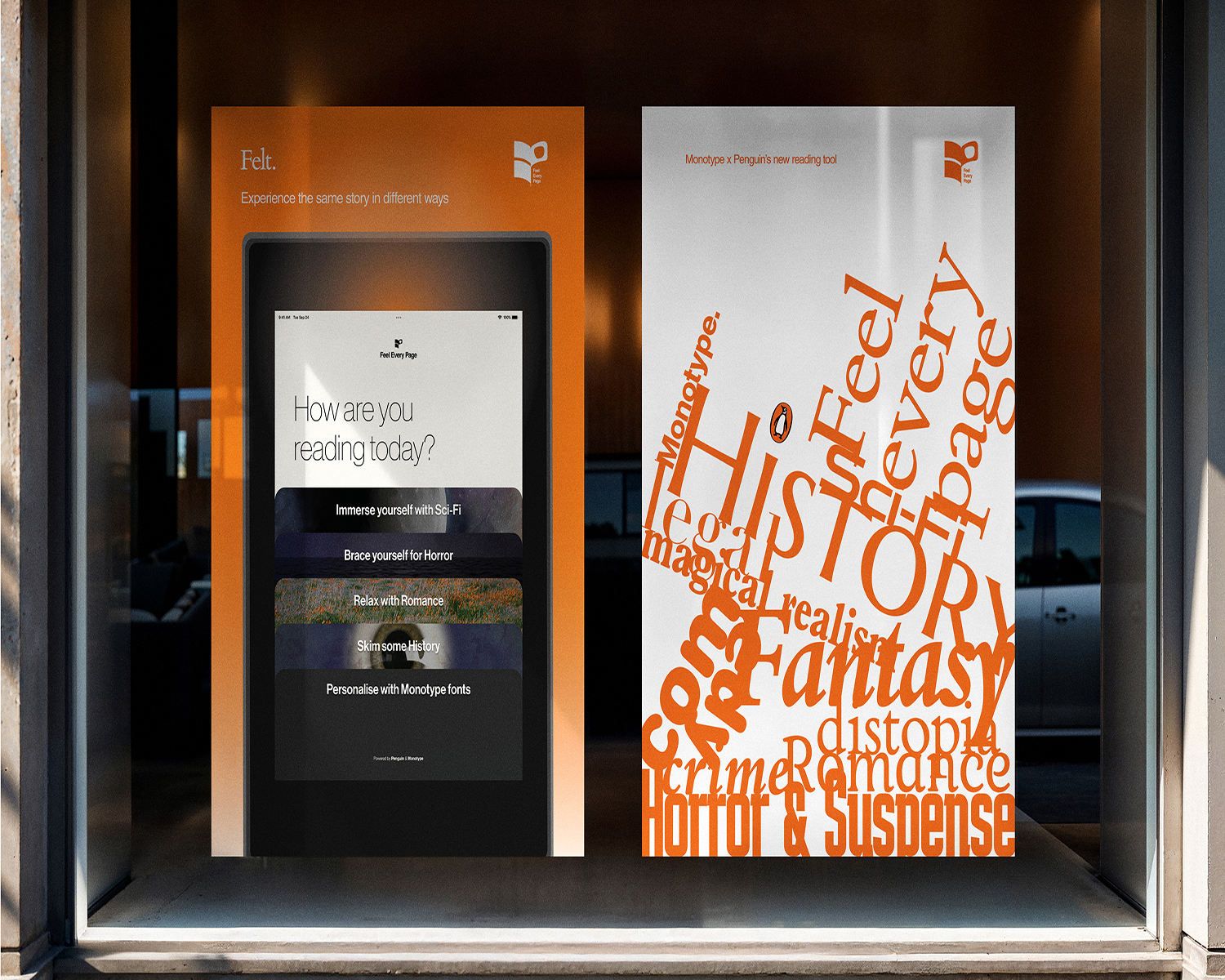
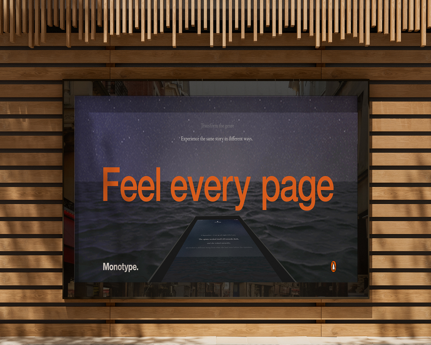
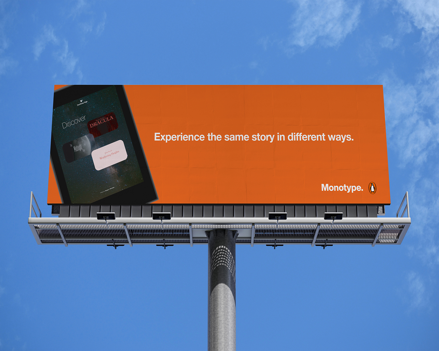
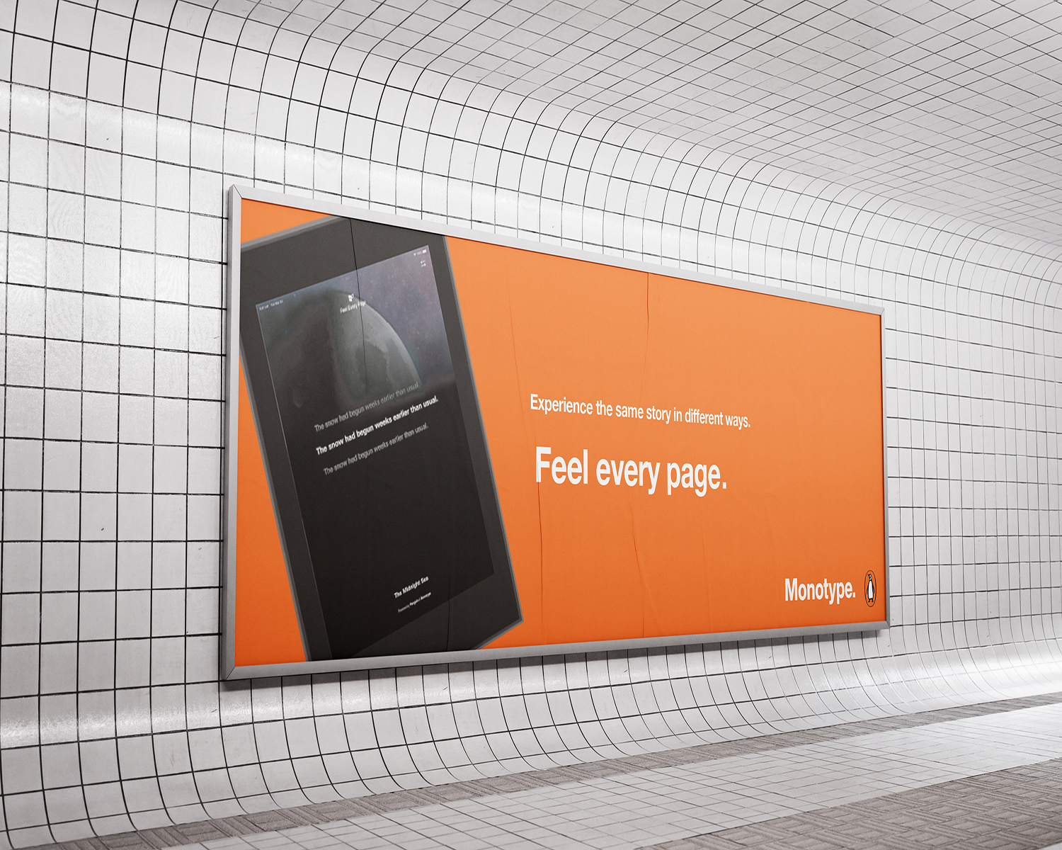
My response to the Monotype × Penguin Random House D&AD brief, exploring typography through a responsive reading device. Type adapts to readers’ preferences and chosen genre, creating an engaging and personalised reading experience addressing the rise of lowering attention spans.