Illustration • Branding • Packaging


I created this children's book to reflect the magic of my childhood toys, capturing the essence of their imagined personalities and interactions. For this project, I took photos of my old dollhouse furniture and overlaid them with illustrations of two bear sisters, Sunshine and Flower, to bring the story to life.


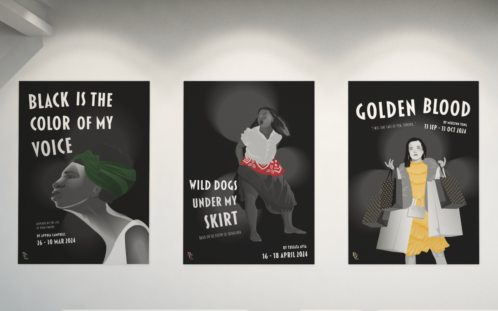
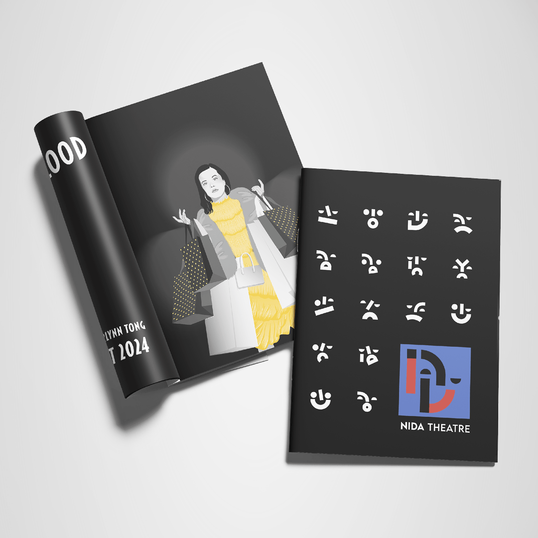
The goal of this redesign for the National Institute of Dramatic Art (NIDA) was to create a dynamic logo and visual identity representing the institution's two branches: the dramatic arts school and the theatre. I designed my logo by incorporating the NIDA letters to form an expressive face, cleverly hiding the 'A' in the negative space. The choice of red and blue symbolises the dual nature of comedy and tragedy.


96% of Australian women initiate breastfeeding at birth, but only 39% of newborns are exclusively breastfed at three months. My goal was to design a NSW Health app that helps new parents establish their breastfeeding routine and offers direct and easy access to information and support services. I used NSW Government brand guidelines to assist in the design of the app and a series of campaign posters.


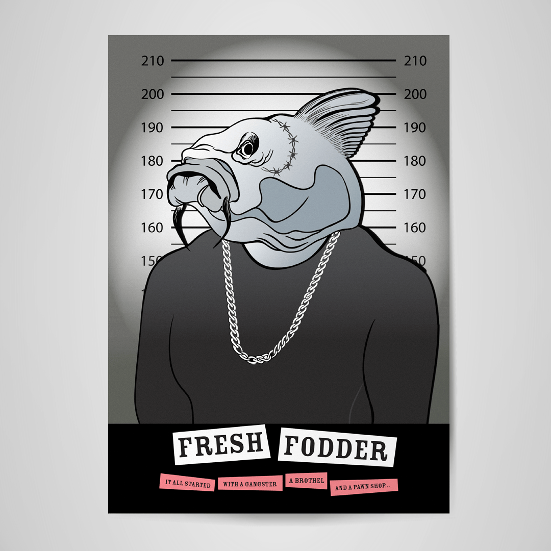
Fresh Fodder is a producer of handcrafted dips and soups based in Orange, NSW. My goal was to modernise the packaging of their hero product, Taramosalata, also known as 'The Gangster Dip,' to reflect its unusual backstory, enhance the visual appeal of the product, and attract a younger market. I designed a peel-back label that uncovers the complete backstory in a comic strip.


This motion graphics compilation showcases a variety of my work including 3D scenes created with Adobe Substance 3D Stager and a snippet of a group D&AD competition entry. Enjoy!

